React RBAC UI Manager - User Guide
react-rbac-ui-manager is a simple RBAC (Role Based Access Control) user interface library based on the material design system using the Material-UI lib.


This lib generates a simple json output of the roles and permissions and can be used internally with any react with material-ui based application.
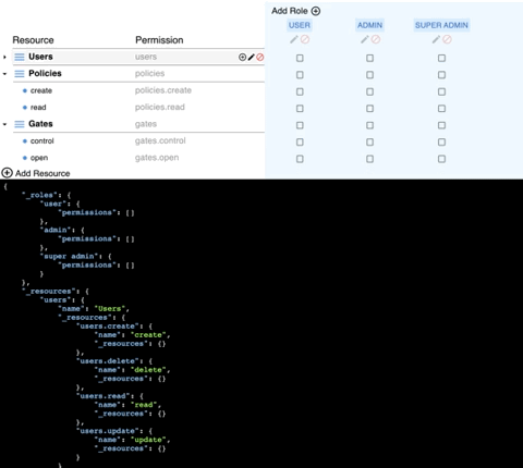
Table of contents
Install
npm install @build-security/react-rbac-ui-manager --save
If your project doesn't already use them, you need to install @material-ui/core, @material-ui/icons and @material-ui/lab as well.
Demo
Check the live working example on codesandbox:

Usage
Simple usage:
import Rbac from "@build-security/react-rbac-ui-manager";
import { PermissionsObject } from "@build-security/react-rbac-ui-manager/dist/types";

const handleChange = (value: PermissionsObject) => {
    console.log(value)
};

<Rbac
    onChange={handleChange}
/>
Customized icons:
import Rbac from "@build-security/react-rbac-ui-manager";
import { PermissionsObject } from "@build-security/react-rbac-ui-manager/dist/types";
import DeleteIcon from '@material-ui/icons/Delete';
import styled from "styled-components";

const handleChange = (value: PermissionsObject) => {
    console.log(value)
 };

const deleteIcon = styled(DeleteIcon)`
    background: red;
    color: black;

    &.MuiSvgIcon-colorError {
        color: black;
    }
`;

<Rbac
    icons={{
        deleteIcon: deleteIcon
    }}
    onChange={handleChange}
/>
👉 Note - the JSON Viewer is not part of this lib.
The live example (in codesandbox) contains a working version with external viewer
API
<Rbac />
The Rbac component accepts the following props (none of which is required):
| Name | Type | Description |
|---|
defaultValue | object | JSON structure, same as the one that is generated by the lib |
onChange | function | Callback fired on every change.
signature:
function(data: object) => void
data: The JSON object with the new value. |
resourceForbiddenCharsRegex | RegExp | Regular expression to remove invalid characters from the resource |
buttons | object | Object contains buttons to be used as replacement for the default buttons (see below) |
icons | object | Object contains icons to be used as replacement for the default icons (see below) |
components | object | Object contains components to be used as replacement for the default components (see below) |
The Buttons object:
| Name | Type | Description |
|---|
cancelButton | node | The component to use for the cancel button inside the modal |
closeButton | node | The component to use for the close button inside the modal |
deleteButton | node | The component to use for the delete button inside the modal |
saveButton | node | The component to use for the save button inside the modal |
The Icons object:
| Name | Type | Description |
|---|
deleteIcon | node | The component to use for the delete icon in the roles column |
editIcon | node | The component to use for the edit icon in the roles column |
treeAddIcon | node | The component to use for the add icon in the tree |
treeCollapseIcon | node | The component to use for the collapse icon in the tree |
treeDeleteIcon | node | The component to use for the delete icon in the tree |
treeExpandIcon | node | The component to use for the expand icon in the tree |
treeEditIcon | node | The component to use for the edit icon in the tree |
treeNodeIcon | node | The component to use for the non-expandable node in the tree |
treeParentIcon | node | The component to use for the expandable node in the tree |
The Components object:
| Name | Type | Description |
|---|
addResource | node | The component to use for the Add Resource block |
addRole | node | The component to use for the Add Role block |
checkboxTableContainer | node | The component to use for the container of the checkbox table |
roleTag | node | The component to use for the role name tag |
License
Licensed under the MIT License, Copyright © 2021-present Dekel Braunstein.
See LICENSE for more information.