Modular, design-conscious color picker widget for JavaScript - with support for a bunch of color formats | iro.js.org


Features | Demo | Installation | Usage | Plugins | Documentation | Special Thanks | Forum
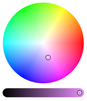
Features
- Work with colors in hex, RGB, HSV and HSL formats (plus kelvin temperatures!) in one simple, frictionless API
- Add multiple colors to the same color picker for selecting color harmonies and themes
- Create the perfect color picker from a selection of pre-built UI components
- All of iro.js can run from a single script - no extra CSS, images, or third-party libraries required!
- ~9kb minified and gzipped
- Licenced under MPL 2.0 - 100% free for personal and commercial use

Codepen Demos
Installation
Install with NPM
npm install @jaames/iro --save
If you are using a module bundler like Webpack or Rollup, import iro.js into your project:
import iro from '@jaames/iro';
const iro = require('@jaames/iro');
Using the jsDelivr CDN
<script src="https://cdn.jsdelivr.net/npm/@jaames/iro@5"></script>
When you manually include the library like this, iro.js will be made globally available on window.iro.
Download and host yourself
Development version
Uncompressed, with source comments included. Intended for debugging.
Production version
Minified and optimized version.
Then add it to the <head> of your page with a <script> tag:
<html>
<head>
<script src="./path/to/iro.min.js"></script>
</head>
</html>
Usage
Getting Started
First, we need a HTML element with a unique identifier (like an id attribute) to act as a container for the color picker:
<div id="picker"></div>
Then use JavaScript to create a new iro.ColorPicker with a CSS selector that matches your container element:
var colorPicker = new iro.ColorPicker('#picker');
You can also use a DOM object instead of a CSS selector here -- this might be more suitable if you're integrating iro.js into an application built with a framework such as Vue, React, etc.
Color Picker Options
The color picker can be customized by passing a set of options to the second iro.ColorPicker parameter:
var colorPicker = new iro.ColorPicker("#picker", {
width: 320,
color: "#f00"
});
Available Options
| Option | Purpose | Default Value |
|---|
width | Total width of the control UI. | 300 |
color | The initial color value. This can be any [supported color format](https://iro.js.org/color_api.html#supported-color-formats). | #ffffff |
colors | Initial color values used for [multi-color selections](https://iro.js.org/advanced.html#multi-color-selections). | null |
display | CSS display value for the color picker root element. | block |
id | HTML ID for the color picker root element. | null |
layout | Used for customising the [UI component layout](https://iro.js.org/advanced.html#custom-ui-layouts). | null |
layoutDirection | UI component stacking direction; either vertical or horizontal. | vertical |
padding | Padding around the control handles. | 6 |
margin | Gap between individual components. | 12 |
borderWidth | Width of the border around the controls. Set to 0 for no border. | 0 |
borderColor | Color of the border. Any valid CSS color is supported. | #ffffff |
handleRadius | Radius of the control handles. | 8 |
handleSvg | Custom handle SVG, used for [custom handles](https://iro.js.org/advanced.html#custom-handles). | null |
handleProps | Custom handle properties, used for [custom handles](https://iro.js.org/advanced.html#custom-handles). | {x:0, y:0} |
wheelLightness | If set to false, the color wheel will not fade to black when the lightness decreases. | true |
wheelAngle | Starting angle of the color wheel's hue gradient, measured in degrees. | 0 |
wheelDirection | Direction of the color wheel's hue gradient; either clockwise or anticlockwise. | anticlockwise |
sliderSize | Slider control size. By default this will be calculated automatically. | undefined |
boxHeight | Box control height. By default this will be the same as the width. | undefined |
More details about color picker options, properties, and methods can be found on the colorPicker API documentation.
Working with Colors
Each color picker has a color object which stores the currently selected color. This color object is tied to the color picker, so any changes to its values will be reflected by the picker, and vice versa.
Color Properties
The color object has some "magic" properties which can be used to both get and set the selected color in different formats. Whenever one of these properties is set, the color picker controls will update and the color:change event will fire.
For example, to get the current color as a hex string:
var hex = colorPicker.color.hexString;
console.log(hex);
Or to set the selected color from a hsl object:
colorPicker.color.hsl = { h: 180, s: 100, l: 50 };
The color object has properties which cover all of the most common web color formats (HEX, RGB, HSL and HSV), as well as some extras:
| Property | Example Format |
|---|
hexString | #ff0000 |
hex8String | #ff0000ff |
rgb | { r: 255, g: 0, b: 0 } |
rgba | { r: 255, g: 0, b: 0, a: 1 } |
rgbString | rgb(255, 0, 0) |
rgbaString | rgb(255, 0, 0, 1) |
hsl | { h: 360, s: 100, l: 50 } |
hsla | { h: 360, s: 100, l: 50, a: 1 } |
hslString | hsl(360, 100%, 50%) |
hslaString | hsla(360, 100%, 50%, 1) |
hsv | { h: 360, s: 100, v: 100 } |
hsva | { h: 360, s: 100, v: 100, a: 1 } |
red | 0 to 255 |
green | 0 to 255 |
blue | 0 to 255 |
alpha | 0 to 1 |
hue | 0 to 360 |
saturation | 0 to 100 |
value | 0 to 100 |
kelvin | 1000 to 40000 |
For more details about color objects, check out the Color API documentation.
Color Picker Events
Events let you to run your own code after certain things have happened, like when the selected color has changed or when the user has interacted with the color picker.
The color picker's on method can be used to attach functions that will be called whenever a particular event is fired. In this example, we add a listener for the color:change event:
colorPicker.on('color:change', function(color) {
console.log(color.hexString);
});
The on method can also take an array of event names, in case you want to listen to multiple events with one function:
colorPicker.on(['color:init', 'color:change'], function(color) {
console.log(color.hexString);
});
Event listeners can also be removed at any time by passing the same function to the color picker's off method:
function onColorChange(color) {
console.log(color.hexString);
}
colorPicker.on('color:change', onColorChange);
colorPicker.off('color:change', onColorChange);
Available Events
color:change
Fired whenever the selected color changes -- either when the user interacts with the color picker, or when the color is updated by your own code. This event's callback functions will recieve two values:
color: the currently selected colorchanges: an object showing which HSV channels have changed since the last time the event was fired
It is safe to modify the color object within callbacks for this event. This can be helpful if you want to limit the range or a certain color channel, for example:
colorPicker.on('color:change', function(color) {
if (color.saturation < 50) {
color.saturation = 50;
}
});
input:change
Similar to color:change, except this event is only fired when the color is changed with the user's mouse or touch input.
Callbacks for this event recieve the same values as color:change, and it is also safe to modify the color object within callbacks for this event.
input:start
Fired whenever the users starts interacting with the color picker controls. The currently selected color is passed to this event's callback function.
input:move
Fired when the user moves their pointer/mouse after beginning interaction. The currently selected color is passed to this event's callback function.
input:end
Fired whenever the user stops interacting with the color picker controls. The currently selected color is passed to this event's callback function.
color:init
Fired whenever a color is added. This event's callbacks will recieve the newly added color object.
color:remove
Fired when a color is removed from the color picker. This event's callbacks will receive the removed color object.
color:setActive
Fired whenever the 'active' color is switched. This event's callbacks will receive the active color object.
mount
Fired when the colorPicker's UI has been mounted to the DOM and is ready for user interaction. The colorPicker object is passed to this event's callback function.
Special Thanks
Thank you to the following people for their support and contributions!
- @KaanMol and @mksglu for starting the Typescript port
- @asonix for vertical slider implementation
Sponsored by Ship Shape

Website | Forum | Codepen Demo | Contribution Guide | Donate | Changelog | License
© James Daniel