Company News
Connect with Socket at RSA and BSidesSF 2024
Come meet the Socket team at BSidesSF and RSA! We're sponsoring several fun networking events and we would love to see you there.
By Sarah Gooding - Apr 15, 2024
@spectrum-web-components/split-view
Advanced tools
An `sp-split-view` element delivers its first two direct child elements in a horizontal or vertical (`<sp-split-view vertical>`) orientation that distributes the available page real estate as per the supplied attribute API. When leveraging the resizable a
Weekly downloads
Readme
An sp-split-view element delivers its first two direct child elements in a horizontal or vertical (<sp-split-view vertical>) orientation that distributes the available page real estate as per the supplied attribute API. When leveraging the resizable attribute a pointer and keyboard accessible affordance is provided for the user to customize the distribution of that area between the available children.
yarn add @spectrum-web-components/split-view
Import the side effectful registration of <sp-split-view> via:
import '@spectrum-web-components/split-view/sp-split-view.js';
When looking to leverage the SplitView base class as a type and/or for extension purposes, do so via:
import { SplitView } from '@spectrum-web-components/split-view';
<sp-split-view>
    <div>Left panel</div>
    <div>Right panel</div>
</sp-split-view>
<sp-split-view resizable primary-min="50" secondary-min="50" primary-size="100">
    <div>
        <h1>Left panel</h1>
        <p>
            Lorem Ipsum is simply dummy text of the printing and typesetting
            industry.
        </p>
    </div>
    <div>
        <h2>Right panel</h2>
        <p>
            It is a long established fact that a reader will be distracted by
            the readable content of a page when looking at its layout.
        </p>
    </div>
</sp-split-view>
<sp-split-view resizable>
    <div>
        <h1>Left panel</h1>
        <p>
            Lorem Ipsum is simply dummy text of the printing and typesetting
            industry.
        </p>
    </div>
    <div>
        <h2>Right panel</h2>
        <p>
            It is a long established fact that a reader will be distracted by
            the readable content of a page when looking at its layout.
        </p>
    </div>
</sp-split-view>
<sp-split-view vertical>
    <div>Top panel</div>
    <div>Bottom panel</div>
</sp-split-view>
<sp-split-view
    vertical
    resizable
    primary-min="50"
    primary-max="150"
    secondary-min="50"
>
    <div>
        <h1>Top panel</h1>
        <p>
            Lorem Ipsum is simply dummy text of the printing and typesetting
            industry.
        </p>
    </div>
    <div>
        <h2>Bottom panel</h2>
        <p>
            It is a long established fact that a reader will be distracted by
            the readable content of a page when looking at its layout.
        </p>
    </div>
</sp-split-view>
<sp-split-view vertical resizable style="height: 300px;">
    <div>
        <h1>Top panel</h1>
        <p>
            Lorem Ipsum is simply dummy text of the printing and typesetting
            industry.
        </p>
    </div>
    <div>
        <h2>Bottom panel</h2>
        <p>
            It is a long established fact that a reader will be distracted by
            the readable content of a page when looking at its layout.
        </p>
    </div>
</sp-split-view>
<sp-split-view
    resizable
    primary-min="50"
    primary-max="200"
    secondary-min="50"
    style="height: 400px; width: 600px;"
>
    <div>
        <h1>First panel - Level 1</h1>
        <p>
            Lorem Ipsum is simply dummy text of the printing and typesetting
            industry. Lorem Ipsum has been the industry's standard dummy text
            ever since the 1500s, when an unknown printer took a galley of type
            and scrambled it to make a type specimen book.
        </p>
    </div>
    <div>
        <h2>Second panel - Level 1</h2>
        <sp-split-view
            vertical
            resizable
            primary-min="50"
            primary-size="100"
            secondary-min="50"
            style="height: 300px;"
        >
            <div>
                <h3>First panel - Level 2</h3>
                <p>
                    Lorem Ipsum is simply dummy text of the printing and
                    typesetting industry.
                </p>
            </div>
            <div>
                <h4>Second panel - Level 2</h4>
                <p>
                    It is a long established fact that a reader will be
                    distracted by the readable content of a page when looking at
                    its layout.
                </p>
            </div>
        </sp-split-view>
    </div>
</sp-split-view>
FAQs
An `sp-split-view` element delivers its first two direct child elements in a horizontal or vertical (`<sp-split-view vertical>`) orientation that distributes the available page real estate as per the supplied attribute API. When leveraging the resizable a
The npm package @spectrum-web-components/split-view receives a total of 409 weekly downloads. As such, @spectrum-web-components/split-view popularity was classified as not popular.
We found that @spectrum-web-components/split-view demonstrated a healthy version release cadence and project activity because the last version was released less than a year ago. It has 7 open source maintainers collaborating on the project.
Did you know?

Socket for GitHub automatically highlights issues in each pull request and monitors the health of all your open source dependencies. Discover the contents of your packages and block harmful activity before you install or update your dependencies.
Company News
Come meet the Socket team at BSidesSF and RSA! We're sponsoring several fun networking events and we would love to see you there.

Security News
OSI is starting a conversation aimed at removing the excuse of the SaaS loophole for companies navigating licensing and the complexities of doing business with open source.
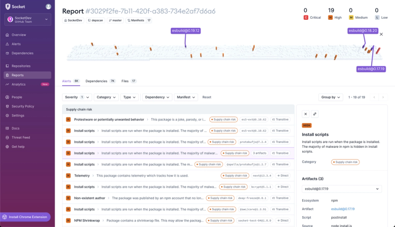
Product
We're introducing dependency visualization for reports - get a quick impression of the state of your dependencies without getting lost in the details.