
Security News
Research
Data Theft Repackaged: A Case Study in Malicious Wrapper Packages on npm
The Socket Research Team breaks down a malicious wrapper package that uses obfuscation to harvest credentials and exfiltrate sensitive data.
@syncfusion/ej2-angular-inputs
Advanced tools
A package of Essential JS 2 input components such as Textbox, Color-picker, Masked-textbox, Numeric-textbox, Slider, Upload, and Form-validator that is used to get input from the users. for Angular
A package of Angular Inputs components. It comes with a collection of form components which is useful to get different input values from the users such as text, numbers, patterns, color and file inputs.
The Angular Inputs package includes the following list of components.
The Angular ColorPicker component is a user interface that is used to select and adjust color values.
Getting Started . Online demos . Learn more
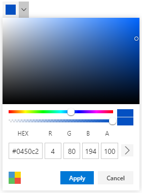
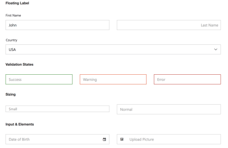
Red Green Blue, Hue Saturation Value and Hex codes.Picker and Palette mode.opacity of the selected color.The Angular TextBox component is an extended version of the HTML input control which is used to edit or display text input on a form.
Getting Started . Online demos . Learn more
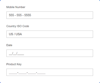
The Angular MaskedTextBox component allows the user to enter the valid input only based on the provided mask.
Getting Started . Online demos . Learn more
The Angular NumericTextBox component is used to get the number inputs from the user. The input values can be incremented or decremented by a predefined step value.
Getting Started . Online demos . Learn more

The Angular Signature component allows user to draw smooth signatures as vector outline of strokes using variable width bezier curve interpolation. It allows to save signature as image.
Getting Started . Online demos . Learn more

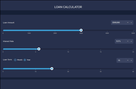
The Angular Slider component allows you to select a value or range of values between the min and max range.
Getting Started . Online demos . Learn more
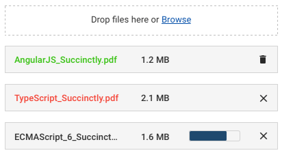
The Angular File Upload component is an extended version of the HTML5 upload control which is used to upload images, documents, and other files to a server.
Getting Started . Online demos . Learn more
The Angular Rating component is used to provide a star rating or view other people’s ratings on a numeric scale for any service provided, such as for movies, applications, or products. It has several built-in features such as support for precision modes, labels, tooltip, and UI customization.
Getting Started . Online demos . Learn more

The Angular OTP Input component is designed to securely enter and verify single-use passwords for multi-factor authentication purposes in various applications, such as banking, e-commerce, or account login processes. It has several built-in features such as support for input types, styling modes, placeholder, seperators, and customization.
Input types - Allow specifying the input type as text, number, or password for the OTP input..Styling modes - Offer built-in styling options such as underline, outline, or fill.Tooltip - Displays additional information of the rating items.Placeholders - Allow setting a hint character for each input field, indicating the expected value.Separators - Specify a character to be placed between input fields.Customization - Allows customizing the default appearance, including input field styling, input length, and more.
Trusted by the world's leading companies

To install inputs and its dependent packages, use the following command.
npm install @syncfusion/ej2-angular-inputs
Inputs components are also offered in following list of frameworks.
 JavaScript |  React |  Vue |  ASP.NET Core |  ASP.NET MVC |
|---|
Product support is available through following mediums.
Check the changelog here. Get minor improvements and bug fixes every week to stay up to date with frequent updates.
This is a commercial product and requires a paid license for possession or use. Syncfusion’s licensed software, including this component, is subject to the terms and conditions of Syncfusion's EULA. To acquire a license for 80+ Angular UI components, you can purchase or start a free 30-day trial.
A free community license is also available for companies and individuals whose organizations have less than $1 million USD in annual gross revenue and five or fewer developers.
See LICENSE FILE for more info.
& Copyright 2024 Syncfusion, Inc. All Rights Reserved. The Syncfusion Essential Studio license and copyright applies to this distribution.
FAQs
A package of Essential JS 2 input components such as Textbox, Color-picker, Masked-textbox, Numeric-textbox, Slider, Upload, and Form-validator that is used to get input from the users. for Angular
The npm package @syncfusion/ej2-angular-inputs receives a total of 18,996 weekly downloads. As such, @syncfusion/ej2-angular-inputs popularity was classified as popular.
We found that @syncfusion/ej2-angular-inputs demonstrated a healthy version release cadence and project activity because the last version was released less than a year ago. It has 0 open source maintainers collaborating on the project.
Did you know?

Socket for GitHub automatically highlights issues in each pull request and monitors the health of all your open source dependencies. Discover the contents of your packages and block harmful activity before you install or update your dependencies.

Security News
Research
The Socket Research Team breaks down a malicious wrapper package that uses obfuscation to harvest credentials and exfiltrate sensitive data.

Research
Security News
Attackers used a malicious npm package typosquatting a popular ESLint plugin to steal sensitive data, execute commands, and exploit developer systems.

Security News
The Ultralytics' PyPI Package was compromised four times in one weekend through GitHub Actions cache poisoning and failure to rotate previously compromised API tokens.