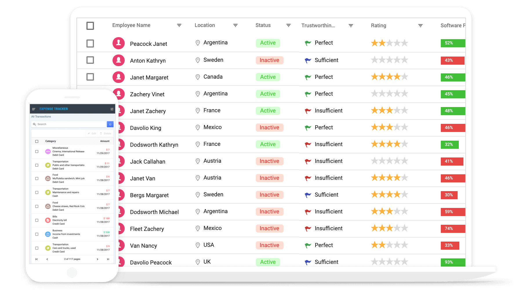
JavaScript Grid Control
The JavaScript Grid control is used to display and manipulate tabular data with configuration options to control the way the data is presented and manipulated. It will pull data from a data source, such as array of JSON objects, OData web services, or DataManager binding data fields to columns. Also displaying a column header to identify the field with support for grouped records.
Getting started
.
Online demos
.
Learn more

Trusted by the world's leading companies

Setup
To install Grid and its dependent packages, use the following command.
npm install @syncfusion/ej2-grids
Adding Grid control
Now, you can start adding the Grid control in the application. For getting started, add a div element for Grid control in index.html. Then refer the index.js file, below EJ2 style and EJ2 script reference into the index.html file.
To render the basic Grid, you can include the HTML code example below in your index.html file.
<!DOCTYPE html>
<html xmlns="http://www.w3.org/1999/xhtml">
<head>
<title>Essential JS 2 Grid</title>
<link rel="stylesheet" href=https://cdn.syncfusion.com/ej2/{{ site.ej2version }}/material.css />
<script src="node_modules/@syncfusion/ej2-base/dist/global/ej2-base.min.js" type="text/javascript"></script>
<script src="node_modules/@syncfusion/ej2-data/dist/global/ej2-data.min.js" type="text/javascript"></script>
<script src="node_modules/@syncfusion/ej2-popups/dist/global/ej2-popups.min.js" type="text/javascript"></script>
<script src="node_modules/@syncfusion/ej2-grids/dist/global/ej2-grids.min.js" type="text/javascript"></script>
<script src="index.js" type="text/javascript" defer></script>
</head>
<body>
<div id="Grid"></div>
</body>
</html>
Basic Grid initialization
you can include the HTML code example below in your index.js file.
let data = [
    {'OrderID': 10248,'CustomerID': 'VINET', 'ShipCountry': 'France'},
    {'OrderID': 10249,'CustomerID': 'TOMSP', 'ShipCountry': 'Germany'},
    {'OrderID': 10250,'CustomerID': 'HANAR', 'ShipCountry': 'Brazil' },
    {'OrderID': 10251,'CustomerID': 'VICTE', 'ShipCountry': 'France'}
]
var grid = new ej.grids.Grid({
    dataSource: data,
    columns: [
                { field: 'OrderID', headerText: 'Order ID'},
                { field: 'CustomerID', headerText: 'Customer ID'},
                { field: 'ShipCountry', headerText: 'Ship Country' }
    ],
});

grid.appendTo('#Grid');
Supported frameworks
Grid control is also offered in following list of frameworks.
Showcase samples
Key features
- Data sources - Bind the Grid control with an array of JSON objects or DataManager.
- Sorting and grouping - Supports n levels of sorting and grouping.
- Filtering - Offers filter UI such as filter bar, menu, excel and checkbox at each column to filter data.
- Paging - Provides the option to easily switch between pages using the pager bar.
- Editing - provides the options for create, read, update, and delete operations.
- Columns - The column definitions are used as the dataSource schema in the Grid. This plays a vital role in rendering column values in the required format.
- Reordering - Allows you to drag any column and drop it at any position in the Grid’s column header row, allowing columns to be repositioned.
- Column chooser - The column chooser provides a list of column names paired with check boxes that allow the visibility to be toggled on the fly.
- Resizing - Resizing allows changing column width on the fly by simply dragging the right corner of the column header.
- Freeze - Columns and rows can be frozen to allow scrolling and comparing cell values.
- Cell spanning - Grid cells can be spanned based on the preferred criteria.
- Foreign data source - This provides the option to show values from external or lookup data sources in a column based on foreign key/value mapping.
- Cell styling - Grid cell styles can be customized either by using CSS or programmatically.
- Selection - Rows or cells can be selected in the grid. One or more rows or cells can also be selected by holding Ctrl or Command, or programmatically.
- Templates - Templates can be used to create custom user experiences in the grid.
- Aggregation - Provides the option to easily visualized the Aggregates for column values.
- Context menu -The context menu provides a list of actions to be performed in the grid. It appears when a cell, header, or the pager is right-clicked.
- Clipboard - Selected rows and cells can be copied from the grid.
- Export to Excel and PDF - Provides the options to Export the grid data to Excel, PDF, and CSV formats.
- RTL support - Provides a full-fledged right-to-left mode which aligns content in the Grid control from right to left.
- Localization - Provides inherent support to localize the UI.
Support
Product support is available through following mediums,
Changelog
Check the changelog here. Get minor improvements and bug fixes every week to stay up to date with frequent updates.
License and copyright
This is a commercial product and requires a paid license for possession or use. Syncfusion’s licensed software, including this component, is subject to the terms and conditions of Syncfusion's EULA. To acquire a license for 80+ JavaScript UI controls, you can purchase or start a free 30-day trial.
A free community license is also available for companies and individuals whose organizations have less than $1 million USD in annual gross revenue and five or fewer developers.
See LICENSE FILE for more info.
© Copyright 2022 Syncfusion, Inc. All Rights Reserved. The Syncfusion Essential Studio license and copyright applies to this distribution.


