Research
Security News
Malicious npm Packages Inject SSH Backdoors via Typosquatted Libraries
Socket’s threat research team has detected six malicious npm packages typosquatting popular libraries to insert SSH backdoors.
@venkatmca/data-table-react
Advanced tools
Welcome to DataTableReact, your ultimate solution for integrating jQuery DataTable-like functionality into React components! With DataTableReact, effortlessly enhance your React applications with dynamic and responsive data tables. Harness a rich array of
Welcome to DataTableReact, your ultimate solution for integrating jQuery DataTable-like functionality into React components! With DataTableReact, effortlessly enhance your React applications with dynamic and responsive data tables. Harness a rich array of customizable options, empowering you to efficiently manage and visualize data within your projects. Seamlessly integrate DataTableReact into your workflow for streamlined data presentation and enhanced user experience.
$ npm install --save @venkatmca/data-table-react
$ yarn add @venkatmca/data-table-react
$ import {
DataTable,
} from "@venkatmca/data-table-react";
import { DataTable } from "@venkatmca/data-table-react";

function App() {
  const title = "Test DataTable";
  const heads = [
    { name: "ID", fieldname: "id" },
    { name: "Name", fieldname: "name" },
  ];
  const data = [
    { id: 1, name: "John" },
    { id: 2, name: "Doe" },
  ];
  return (
    <div>
      <DataTable
        title={title}
        heads={heads}
        data={data}
        currentpage={1}
        itemsperpage={10}
        hasItemsPerPageDropdown={true}
        hasPagination={true}
      />
    </div>
  );
}

Properties used to customise the rendering:
| Name | Type | Description | |
|---|---|---|---|
| title | string | The title for the table | |
| heads | HeadProps | Head text for the table head and field name to fetched from data and display in | |
| data | Array | Data records for the table | |
| currentPage | number | optional Current page in pagination | |
| itemsperpage | number | optional The number of items you want per page default is 10. | |
| hasItemsPerPageDropdown | boolean | optional Items per page change dropdown are displayed when true and not displayed when false. default is true. | |
| hasPagination | boolean | optional Bottom pagination buttons are displayed when true and not displayed when false. default is true. | |
| searchEnabled | boolean | optional Search box are displayed when true and not displayed when false. default is true. |
The same country select properties and additionally
| Name | Type | Description | |
|---|---|---|---|
| name | string | required Title of the table head | |
| fieldname | string | required Which field of object need to be displayed from data array to | |
| view | FC | optional Custom component to display fieldname |
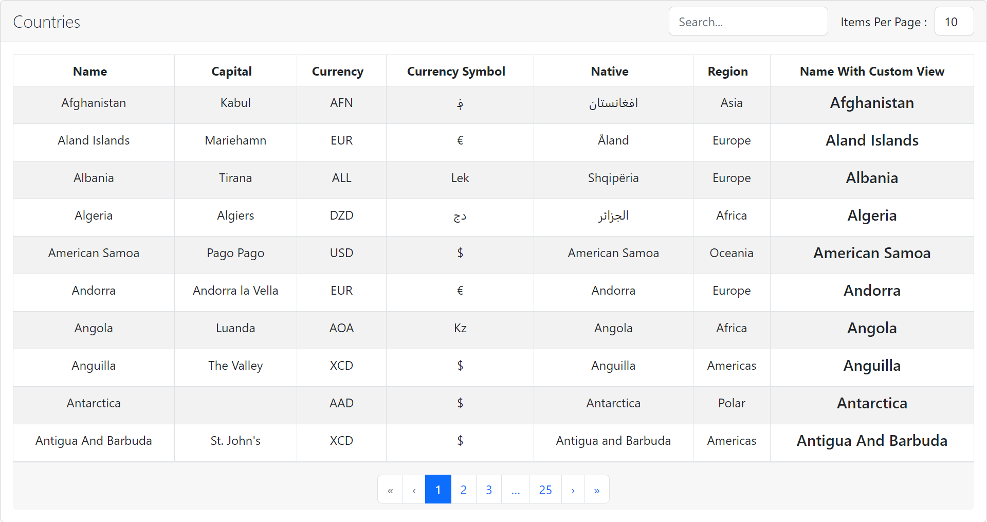
A demo is worth a thousand words
Show your ❤️ and support by giving a ⭐. Any suggestions are welcome! venkatmcajj@gmail.com
Become a financial contributor and help us sustain our community. Contribute
Licensed under MIT
FAQs
Welcome to DataTableReact, your ultimate solution for integrating jQuery DataTable-like functionality into React components! With DataTableReact, effortlessly enhance your React applications with dynamic and responsive data tables. Harness a rich array of
The npm package @venkatmca/data-table-react receives a total of 0 weekly downloads. As such, @venkatmca/data-table-react popularity was classified as not popular.
We found that @venkatmca/data-table-react demonstrated a healthy version release cadence and project activity because the last version was released less than a year ago. It has 1 open source maintainer collaborating on the project.
Did you know?

Socket for GitHub automatically highlights issues in each pull request and monitors the health of all your open source dependencies. Discover the contents of your packages and block harmful activity before you install or update your dependencies.

Research
Security News
Socket’s threat research team has detected six malicious npm packages typosquatting popular libraries to insert SSH backdoors.

Security News
MITRE's 2024 CWE Top 25 highlights critical software vulnerabilities like XSS, SQL Injection, and CSRF, reflecting shifts due to a refined ranking methodology.

Security News
In this segment of the Risky Business podcast, Feross Aboukhadijeh and Patrick Gray discuss the challenges of tracking malware discovered in open source softare.