Company News
Connect with Socket at RSA and BSidesSF 2024
Come meet the Socket team at BSidesSF and RSA! We're sponsoring several fun networking events and we would love to see you there.
avataaars
Advanced tools
Weekly downloads
Readme
The core React component for Avataaars Generator developed by Fang-Pen Lin, based on the Sketch library Avataaars designed by Pablo Stanley.

First, you need to install the avataaars component package, here you run
yarn add avataaars
or
npm install avataaars --save
if you are using npm. Then, in your React app, import the Avataaar component and put it where you like it to be, for example
import * as React from 'react'
import Avatar from 'avataaars'

export default class MyComponent extends React.Component {
  render () {
    return
      <div>
        Your avatar:
        <Avatar
          style={{width: '100px', height: '100px'}}
          avatarStyle='Circle'
          topType='LongHairMiaWallace'
          accessoriesType='Prescription02'
          hairColor='BrownDark'
          facialHairType='Blank'
          clotheType='Hoodie'
          clotheColor='PastelBlue'
          eyeType='Happy'
          eyebrowType='Default'
          mouthType='Smile'
          skinColor='Light'
        />
      </div>
  }
}
To showcase individual pieces of the avatar you can use the Piece component, for example:
import * as React from 'react'
import {Piece} from 'avataaars';

export default class MyComponent extends React.Component {
  render () {
    return
      <div>
        <Piece pieceType="mouth" pieceSize="100" mouthType="Eating"/>
        <Piece pieceType="eyes" pieceSize="100" eyeType="Dizzy"/>
        <Piece pieceType="eyebrows" pieceSize="100" eyebrowType="RaisedExcited"/>
        <Piece pieceType="accessories" pieceSize="100" accessoriesType="Round"/>
        <Piece pieceType="top" pieceSize="100" topType="LongHairFro" hairColor="Red"/>
        <Piece pieceType="facialHair" pieceSize="100" facialHairType="BeardMajestic"/>
        <Piece pieceType="clothe" pieceSize="100" clotheType="Hoodie" clotheColor="Red"/>
        <Piece pieceType="graphics" pieceSize="100" graphicType="Skull" />
        <Piece pieceType="skin" pieceSize="100" skinColor="Brown" />
      </div>
  }
}
To explore avatar options and generate the React code, please use Avataaars Generator
To build your own avatar editor, you may want to use lower level Avatar component along with OptionContext. For more details usage, please reference to source code of avataaars-generator, see how it uses OptionContext to collection available options.
FAQs
React component for avataaars
The npm package avataaars receives a total of 1,126 weekly downloads. As such, avataaars popularity was classified as popular.
We found that avataaars demonstrated a not healthy version release cadence and project activity because the last version was released a year ago. It has 1 open source maintainer collaborating on the project.
Did you know?

Socket for GitHub automatically highlights issues in each pull request and monitors the health of all your open source dependencies. Discover the contents of your packages and block harmful activity before you install or update your dependencies.

Company News
Come meet the Socket team at BSidesSF and RSA! We're sponsoring several fun networking events and we would love to see you there.

Security News
OSI is starting a conversation aimed at removing the excuse of the SaaS loophole for companies navigating licensing and the complexities of doing business with open source.

Product
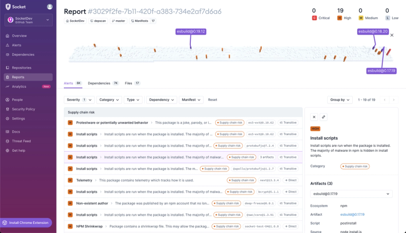
We're introducing dependency visualization for reports - get a quick impression of the state of your dependencies without getting lost in the details.