Security News
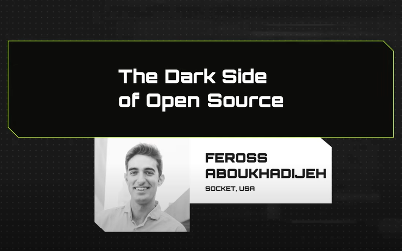
The Dark Side of Open Source
At Node Congress, Socket CEO Feross Aboukhadijeh uncovers the darker aspects of open source, where applications that rely heavily on third-party dependencies can be exploited in supply chain attacks.
nativescript-vue-shadow-ns-7
Advanced tools
Readme
This repo is a port to Nativescript-Vue of @JoshDSommer's NativeScript Angular Shadow Directive project. As such, a good portion of the code is inspired by it, but many changes were made to fit into how Vue does Directives.
From the command prompt go to your app's root folder and execute:
npm install nativescript-vue-shadow-ns-7

This is a Vue directive to make your life easier when it comes to using native shadows with Nativescript-Vue.
Shadows are a very important part of Material design specification. It brings up the concept of elevation, which implies in the natural human way of perceiving objects raising up from the surface.
With this directive, you won't have to worry about all the aspects regarding shadowing on Android and on iOS. On the other hand, if you care about some of the details, you will still be able to provide certain extra attributes and they will superseed the default ones.
However, running this on Android you will require the SDK to be greater or equal than 21 (Android 5.0 Lollipop or later), otherwise shadows will simply not be shown. There should be no problem running this on any version of iOS.
import NSVueShadow from 'nativescript-vue-shadow-ns-7'
Vue.use(NSVueShadow)
Simple attribute for v-shadow:
<Label v-shadow="2"></Label>
You can property bind it in your template tag. This can be a string, number or object ( AndroidData | IOSData ):
<Label v-shadow="myCustomData"></Label>
Then in your script tag you can do something like this where we bind to the object:
import { AndroidData, ShapeEnum } from "nativescript-vue-shadow-ns-7";
// ...
export default class MyComponent extends Vue {
  private myCustomData: AndroidData = {
    elevation: 6,
    bgcolor: "#ff1744",
    shape: ShapeEnum.OVAL
  };
  // ...
}
You can also provide details directly in your markup by using the v-shadow directive with an explicit object ( AndroidData | IOSData ):
<Label v-shadow="{ elevation: elevation, shape: shape.RECTANGLE, bgcolor: '#006968', cornerRadius: 15 }"></Label>
There are a couple of platform specific attributes you might want to use to customize your view. Bear in mind some of them clash with CSS styles applied to the same views. When it happens, the default behaviour on Android is the original HTML/CSS styles are lost in favor of the ones provided by this directive. On iOS, on the other hand, HTML/CSS pre-existent styles are regarded, consequently the shadow might not be applied.
The tip is avoid applying things like background color and border radius to the same view you intend to apply this directive (Note: this is now supported).
The table below list and describes all possible attributes as well as show which platform supports each one of them:
| Attribute | Type | Default | Platform | Description |
|---|---|---|---|---|
| elevation | number | string | both | Determines the elevation of the view from the surface. It does all shadow related calculations. You might want to have a look at this enum of standard material design elevations. FYI, it's calculated in DIPs (or DPs, density independent pixels) on Android, or PTs (points) on iOS. | |
| pressedElevation | number | string | Android | Determines the view's elevation when on pressed state. | |
| shape | string => 'RECTANGLE' | 'OVAL' | 'RING' | 'LINE' | 'RECTANGLE' | Android | Determines the shape of the view and overrides its format styles. |
| bgcolor | string (#RGB) | Android | Determines view's background color and overrides its previous background. If not set, the previous background is used. NOTE: setting the background to transparent is known to cause issues on Android (the shadow may overlap the background) | |
| cornerRadius | number | Android | Determines view's corner radius (CSS border-radius) and overrides its previous style. If this is not set, the view's CSS border-radius are used. FYI, it's calculated in DIPs (or DPs, density independent pixels). | |
| translationZ | number | Android | Determines an extra distance (in DIP) to the surface. | |
| pressedTranslationZ | number | Android | Determines an extra distance (in DIP) to the surface when the view is in the pressed state. | |
| forcePressAnimation | boolean | false | Android | By default, if a view has a StateAnimator, it is overwritten by an animator that raises the View on press. Setting this to true will always define this new animator, essentially making any clickable View work as a button. |
| maskToBounds | boolean | false | iOS | Determines whether the shadow will be limited to the view margins. |
| shadowColor | string (#RGB) | iOS | Determines shadow color. Shadow won't be applied if the view already has background. | |
| shadowOffset | number | iOS | Determines the distance in points (only on Y axis) of the shadow. Negative value shows the shadow above the view. | |
| shadowOpacity | number | iOS | From 0 to 1. Determines the opacity level of the shadow. | |
| shadowRadius | number | iOS | Determines the blurring effect in points of the shadow. The higher the more blurred. | |
| useShadowPath | boolean | true | iOS | Determines whether to use shadowPath to render the shadow. Setting this to false negatively impacts performance. |
| rasterize | boolean | false | iOS | Determines whether the view should be rasterized. Activating this will increase memory usage, as rasterized views are stored in memory, but will massively improve performance. |
If you want to be consistent with the Material Design specification but you're sick of trying to memorize which elevation your view should have. We've put together a list of pre-defined elevations:
If you don't even want to check it out every time you have to shadow an element, just import the Elevation enum and enjoy :)
import { Elevation } from "nativescript-vue-shadow-ns-7";

export default class MyComponent extends Vue {
  // ...
  private elevation: number = Elevation.SNACKBAR;
  // ...
}
Android buttons are split into three categories: floating, raised and flat. Different from labels and other ui elements, each button category has its own state animator. So, when buttons are tapped, Android does affect their elevation (and z translation) in a way that Angular is not notified. At the end of tap animation, buttons get back to resting defaults (i.e. raised button's elevation at 2dp and translationZ at 0) overriding the shadow stablished by this plugin.
This plugin replaces the default StateListAnimator with one that gets back to the values you provide for elevation and translationZ.
Feel free to fill submit a PR if you want the flexibility of defining your own StateListAnimator. The motivation so far was simply put this plugin to work with buttons without changing the original state once they are clicked.
It's also possible to set this StateListAnimator to any View, making it behave like a button.
npm install in base directory of projectnpm installnpm run serve:android or npm run serve:ios. (use debug:android or debug:ios to attach to devtools)MIT License
FAQs
Nativescript-Vue Shadow Plugin
The npm package nativescript-vue-shadow-ns-7 receives a total of 118 weekly downloads. As such, nativescript-vue-shadow-ns-7 popularity was classified as not popular.
We found that nativescript-vue-shadow-ns-7 demonstrated a not healthy version release cadence and project activity because the last version was released a year ago. It has 1 open source maintainer collaborating on the project.
Did you know?

Socket for GitHub automatically highlights issues in each pull request and monitors the health of all your open source dependencies. Discover the contents of your packages and block harmful activity before you install or update your dependencies.

Security News
At Node Congress, Socket CEO Feross Aboukhadijeh uncovers the darker aspects of open source, where applications that rely heavily on third-party dependencies can be exploited in supply chain attacks.

Research
Security News
The Socket Research team found this npm package includes code for collecting sensitive developer information, including your operating system username, Git username, and Git email.

Security News
OpenJS is warning of social engineering takeovers targeting open source projects after receiving a credible attempt on the foundation.