Research
Security News
Malicious npm Packages Inject SSH Backdoors via Typosquatted Libraries
Socket’s threat research team has detected six malicious npm packages typosquatting popular libraries to insert SSH backdoors.
react-element-spinner
Advanced tools
A customizable loading spinner for React that overlays divs and blocks buttons.
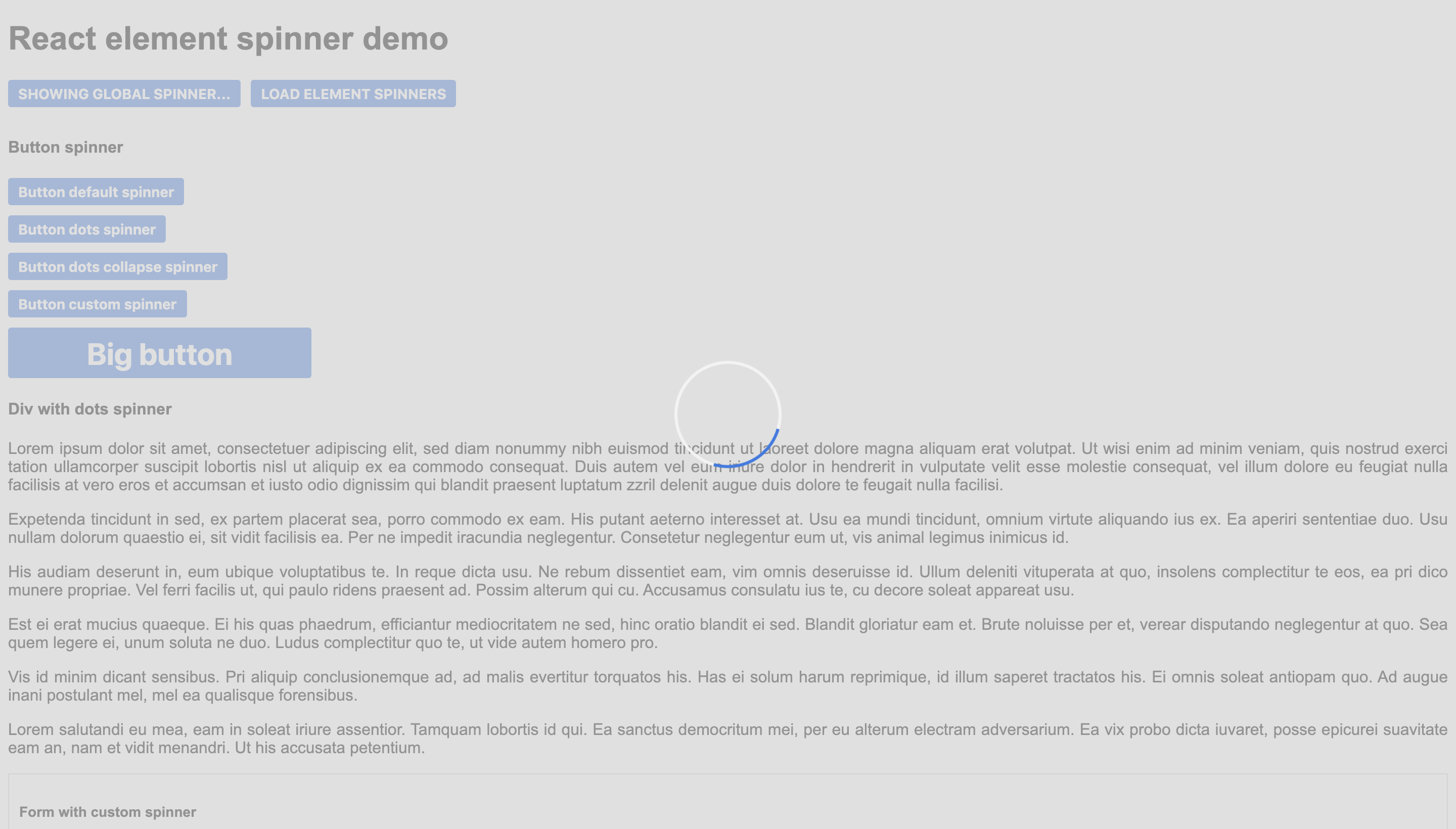
There is a demo with some examples here. The repo with the code is this one.
This code would create a global spinner, it would block all the page.
import { SpinnerComponent } from 'react-element-spinner';
<SpinnerComponent loading={true} position="global" />

This code would create a spinner that blocks the form.
import { SpinnerComponent } from 'react-element-spinner';

<form>
    <SpinnerComponent loading={true} position="centered" />
    <input type="text" name="address"/>
    <button>SAVE</button>
</form>
This code would create a spinner that blocks the button.
import { SpinnerComponent } from 'react-element-spinner';

<button>
  Button
  <SpinnerComponent loading={true} position="inline" color="#498DFF"/>
</button>

| Name | Type | Required | Default | Description |
|---|---|---|---|---|
| loading | boolean | true | - | Whether the spinner has to be shown or not. |
| position | string | true | - | Position of the spinner: "global" for all the page, "centered" to overlay a div and "inline" to be next to the content (for example a button). |
| color | string | false | #3578e5 | Color of the spinner |
| secondaryColor | string | false | #f3f3f3 | Secondary color of the default spinner. |
| backgroundColor | string | false | #d3d3d3 | Color of the background div (only for "centered" and "global"). |
| resize | boolean | false | false | Whether to resize the overlay div or not when dimensions change (only for "centered"). |
| spinnerType | string | false | "default" | Choose one of the three available spinners: "default", "circle-dots" or "circle-dots-collapse". |
| customSpinner | ReactElement | false | undefined | Custom spinner to use instead of the default ones. |
| message | string | false | undefined | Message to show under the spinner. |
The spinner component is easily customizable by overriding its css classes.
| Class | Element |
|---|---|
| loader-container | The main div. |
| loader | The spinner div. |
| background | The background div. |
| span | The message. |
FAQs
An npm package that provides a spinner to block elements.
We found that react-element-spinner demonstrated a not healthy version release cadence and project activity because the last version was released a year ago. It has 1 open source maintainer collaborating on the project.
Did you know?

Socket for GitHub automatically highlights issues in each pull request and monitors the health of all your open source dependencies. Discover the contents of your packages and block harmful activity before you install or update your dependencies.

Research
Security News
Socket’s threat research team has detected six malicious npm packages typosquatting popular libraries to insert SSH backdoors.

Security News
MITRE's 2024 CWE Top 25 highlights critical software vulnerabilities like XSS, SQL Injection, and CSRF, reflecting shifts due to a refined ranking methodology.

Security News
In this segment of the Risky Business podcast, Feross Aboukhadijeh and Patrick Gray discuss the challenges of tracking malware discovered in open source softare.