


About
This is a React-Native TextInput component, containing a floating placeholder, visible even after filled in, that you can freely modify its styles 💅🎉

Instalation
To install just input the following command:
npm i react-native-floating-label-input
or
yarn add react-native-floating-label-input
⚠ Important
- If you are using version 1.3.5 or higher, follow instructions below.
- If not, just install:
npm i react-native-reanimated@1.13.2
or
yarn add react-native-reanimated@1.13.2
Version 1.3.5 or higher - react-native-reanimated v2
-
All animations now are using react-native-reanimated v2, as it was officially released recently. Please follow the Software Mansion guide installation for the react-native-reanimated v2: https://docs.swmansion.com/react-native-reanimated/docs/installation
-
OBS.: if during Software Mansion installation guide your project won't build or builds but crashes on start, try removing node_modules folder.
-
OBS. 2: if you don't want to use the new react-native-reanimated v2, do not upgrade to this version, install version 1.3.4 and react-native-reanimated@1.13.2
Version 1.3.4 or lower - react-native-reanimated v1
- Last stable version of this lib with Software-Mansion react-native-reanimated v1.
Just install by running:
npm i react-native-reanimated@1.13.2
or
yarn add react-native-reanimated@1.13.2
Props
| Prop | Type | Default | Description |
|---|
labelProps | TextProps | undefined | Set props to the label as TextProps |
mask | string | undefined | Set a custom mask to your input |
maskType | 'currency'
'phone'
'date'
'card' | undefined | Set the mask type |
staticLabel | boolean | false | Set this to true if you want the label to be always at a set position. Commonly used with hint for displaying both label and hint for your input. For changing the position of the label with this prop as true, use the customLabelStyles topFocused and leftFocused to adjust the wanted position. |
hint | string | undefined | Hint displayed when label is focused or staticLabel prop is being used |
hintTextColor | string | '#ccc' | Set hint text color |
currency | string | undefined | Set currency on input |
currencyDivider | ','
'.' | ',' | Set currency thousands divider |
maxDecimalPlaces | number | 2 | Set maximum decimal places |
isFocused | boolean | undefined | If you override the onFocus/onBlur props, you must handle this prop as an state variable |
customLabelStyles | Object | leftFocused?: number
leftBlurred?: number
topFocused?: number
topBlurred?: number
fontSizeFocused?: number
fontSizeBlurred?: number
colorFocused?: string
colorBlurred?: string | Custom styles for the floating label |
customShowPasswordImage | image source path | undefined | Set the image source to set your custom show image |
customHidePasswordImage | image source path | undefined | Set the image source to set your custom hide image |
labelStyles | TextStyle | undefined | Set styles to the floating label component |
showPasswordImageStyles | ImageStyle | undefined | Set styles to the default show password component |
showPasswordContainerStyles | ViewStyle | undefined | Set styles to the default show password container component |
containerStyles | ViewStyle | undefined | Set styles to the input container component |
inputStyles | TextStyle | undefined | Set styles to the input component |
isPassword | boolean | false | Set to true if your input is a password |
darkTheme | boolean | false | Change color of the default show/hide password image |
multiline | boolean | false | Set this to true to enable multiline support |
maxLength | number | false | Set maximum number of characters input will accept. Value overridden by mask if present |
showCountdown | boolean | false | Set this to true to show the allowed number of characters remaining |
showCountdownStyles | TextStyle | undefined | Set your styles to the countdown label |
countdownLabel | string | undefined | Set the label to be shown after the allowed number of characters remaining |
customShowPasswordComponent | JSX.Element | undefined | Set your own JSX.Element to be the show password element |
customHidePasswordComponent | JSX.Element | undefined | Set your own JSX.Element to be the hide password element |
rightComponent | JSX.Element | undefined | Add right component to your input. Be aware if using the input as password this component is positioned before the show/hide component |
leftComponent | JSX.Element | undefined | Add left component to your input. Usually used for displaying icon |
togglePassword | boolean | undefined | Prop for force toggling show/hide password. When set to true, shows the password, and when set to false hides it |
animationDuration | number | 300 | The duration of the animation in milliseconds |
togglePassword : boolean
- Prop for force toggling show/hide password. When set to true, shows the password, and when set to false hides it
import React, { useState, useEffect } from 'react';
import { StyleSheet, Text, TouchableOpacity, View } from 'react-native';
import { FloatingLabelInput } from 'react-native-floating-label-input';
export default function App() {
const [cont, setCont] = useState('');
const [show, setShow] = useState(false);
useEffect(() => {
const timeout = setTimeout(() => {
setShow(!show);
}, 5000);
return () => clearTimeout(timeout);
}, [show]);
return (
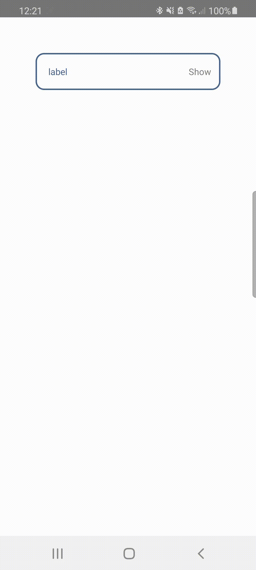
<View style={{ padding: 50, flex: 1, backgroundColor: '#fff' }}>
<FloatingLabelInput
label={'label'}
isPassword
togglePassword={show}
value={cont}
onChangeText={value => setCont(value)}
customShowPasswordComponent={<Text>Show</Text>}
customHidePasswordComponent={<Text>Hide</Text>}
/>
</View>
);
}
const styles = StyleSheet.create({
container: {
flex: 1,
backgroundColor: '#fff',
alignItems: 'center',
justifyContent: 'center',
},
});
staticLabel : boolean
- Set this to true if you want the label to be always at a set position. Commonly used with hint for displaying both label and hint for your input. For changing the position of the label with this prop as true, use the customLabelStyles topFocused and leftFocused to adjust the wanted position. Default false.
hint : string
- Hint displays only when staticLabel prop is set to true. This prop is used to show a preview of the input to the user.
hintTextColor : string
- Set the color to the hint
Example
import React, { useState } from 'react';
import { View } from 'react-native';
import { FloatingLabelInput } from 'react-native-floating-label-input';

const app: React.FC = () => {
  const [phone, setPhone] = useState('');

  return (
    <View style={{ padding: 50, flex: 1, backgroundColor: '#fff' }}>
      <FloatingLabelInput
        label="Phone"
        value={phone}
        staticLabel
        hintTextColor={'#aaa'}
        mask="99 (99) 99999-9999"
        hint="55 (22) 98765-4321"
        containerStyles={{
          borderWidth: 2,
          paddingHorizontal: 10,
          backgroundColor: '#fff',
          borderColor: 'blue',
          borderRadius: 8,
        }}
        customLabelStyles={{
          colorFocused: 'red',
          fontSizeFocused: 12,
        }}
        labelStyles={{
          backgroundColor: '#fff',
          paddingHorizontal: 5,
        }}
        inputStyles={{
          color: 'blue',
          paddingHorizontal: 10,
        }}
        onChangeText={value => {
          setPhone(value);
        }}
      />
    </View>
  );
};
export default app;
setGlobalStyles : Object
import { AppRegistry } from 'react-native';
import App from './App';
import { name as appName } from './app.json';
import './globalStyles';
AppRegistry.registerComponent(appName, () => App);
import { setGlobalStyles } from 'react-native-floating-label-input';
setGlobalStyles.containerStyles = {
backgroundColor: '#eeddee',
};
setGlobalStyles.labelStyles = {
color: '#f98f68',
};
setGlobalStyles.inputStyles = {
color: '#383',
};
Input mask
Props relating mask:
- mask: 'string';
- maskType?: 'currency' | 'phone' | 'date' | 'card';
- currencyDivider: ',' | '.';
-
Currency
Currently the mask will take effect in all maskTypes, except 'currency', wich is made automatically when maskType is set as currency. The reason is because currency is dynamic within the input value. If you want to change the thousands divider to other pattern, just insert the prop currencyDivider with one of: ',' or '.'.
import React, { useState } from 'react';
import { ScrollView } from 'react-native';
import { FloatingLabelInput } from 'react-native-floating-label-input';
const app: React.FC = () => {
const [birthday, setBirthday] = useState('');
const [phone, setPhone] = useState('');
const [price, setPrice] = useState('');
return (
<ScrollView
keyboardShouldPersistTaps="handled"
contentContainerStyle={{
flex: 1,
justifyContent: 'center',
alignItems: 'stretch',
margin: 30,
}}
>
<FloatingLabelInput
label="Birthday"
value={birthday}
mask="99/99/9999"
keyboardType="numeric"
onChangeText={value => setBirthday(value)}
/>
<FloatingLabelInput
label="Phone"
value={phone}
mask="(99)99999-9999"
keyboardType="numeric"
onChangeText={value => setPhone(value)}
/>
<FloatingLabelInput
label="Price"
value={price}
maskType="currency"
currencyDivider="." // which generates: 9.999.999,99 or 0,99 ...
keyboardType="numeric"
onChangeText={value => setPrice(value)}
/>
</ScrollView>
);
};
export default app;
customShowPasswordImage or customHidePasswordImage
- If you want to use the "customShowPasswordImage" prop or "customHidePasswordImage" prop, provide a image path, for example:
import showPassword from '../assets/images/yourImage';
import hidePassword from '../assets/images/yourImage2';
<FloatingLabelInput
label="Password"
value={password}
isPassword={true}
onChangeText={text => setPassword(text)}
customShowPasswordImage={showPassword}
customHidePasswordImage={hidePassword}
/>;
Contributing
Pull requests are welcome. For major changes, please open an issue first to discuss what you would like to change.


