react-native-popover-view


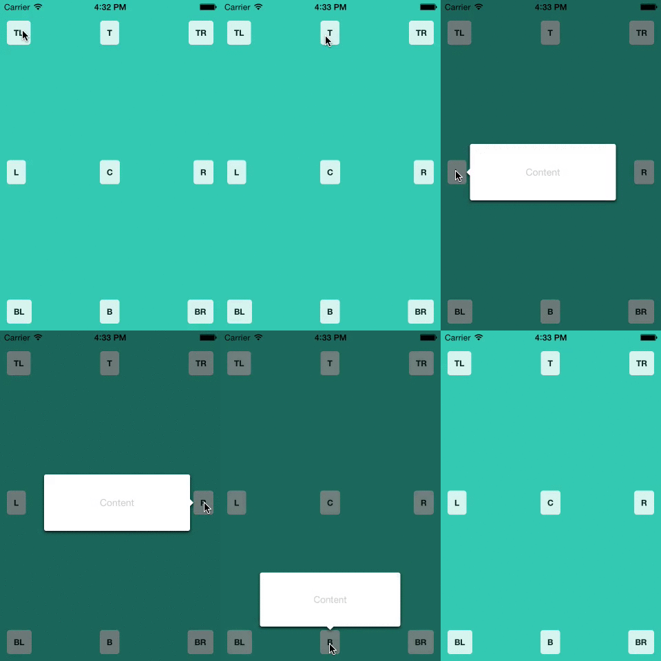
A well-tested, lightweight <Popover> component for react-native. Great for use in Tablets; you can put entire views that you would normally show in a modal (on a smaller device) into a popover, optionally give it an anchor point, and have it float on top of all of the other views.
It is written entirely in JavaScript, but uses React Native's native driver for responsive animations, even when the JS thread is busy.
A Note on Origins
This is a fork of react-native-popover, originally created by Jean Regisser but since abandoned.
Similar forks exist on Github (such as react-native-modal-popover), but this is the first to be published on NPM as far as I know.

Install
npm i --save react-native-popover-view@latest
or
yarn add react-native-popover-view@latest
Usage
import Popover from 'react-native-popover-view'

...
render (
  <Popover
    isVisible={this.state.isVisible} />
    <CustomElement />
  </Popover>
)
Props
| Prop | Type | Optional | Default | Description |
|---|
| isVisible | bool | Yes | false | Show/Hide the popover |
| fromRect | rect | Yes | null | Rectangle at which to anchor the popover. If not provided, the popover will appear in the center of the screen. |
| displayArea | rect | Yes | screen rect | Area where the popover is allowed to be displayed |
| placement | string | Yes | 'auto' | How to position the popover - top | bottom | left | right | auto. When 'auto' is specified, it will determine the ideal placement so that the popover is fully visible within displayArea. |
| onClose | function | Yes | | Callback to be fired when the user taps the popover |
| doneClosingCallback | function | Yes | | Callback to be fired when the popover is finished closing (after animation) |
| showInModal | bool | Yes | true | Whether the Popover should be encapsulated in the view from RN, which allows it to show above all other content, or just be present in the view hierarchy like a normal view. |
| showArrow | bool | Yes | true | Whether the arrow that points to the rect (passing in as fromRect) is shown. If fromRect is null, the arrow will never be shown. |
| showBackground | bool | Yes | true | Whether the background behind the popover darkens when the popover is shown. |
rect is an object with the following properties: {x: number, y: number, width: number, height: number}
Full Example
import React, { Component } from 'react';
import Popover from 'react-native-popover-view;
import {
  AppRegistry,
  StyleSheet,
  Text,
  TouchableHighlight,
  View,
} from 'react-native';

class PopoverExample extends Component {
  this.state = {
    isVisible: false,
    buttonRect: {},
  }

  showPopover() {
    this.refs.button.measure((ox, oy, width, height, px, py) => {
      this.setState({
        isVisible: true,
        buttonRect: {x: px, y: py, width: width, height: height}
      });
    });
  },

  closePopover() {
    this.setState({isVisible: false});
  },

  render() {
    return (
      <View style={styles.container}>
        <TouchableHighlight ref='button' style={styles.button} onPress={this.showPopover}>
          <Text style={styles.buttonText}>Press me</Text>
        </TouchableHighlight>

        <Popover
          isVisible={this.state.isVisible}
          fromRect={this.state.buttonRect}
          onClose={this.closePopover}>
          <Text>I'm the content of this popover!</Text>
        </Popover>
      </View>
    );
  }
});

var styles = StyleSheet.create({
  container: {
    flex: 1,
    alignItems: 'center',
    justifyContent: 'center',
    backgroundColor: 'rgb(43, 186, 180)',
  },
  button: {
    borderRadius: 4,
    padding: 10,
    marginLeft: 10,
    marginRight: 10,
    backgroundColor: '#ccc',
    borderColor: '#333',
    borderWidth: 1,
  },
  buttonText: {
  }
});

AppRegistry.registerComponent('PopoverExample', () => PopoverExample);
Credits
Original codebase created by Jean Regisser jean.regisser@gmail.com (https://github.com/jeanregisser) as react-native-popover, which is now gone stale
The code supporting animations was inspired and adapted from @brentvatne's Transition.js mixin.
MIT Licensed


