react-native-svg-charts


Prerequisites
This library uses react-native-svg
to render its graphs. Therefore this library needs to be installed AND linked into your project to work.
Other than the above dependency this library uses pure javascript and supports both iOS and Android
Motivation
Creating beautiful graphs in React Native shouldn't be hard or require a ton of knowledge.
We use react-native-svg in order to render our SVG's and to provide you with great extensibility.
We utilize the very popular d3 library to create our SVG paths and to calculate the coordinates.
We built this library to be as extensible as possible while still providing you with the most common charts and data visualization tools out of the box.
The Line-, Bar-, Area- and Waterfall -charts can all be extended with "decorators" and "extras".
The renderDecorator prop is called on each passed dataPoint and allows you to simply add things such as points or other decorators to your charts.
The extras and renderExtra prop is used to further decorate your charts with e.g intersections and projections, see the examples for more info.
Feedback and PR's are more than welcome 🙂
Running
If you want to test out the library you can clone this repository and run it.
We suggest that you test out the storybooks that we've implemented.
Most of the charts are implemented with knobs so that you can tweak most properties and see their behavior live.
Clone the repo and run the following:
yarn
(cd ios && pod install)
react-native run-ios
react-native run-android
yarn storybook
Common Props
| Property | Default | Description |
|---|
| dataPoints | required | An array of integers - the data you want plotted, e.g [1,2,3,4]. This prop is different for PieChart and BarChart |
| strokeColor | 'black' | color of the stroke |
| strokeWidth | 1 | width of the stroke |
| fillColor | 'none' | color of the fill |
| dashArray | [ 5, 5 ] | see this but pass in as array |
| renderGradient | () => {} | function that renders the gradient. Example |
| animate | true | PropTypes.bool |
| animationDuration | 300 | PropTypes.number |
| style | undefined | Supports all ViewStyleProps |
| curve | d3.curveCardinal | A function like this |
| contentInset | { top: 0, left: 0, right: 0, bottom: 0 } | An object that specifies how much fake "margin" to use inside of the SVG canvas. This is particularly helpful on Android where overflow: "visible" isn't supported and might cause clipping. Note: important to have same contentInset on axis's and chart |
| numberOfTicks | 10 | We use d3-array to evenly distribute the grid and dataPoints on the yAxis. This prop specifies how many "ticks" we should try to render. Note: important that this prop is the same on both the chart and on the yAxis |
| showGrid | true | Whether or not to show the grid lines |
| gridMin | undefined | Normally the graph tries to draw from edge to edge within the view bounds. Using this prop will allow the grid to reach further than the actual dataPoints. Example |
| gridMax | undefined | The same as "gridMin" but will instead increase the grids maximum value |
| gridProps | {} | An object of props that are passed to the Line component that renders the grid |
| extras | undefined | An array of whatever data you want to render. Each item in the array will call renderExtra. See example |
| renderExtra | () => {} | Similar to the renderItem of a FlatList. This function will be called for each item in the extras array and pass an object as an argument. The argument object is of the shape {x: function, y: function, item: item of extras}. See example |
| renderDecorator | () => {} | Called once for each entry in dataPoints and expects a component. Use this prop to render e.g points (circles) on each data point. See example |
Components
This library currently provides the following components
Also see other examples
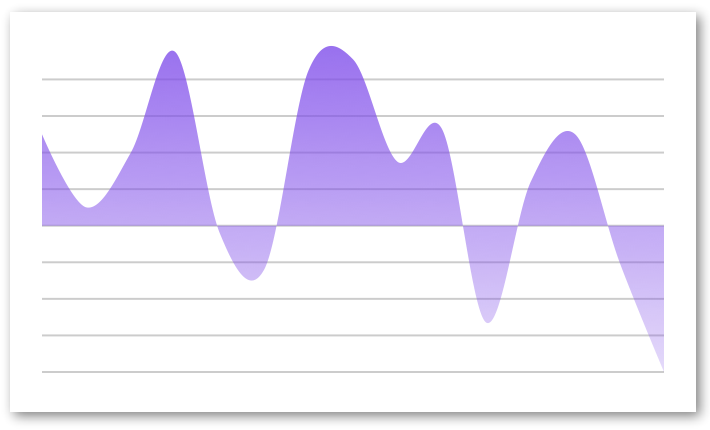
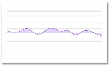
AreaChart
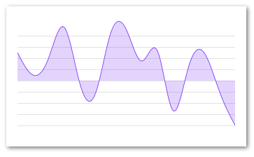
Example
import React from 'react'
import { AreaChart } from 'react-native-svg-charts'
import * as shape from 'd3-shape'

class AreaChartExample extends React.PureComponent {

    render() {

            const data = [ 50, 10, 40, 95, -4, -24, 85, 91, 35, 53, -53, 24, 50, -20, -80 ]

            return (
                <AreaChart
                    style={ { height: 200 } }
                    dataPoints={ data }
                    fillColor={ 'rgba(134, 65, 244, 0.2)' }
                    strokeColor={ 'rgb(134, 65, 244)' }
                    contentInset={ { top: 30, bottom: 30 } }
                    curve={shape.curveNatural}
                />
            )
        }

}
Props
See Common Props
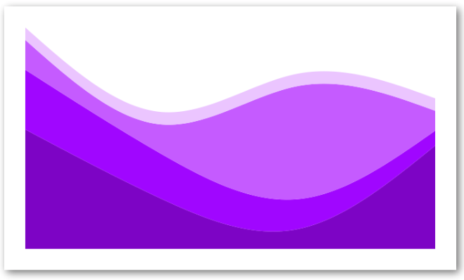
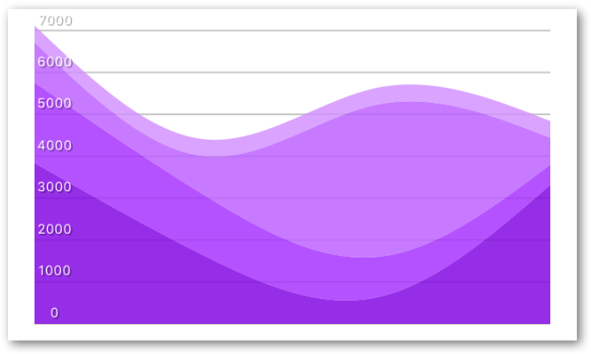
StackedAreaChart
Very similar to an area chart but with multiple sets of data stacked together. Notice that the dataPoints prop has changed to data and have a different signature.
We suggest that you read up on d3 stacks in order to better understand this chart and its props
See Area stack chart with Y axis to see how to use a YAxis with this component
Example
import React from 'react'
import { StackedAreaChart } from 'react-native-svg-charts'
import * as shape from 'd3-shape'

class StackedAreaExample extends React.PureComponent {

    render() {

        const data = [
            {
                month: new Date(2015, 0, 1),
                apples: 3840,
                bananas: 1920,
                cherries: 960,
                dates: 400,
            },
            {
                month: new Date(2015, 1, 1),
                apples: 1600,
                bananas: 1440,
                cherries: 960,
                dates: 400,
            },
            {
                month: new Date(2015, 2, 1),
                apples: 640,
                bananas: 960,
                cherries: 3640,
                dates: 400,
            },
            {
                month: new Date(2015, 3, 1),
                apples: 3320,
                bananas: 480,
                cherries: 640,
                dates: 400,
            },
        ]

        const colors = [ '#8800cc', '#aa00ff', '#cc66ff', '#eeccff' ]
        const keys   = [ 'apples', 'bananas', 'cherries', 'dates' ]

        return (
            <AreaStackChart
                style={ { height: 200, paddingVertical: 16 } }
                data={ data }
                keys={ keys }
                colors={ colors }
                curve={ shape.curveNatural }
                showGrid={ false }
            />
        )
    }
}

export default StackedAreaExample
Props
| Property | Default | Description |
|---|
| data | required | An array of the data entries |
| keys | required | This array should contain the object keys of interest (see above example) |
| colors | required | An array of equal size as keys with the color for each key |
| order | d3.stackOrderNone | The order in which to sort the areas |
| offset | d3.stackOffsetNone | A function to determine the offset of the areas |
Also see Common Props
BarChart
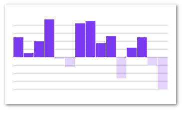
Example (single set data)
import React from 'react'
import { BarChart } from 'react-native-svg-charts'

class BarChartExample extends React.PureComponent {

    render() {

        const data    = [ 50, 10, 40, 95, -4, -24, 85, 91, 35, 53, -53, 24, 50, -20, -80 ]
        const barData = [
            {
                values: data,
                fillColor: 'rgb(134, 65, 244)',
                fillColorNegative: 'rgba(134, 65, 244, 0.2)',
            },
        ]

        return (
            <BarChart
                style={ { height: 200 } }
                data={ barData }
                contentInset={ { top: 30, bottom: 30 } }
            />
        )
    }

}
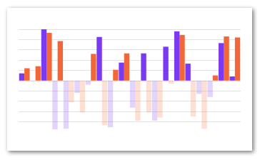
Example (multiple set data - grouped)
import React from 'react'
import { BarChart } from 'react-native-svg'

class GroupedBarChartExample extends React.PureComponent {

    render() {

        const data1 = [ 14, -1, 100, -95, -94, -24, -8, 85, -91, 35, -53, 53, -78, 66, 96, 33, -26, -32, 73, 8 ]
        const data2 = [ 24, 28, 93, 77, -42, -62, 52, -87, 21, 53, -78, -62, -72, -6, 89, -70, -94, 10, 86, 84 ]

        const barData = [
            {
                values: data1,
                fillColor: 'rgb(134, 65, 244)',
                fillColorNegative: 'rgba(134, 65, 244, 0.2)',
            },
            {
                values: data2,
                fillColor: 'rgb(244, 115, 65)',
                fillColorNegative: 'rgb(244, 115, 65, 0.2)',
            },
        ]

        return (
            <BarChart
                style={ { height: 200 } }
                data={ barData }
                contentInset={ { top: 30, bottom: 30 } }
            />
        )
    }

}
Props
Also see Common Props
| Property | Default | Description |
|---|
| data | required | Slightly different than other charts since we allow for grouping of bars. This array should contain at least one object with the following shape {fillColor: 'string', fillColorNegative: 'string', strokeColorPositive: 'string', strokeColorNegative: '', values: []} |
| spacing | 0.05 | Spacing between the bars (or groups of bars). Percentage of one bars width. Default = 5% of bar width |
| contentInset | { top: 0, left: 0, right: 0, bottom: 0 } | PropTypes.shape |
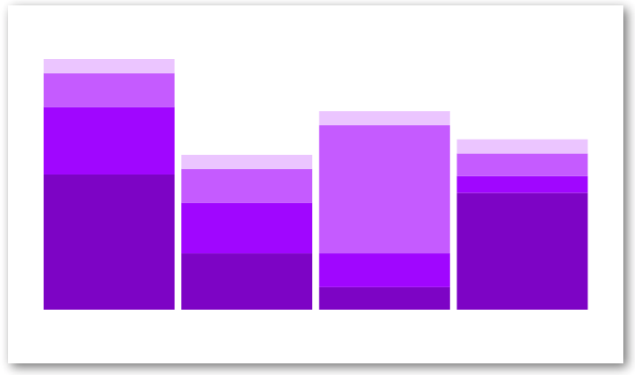
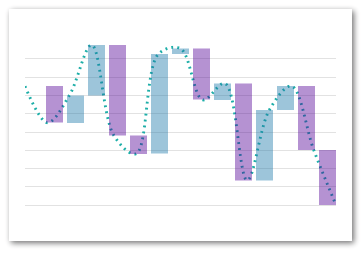
StackedBarChart
The same as the StackedAreaChart except with bars.
We suggest that you read up on d3 stacks in order to better understand this chart and its props
Example
import React from 'react'
import { StackedBarChart } from 'react-native-svg-charts'

class StackedBarChartExample extends React.PureComponent {

    render() {

        const data = [
            {
                month: new Date(2015, 0, 1),
                apples: 3840,
                bananas: 1920,
                cherries: 960,
                dates: 400,
                oranges: 400,
            },
            {
                month: new Date(2015, 1, 1),
                apples: 1600,
                bananas: 1440,
                cherries: 960,
                dates: 400,
            },
            {
                month: new Date(2015, 2, 1),
                apples: 640,
                bananas: 960,
                cherries: 3640,
                dates: 400,
            },
            {
                month: new Date(2015, 3, 1),
                apples: 3320,
                bananas: 480,
                cherries: 640,
                dates: 400,
            },
        ]

        const colors = [ '#7b4173', '#a55194', '#ce6dbd', '#de9ed6' ]
        const keys   = [ 'apples', 'bananas', 'cherries', 'dates' ]

        return (
            <StackedBarChart
                style={ { height: 200 } }
                keys={ keys }
                colors={ colors }
                data={ data }
                showGrid={ false }
                contentInset={ { top: 30, bottom: 30 } }
            />
        )
    }

}

export default StackedBarChartExample
Props
| Property | Default | Description |
|---|
| data | required | An array of the data entries |
| keys | required | This array should contain the object keys of interest (see above example) |
| colors | required | An array of equal size as keys with the color for each key |
| order | d3.stackOrderNone | The order in which to sort the areas |
| offset | d3.stackOffsetNone | A function to determine the offset of the areas |
Also see Common Props
LineChart
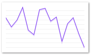
Example
import React from 'react'
import { LineChart } from 'react-native-svg-charts'
import * as shape from 'd3-shape'

class LineChartExample extends React.PureComponent {

    render() {

        const data = [ 50, 10, 40, 95, -4, -24, 85, 91, 35, 53, -53, 24, 50, -20, -80 ]

        return (
            <LineChart
                style={ { height: 200 } }
                dataPoints={ data }
                fillColor={ 'purple' }
                strokeColor={ 'rgb(134, 65, 244)' }
                shadowColor={ 'rgba(134, 65, 244, 0.2)' }
                contentInset={ { top: 20, bottom: 20 } }
                curve={shape.curveLinear}
            />
        )
    }

}
Props
See Common Props
PieChart
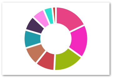
Example
import React from 'react'
import { PieChart } from 'react-native-svg-charts'

class PieChartExample extends React.PureComponent {

    render() {

        const data = [ 50, 10, 40, 95, -4, -24, 85, 91, 35, 53, -53, 24, 50, -20, -80 ]

        const randomColor = () => ('#' + (Math.random() * 0xFFFFFF << 0).toString(16) + '000000').slice(0, 7)

        const pieData = data
            .filter(value => value > 0)
            .map((value, index) => ({
                value,
                color: randomColor(),
                key: `pie-${index}`,
            }))

        return (
            <PieChart
                style={ { height: 200 } }
                dataPoints={ pieData }
            />
        )
    }

}
Props
| Property | Default | Description |
|---|
| data | required | Slightly different than dataPoints because we allow for custom coloring of slices. The array should contain objects of the following shape: `{key: 'string |
| outerRadius | "100%" | The outer radius, use this to tweak how close your pie is to the edge of it's container. Takes either percentages or absolute numbers (pixels) |
| innerRadius | "50%" | The inner radius, use this to create a donut. Takes either percentages or absolute numbers (pixels) |
| labelRadius | undefined | The radius of the circle that will help you layout your labels. Takes either percentages or absolute numbers (pixels) |
| padAngle | | The angle between the slices |
| renderDecorator | () => {} | PropTypes.func |
| sort | (a,b) => b.value - a.value | Like any normal sort function it expects either 0, a positive or negative return value. The arguments are each an object from the dataPoints array |
ProgressCircle
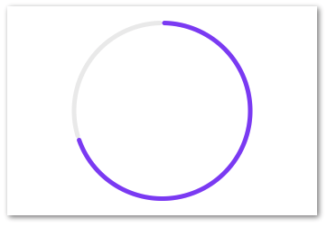
Example
import React from 'react'
import { ProgressCircle }  from 'react-native-svg-charts'

class ProgressCircleExample extends React.PureComponent {

    render() {

        return (
            <ProgressCircle
                style={ { height: 200 } }
                progress={ 0.7 }
                progressColor={'rgb(134, 65, 244)'}
            />
        )
    }

}
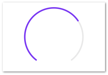
Example (Gauge variant)
import React from 'react'
import { ProgressCircle } from 'react-native-svg-charts'

class ProgressGaugeExample extends React.PureComponent {

    render() {

        return (
            <ProgressCircle
                style={ { height: 200 } }
                progress={ 0.7 }
                progressColor={ 'rgb(134, 65, 244)' }
                startAngle={ -Math.PI * 0.8 }
                endAngle={ Math.PI * 0.8 }
            />
        )
    }

}
Props
| Property | Default | Description |
|---|
| progress | required | PropTypes.number.isRequired |
| progressColor | 'black' | PropTypes.any |
| startAngle | 0 | PropTypes.number |
| endAngle | Math.PI * 2 | PropTypes.number |
WaterfallChart
Example
import React from 'react'
import { WaterfallChart } from 'react-native-svg-charts'
import * as shape from 'd3-shape'

class WaterfallChartExample extends React.PureComponent {

    render() {

        const data = [ 50, 10, 40, 95, -4, -24, 85, 91, 35, 53, -53, 24, 50, -20, -80 ]

        return (
            <WaterfallChart
                style={ { height: 200 } }
                dataPoints={ data }
                contentInset={ { top: 20, bottom: 20 } }
                dashArray={ [ 2, 4 ] }
                spacing={ 0.2 }
                curve={ shape.curveCatmullRom }
            />
        )
    }

}
Props
See Common Props
YAxis
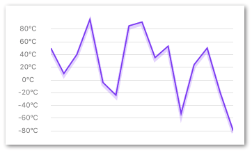
A helper component to layout your Y-axis labels on the same coordinates as your chart.
It's very important that the component has the exact same view bounds (preferably wrapped in the same parent view) as the chart it's supposed to match.
If the chart has property contentInset set it's very important that the YAxis has the same vertical contentInset.
Example
import React from 'react'
import { LineChart, YAxis } from 'react-native-svg-charts'
import * as shape from 'd3-shape'
import YAxis from '../y-axis'
import { View } from 'react-native'

class YAxisExample extends React.PureComponent {

    render() {

        const data = [ 50, 10, 40, 95, -4, -24, 85, 91, 35, 53, -53, 24, 50, -20, -80 ]

        const contentInset = { top: 20, bottom: 20 }

        return (
            <View style={ { height: 200, flexDirection: 'row' } }>
                <YAxis
                    dataPoints={ data }
                    contentInset={ contentInset }
                    labelStyle={ { color: 'grey' } }
                    formatLabel={ value => `${value}ºC` }
                />
                <LineChart
                    style={ { flex: 1, marginLeft: 16 } }
                    dataPoints={ data }
                    fillColor={ 'purple' }
                    strokeColor={ 'rgb(134, 65, 244)' }
                    shadowColor={ 'rgba(134, 65, 244, 0.2)' }
                    contentInset={ contentInset }
                    curve={ shape.curveLinear }
                />
            </View>
        )
    }

}
Props
(see Common Props)
| Property | Default | Description |
|---|
| labelStyle | undefined | Supports all TextStyleProps |
| formatLabel | value => {} | A utility function to format the text before it is displayed, e.g `value => "$" + value |
| contentInset | { top: 0, bottom: 0 } | Used to sync layout with chart (if same prop used there) |
XAxis
A helper component to layout your X-axis labels on the same coordinates as your chart.
It's very important that the component has the exact same view bounds (preferably wrapped in the same parent view) as the chart it's supposed to match.
If the chart has property contentInset set it's very important that the YAxis has the same horizontal contentInset.
The XAxis has a special property chartType that should match the type of the chart in order to layout the labels correctly
Example
import React from 'react'
import { BarChart, XAxis } from 'react-native-svg-charts'
import { View } from 'react-native'

class XAxisExample extends React.PureComponent {

    render() {

        const data    = [ 14, -1, 100, -95, -94, -24, -8, 85, -91, 35, -53, 53, -78, 66, 96, 33, -26, -32, 73, 8 ]
        const barData = [
            {
                values: data,
                fillColor: 'rgb(134, 65, 244)',
                fillColorNegative: 'rgba(134, 65, 244, 0.2)',
            },
        ]

        return (
            <View style={ { height: 200 } }>
                <BarChart
                    style={ { flex: 1 } }
                    data={ barData }
                />
                <XAxis
                    style={ { paddingVertical: 16 } }
                    values={ data }
                    formatLabel={ (value, index) => index }
                    chartType={ XAxis.Type.BAR }
                    labelStyle={ { color: 'grey' } }
                />
            </View>
        )
    }
}
Props
| Property | Default | Description |
|---|
| values | required | An array of values to render on the xAxis. Should preferably have the same length as the chart's dataPoints. |
| chartType | XAxis.Type.LINE | Should state what chart type it is rendered next to. Important because of slightly different calculations. One of [ XAxis.Type.LINE, XAxis.Type.BAR ] |
| spacing | 0.05 | Only applicable if chartType=XAxis.Type.BAR and should then be equal to spacing prop on the actual BarChart. |
| labelStyle | undefined | Supports all TextStyleProps |
| formatLabel | (value, index) => index} | A utility function to format the text before it is displayed, e.g `value => "day" + value |
| contentInset | { left: 0, right: 0 } | Used to sync layout with chart (if same prop used there) |
Other Examples
Gradient
import React from 'react'
import { AreaChart } from 'react-native-svg-charts'
import { LinearGradient, Stop } from 'react-native-svg'

class GradientExample extends React.PureComponent {

    render() {

        const data = [ 50, 10, 40, 95, -4, -24, 85, 91, 35, 53, -53, 24, 50, -20, -80 ]

        return (
            <AreaChart
                style={ { height: 200 } }
                dataPoints={ data }
                contentInset={ { top: 20, bottom: 20 } }
                renderGradient={ ({ id }) => (
                    <LinearGradient id={ id } x1={ '0%' } y={ '0%' } x2={ '0%' } y2={ '100%' }>
                        <Stop offset={ '0%' } stopColor={ 'rgb(134, 65, 244)' } stopOpacity={ 0.8 }/>
                        <Stop offset={ '100%' } stopColor={ 'rgb(134, 65, 244)' } stopOpacity={ 0.2 }/>
                    </LinearGradient>
                ) }
            />
        )
    }

}
Gradient Advanced
This example is made to show you how flexible and powerful the renderGradient/Decorator/Extras pattern is. Your imagination sets the limits in this case
import React from 'react'
import { AreaChart } from 'react-native-svg-charts'
import { LinearGradient, Stop } from 'react-native-svg'
import { StyleSheet, View } from 'react-native'

class GradientAdvancedExample extends React.PureComponent {

    render() {

        const data = [ 50, 10, 40, 95, -4, -24, 85, 91, 35, 53, -53, 24, 50, -20, -80 ]

        const cut = 0.5
        const cutBuffer = 0.001

        return (
            <View>
                <AreaChart
                    style={ { height: 200 } }
                    dataPoints={ data }
                    contentInset={ { top: 20, bottom: 20 } }
                    renderGradient={ ({ id }) => (
                        <LinearGradient id={ id } x1={ '0%' } y1={ '0%' } x2={ '0%' } y2={ '100%' }>
                            <Stop offset={ '0%' } stopColor={ 'rgb(134, 65, 244)' } stopOpacity={ 0.8 }/>
                            <Stop offset={ '100%' } stopColor={ 'rgb(134, 65, 244)' } stopOpacity={ 0.2 }/>
                        </LinearGradient>
                    ) }
                />
                <AreaChart
                    style={ StyleSheet.absoluteFill }
                    dataPoints={ data }
                    contentInset={ { top: 20, bottom: 20 } }
                    renderGradient={ ({ id }) => (
                        <LinearGradient id={ id } x1={ '0%' } y1={ '0%' } x2={ '100%' } y2={ '0%' }>
                            <Stop offset={ '0' } stopColor={ 'transparent' } stopOpacity={ 0 }/>
                            <Stop offset={ `${cut}` } stopColor={ 'transparent' } stopOpacity={ 0 }/>
                            <Stop offset={ `${cut + cutBuffer}` } stopColor={ 'white' } stopOpacity={ 0.6 }/>
                            <Stop offset={ '1' } stopColor={ 'white' } stopOpacity={ 0.6 }/>
                        </LinearGradient>
                    ) }
                />
            </View>
        )
    }

}

export default GradientAdvancedExample
Decorator
The renderDecorator prop allow for decorations on each of the provided data points. The renderDecorator is very similar to the renderItem of a FlatList
and is a function that is called with an object as an arguments to help the layout of the extra decorator. The content of the argument object is as follows:
{
value: number,
index: number,
x: function,
y: function,
}
Remember that all components returned by renderDecorator must be one that is renderable by the <Svg/> element, i.e all components supported by react-native-svg
import React from 'react'
import { AreaChart } from 'react-native-svg-charts'
import { Circle } from 'react-native-svg'

class DecoratorExample extends React.PureComponent {

    render() {

        const data = [ 50, 10, 40, 95, -4, -24, 85, 91, 35, 53, -53, 24, 50, -20, -80 ]

        return (
            <AreaChart
                style={ { height: 200 } }
                dataPoints={ data }
                fillColor={ 'rgba(134, 65, 244, 0.2)' }
                strokeColor={ 'rgb(134, 65, 244)' }
                contentInset={ { top: 20, bottom: 30 } }
                renderDecorator={ ({ x, y, index, value }) => (
                    <Circle
                        key={ index }
                        cx={ x(index) }
                        cy={ y(value) }
                        r={ 4 }
                        stroke={ 'rgb(134, 65, 244)' }
                        fill={ 'white' }
                    />
                ) }
            />
        )
    }

}
The extras prop allow for arbitrary decorators on your chart. The prop takes an array of arbitrary data and then calls renderExtra for each entry in that array.
The renderExtra is very similar to the renderItem of a FlatList
and is a function that is called with an object as an arguments to help the layout of the extra decorator. The content of the argument object is as follows:
{
item: any,
x: function,
y: function,
index: number,
}
Remember that all components returned by renderExtra must be one that is renderable by the <Svg/> element, i.e all components supported by react-native-svg
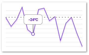
Example
import React from 'react'
import { LineChart } from 'react-native-svg-charts'
import { Circle } from 'react-native-svg'
import * as shape from 'd3-shape'
import { Circle, G, Line, Rect, Text } from 'react-native-svg'
class ExtrasExample extends React.PureComponent {
render() {
const data = [ 50, 10, 40, 95, -4, -24, 85, 91, 35, 53, -53, 24, 50, -20, -80 ]
const HorizontalLine = (({ y }) => (
<Line
key={ 'zero-axis' }
x1={ '0%' }
x2={ '100%' }
y1={ y(50) }
y2={ y(50) }
stroke={ 'grey' }
strokeDasharray={ [ 4, 8 ] }
strokeWidth={ 2 }
/>
))
const Tooltip = ({ x, y }) => (
<G
x={ x(5) - (75 / 2) }
key={ 'tooltip' }
onPress={ () => console.log('tooltip clicked') }
>
<G y={ 50 }>
<Rect
height={ 40 }
width={ 75 }
stroke={ 'grey' }
fill={ 'white' }
ry={ 10 }
rx={ 10 }
/>
<Text
x={ 75 / 2 }
textAnchor={ 'middle' }
y={ 10 }
stroke={ 'rgb(134, 65, 244)' }
>
{ `${data[5]}ºC` }
</Text>
</G>
<G x={ 75 / 2 }>
<Line
y1={ 50 + 40 }
y2={ y(data[ 5 ]) }
stroke={ 'grey' }
strokeWidth={ 2 }
/>
<Circle
cy={ y(data[ 5 ]) }
r={ 6 }
stroke={ 'rgb(134, 65, 244)' }
strokeWidth={2}
fill={ 'white' }
/>
</G>
</G>
)
return (
<LineChart
style={ { height: 200 } }
dataPoints={ data }
fillColor={ 'purple' }
strokeColor={ 'rgb(134, 65, 244)' }
shadowColor={ 'rgba(134, 65, 244, 0.2)' }
contentInset={ { top: 20, bottom: 20 } }
curve={ shape.curveLinear }
extras={ [ HorizontalLine, Tooltip ] }
renderExtra={ ({ item, ...args }) => item(args) }
/>
)
}
}
gridMin/Max
Charts normally render edge to edge, if this is not the wanted behaviour it can easily be altered with the gridMin and gridMax props. Just compare the below example with the example for the regular AreaChart
Example
import React from 'react'
import { AreaChart } from 'react-native-svg-charts'
import * as shape from 'd3-shape'

class GridMinMaxExample extends React.PureComponent {

    render() {

        const data = [ 50, 10, 40, 95, -4, -24, 85, 91, 35, 53, -53, 24, 50, -20, -80 ]

        return (
            <AreaChart
                style={ { height: 200 } }
                dataPoints={ data }
                fillColor={ 'rgba(134, 65, 244, 0.2)' }
                strokeColor={ 'rgb(134, 65, 244)' }
                contentInset={ { top: 30, bottom: 30 } }
                curve={shape.curveNatural}
                gridMax={500}
                gridMin={-500}
            />
        )
    }
}
StackedAreaChart with YAxis
Since the <StackedAreaChart> uses a different data structure and can be affected by both the order and offset prop it's not obvious how to extra the dataPoints for the YAxis.
The remedy this the AreaStackChart exposes a static API with a function extractDataPoints where you must pass in the same data, keys ( as well as order and offset if other than default is used) as the props to the component itself
import React from 'react'
import { AreaStackChart, YAxis } from 'react-native-svg-charts'
import * as shape from 'd3-shape'
import { View } from 'react-native'

class AreaStackWithAxisExample extends React.PureComponent {

    render() {

        const data = [
            {
                month: new Date(2015, 0, 1),
                apples: 3840,
                bananas: 1920,
                cherries: 960,
                dates: 400,
            },
            {
                month: new Date(2015, 1, 1),
                apples: 1600,
                bananas: 1440,
                cherries: 960,
                dates: 400,
            },
            {
                month: new Date(2015, 2, 1),
                apples: 640,
                bananas: 960,
                cherries: 3640,
                dates: 400,
            },
            {
                month: new Date(2015, 3, 1),
                apples: 3320,
                bananas: 480,
                cherries: 640,
                dates: 400,
            },
        ]

        const colors = [ 'rgb(138, 0, 230, 0.8)', 'rgb(173, 51, 255, 0.8)', 'rgb(194, 102, 255, 0.8)', 'rgb(214, 153, 255, 0.8)' ]
        const keys   = [ 'apples', 'bananas', 'cherries', 'dates' ]

        return (
            <View style={ { flexDirection: 'row', height: 200 } }>
                <AreaStackChart
                    style={ { flex: 1 } }
                    contentInset={ { top: 10, bottom: 10 } }
                    data={ data }
                    keys={ keys }
                    colors={ colors }
                    curve={ shape.curveNatural }
                />
                <YAxis
                    style={ { position: 'absolute', top: 0, bottom: 0, transform: [ { translateY: -5 } ] } }
                    dataPoints={ AreaStackChart.extractDataPoints(data, keys) }
                    contentInset={ { top: 10, bottom: 10 } }
                    labelStyle={ {
                        fontSize: 8,
                        color: 'white',
                        textShadowOffset: { width: 1, height: 1 },
                        textShadowColor: 'rgba(0,0,0,0.3)',
                    } }
                />
            </View>
        )
    }
}

export default AreaStackWithAxisExample
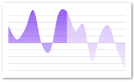
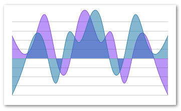
Layered Charts
This library supports layering/composing out of the box with simple styling. As long as the layered charts share the same container and are correctly positioned everything will work as expected.
If your data sets don't share the same max/min data make sure to utilize the gridMin/gridMax prop to align the charts.
Example
import React from 'react'
import { AreaChart } from 'react-native-svg-charts'
import * as shape from 'd3-shape'
import { StyleSheet, View } from 'react-native'

class StackedChartsExample extends React.PureComponent {

    render() {

            const data  = [ 50, 10, 40, 95, -4, -24, 85, 91, 35, 53, -53, 24, 50, -20, -80 ]
            const data2 = [ 50, 10, 40, 95, -4, -24, 85, 91, 35, 53, -53, 24, 50, -20, -80 ].reverse()

            return (
                <View style={ { height: 200 } }>
                    <AreaChart
                        style={ { flex: 1 } }
                        dataPoints={ data }
                        fillColor={ 'rgba(134, 65, 244, 0.5)' }
                        strokeColor={ 'rgb(134, 65, 244)' }
                        contentInset={ { top: 20, bottom: 20 } }
                        curve={ shape.curveNatural }
                    />
                    <AreaChart
                        style={ StyleSheet.absoluteFill }
                        dataPoints={ data2 }
                        fillColor={ 'rgba(34, 128, 176, 0.5)' }
                        strokeColor={ 'rgb(34, 128, 176)' }
                        contentInset={ { top: 20, bottom: 20 } }
                        curve={ shape.curveNatural }
                    />
                </View>
            )
        }

}
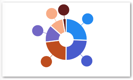
PieChart with labels
The PieChart as well as most of the charts support decorators.
In the case of the PieChart you get pieCentroid and labelCentroid instead of the x and y as arguments in the renderDecorator callback.
This will allow you to render labels aligned with your pie slices. Experiment with outerRadius and labelRadius to layout your labels in relation to your chart
Example
import React from 'react'
import PieChart from 'react-native-svg-charts'
import { Circle, G, Line } from 'react-native-svg'

class PieChartWithLabelExample extends React.PureComponent {

    render() {

        const data = [ 50, 10, 40, 95, -4, -24, 85, 91 ]

        const randomColor = () => ('#' + (Math.random() * 0xFFFFFF << 0).toString(16) + '000000').slice(0, 7)

        const pieData = data
            .filter(value => value > 0)
            .map((value, index) => ({
                value,
                color: randomColor(),
                key: `pie-${index}`,
            }))

        return (
            <PieChart
                style={ { height: 200 } }
                dataPoints={ pieData }
                innerRadius={ 20 }
                outerRadius={ 55 }
                labelRadius={ 80 }
                renderDecorator={ ({ item, pieCentroid, labelCentroid, index }) => (
                    <G key={ index }>
                        <Line
                            x1={ labelCentroid[ 0 ] }
                            y1={ labelCentroid[ 1 ] }
                            x2={ pieCentroid[ 0 ] }
                            y2={ pieCentroid[ 1 ] }
                            stroke={ item.color }
                        />
                        <Circle
                            cx={ labelCentroid[ 0 ] }
                            cy={ labelCentroid[ 1 ] }
                            r={ 15 }
                            fill={ item.color }
                        />
                    </G>
                ) }

            />
        )
    }

}
License
MIT


