
Company News
Connect with Socket at RSA and BSidesSF 2024
Come meet the Socket team at BSidesSF and RSA! We're sponsoring several fun networking events and we would love to see you there.
By Sarah Gooding - Apr 15, 2024
searchkit-datefilter
Advanced tools
Weekly downloads
Readme
A calendar-style date filter component for Searchkit
This Searchkit filter lets users filter start-end date ranges based on a chosen start time and an optional end time.
See demo directory for a working example.

import { SearchkitComponent } from "searchkit";
import { DateRangeFilter, DateRangeCalendar } from "searchkit-datefilter"
class App extends SearchkitComponent {
render(){
<div>
<DateRangeFilter
id="event_date"
title="Date range"
fromDateField="event_date.from"
toDateField="event_date.to"
calendarComponent={DateRangeCalendar}
fieldOptions={{
type: 'embedded',
options: {
path: 'event_date'
}
}}
/>
</div>
}
}
If you're using Searchkit CSS, this module should match that pretty well.
@import '../node_modules/searchkit/release/theme.css';
@import '../node_modules/searchkit-datefilter/release/theme.css';
Note that this is an illustrative example; in actual use you probably want to set up a resolve alias for your node_modules dir or use ~ if your loader supports it.
A quick fix is to add the parameter url=false to your CSS loader, but note that this will break imports that use url().
{
  test: /\.css$/,
  loader: 'style!css?importLoaders=1&url=false!postcss'
},
A better solution is to set up css-raw-loader.
fromDateField (ESField): Required. An elasticsearch date field to use as the beginning.toDateField (ESField): Required. An elasticsearch date field to use as the end.id (string): Required. id of component. Must be unique. Used as key for url serialisationtitle (string): Required. Title used for component and for selected filters componentcalendarComponent (ReactComponent): Calendar component to use when rendering
DateRangeCalendarDateRangeFilterInput which just shows two date math input fieldsfieldOptions ({type:"embedded|nested|children", options:Object}) Configures the type field that is stored in ElasticSearch, can be embedded or nested or children
type:nested requires options.path providedtype:children requires options.childType providedrangeFormatter ((count:number)=> string|number) A formatter function used to convert numbers into more readable display values. E.g. long number formatting or prefixing currencies.`Warning: Failed context type: Invalid context 'searchkit' of type 'SearchkitManager' supplied to 'DateRangeFilter', expected instance of 'SearchkitManager'
Webpack is bundling searchkit twice. See webpack/webpack#2134.
To resolve this in your project, you will need to add something like this to webpack.config.js:
resolve: {
  alias: {
    'searchkit': path.resolve(path.join(process.cwd(), 'node_modules', 'searchkit'))
  }
}
FAQs
A calendar-style date filter component for Searchkit
The npm package searchkit-datefilter receives a total of 92 weekly downloads. As such, searchkit-datefilter popularity was classified as not popular.
We found that searchkit-datefilter demonstrated a not healthy version release cadence and project activity because the last version was released a year ago. It has 1 open source maintainer collaborating on the project.
Did you know?

Socket for GitHub automatically highlights issues in each pull request and monitors the health of all your open source dependencies. Discover the contents of your packages and block harmful activity before you install or update your dependencies.
Company News
Come meet the Socket team at BSidesSF and RSA! We're sponsoring several fun networking events and we would love to see you there.

Security News
OSI is starting a conversation aimed at removing the excuse of the SaaS loophole for companies navigating licensing and the complexities of doing business with open source.
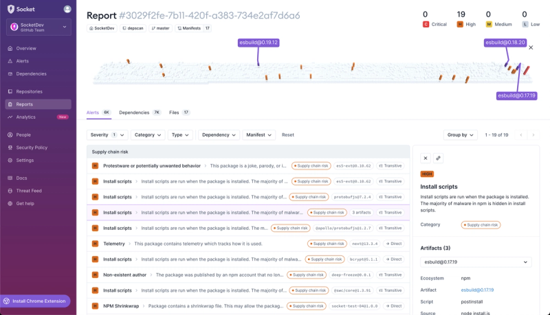
Product
We're introducing dependency visualization for reports - get a quick impression of the state of your dependencies without getting lost in the details.