Research
Security News
Malicious npm Packages Inject SSH Backdoors via Typosquatted Libraries
Socket’s threat research team has detected six malicious npm packages typosquatting popular libraries to insert SSH backdoors.
timeline-calendar
Advanced tools
Simple timeline calendar for React that is easy to customize and work with.
Simple timeline calendar for React that is easy to customize and work with.
import React, { useState } from "react";
import TimelineCalendar from "timeline-calendar";
// Import this CSS file if you do not want to implement all the details yourself.
import "../node_modules/timeline-calendar/dist/lib.esm.css";
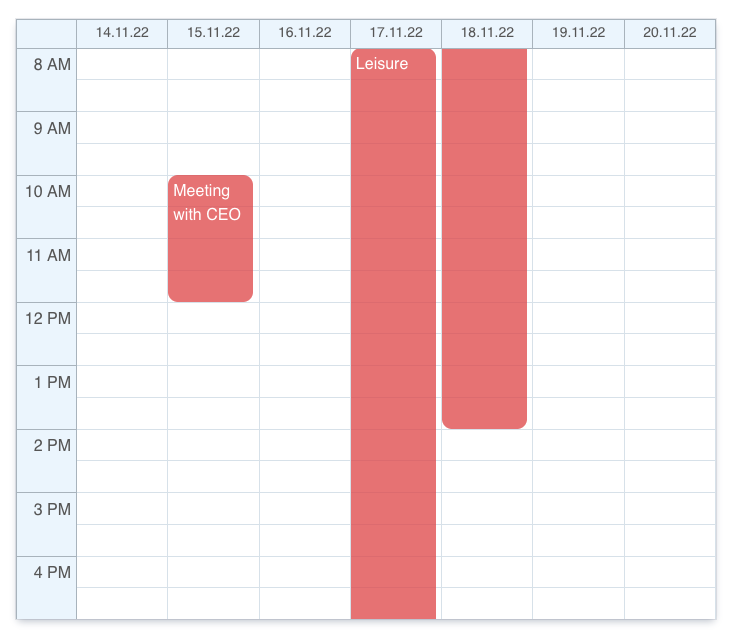
let events = [
{
id: 1,
title: "Meeting with CEO",
start: new Date("2022-11-15 10:00"),
end: new Date("2022-11-15 12:00"),
},
{
id: 2,
title: "Leisure",
start: new Date("2022-11-17 08:00"),
end: new Date("2022-11-18 14:00"),
}
];
let options = {
events: events,
// events: Event[];
// numberOfColumns?: number; Defaults to 7 (weekly).
// onCellClick?: (date: Date) => void;
// onEventClick?: (event: Event) => void;
// disableCellPredicate?: (date: Date) => boolean; Defaults to false.
// hourWindowDateFormat?: string; Format of the string is based on Unicode Technical Standard #35
// dateWindowDateFormat?: string; Format of the string is based on Unicode Technical Standard #35
// businessHourStart?: number; Defaults to 8.
}
export default function App() {
let [date, setDate] = useState(new Date());
return <TimelineCalendar {...options} currentDate={date} />;
}

It is easy to customize the theme by defining CSS variables in :root.
:root {
    --cell-divider-color: #dce5ec;
    --cell-bg-color: white;
    --xy-bg-color: #eef6fd;
    --xy-color: #606060;
    --xy-divider-color: #b1bbc4;
    --border-color: transparent;
    --event-color: rgba(225, 81, 83, 0.75);
    --cell-hover-color: #a8a8a8;
    --cell-disabled-color: rgb(245, 245, 245);
}
Change height by assigning height to this CSS class:
.timeline-calendar {
    height: 800px !important;
}

.calendar-grid {
    height: 600px !important;
}
This package exports ESM only at this point in time.
FAQs
Simple timeline calendar for React that is easy to customize and work with.
The npm package timeline-calendar receives a total of 22 weekly downloads. As such, timeline-calendar popularity was classified as not popular.
We found that timeline-calendar demonstrated a not healthy version release cadence and project activity because the last version was released a year ago. It has 1 open source maintainer collaborating on the project.
Did you know?

Socket for GitHub automatically highlights issues in each pull request and monitors the health of all your open source dependencies. Discover the contents of your packages and block harmful activity before you install or update your dependencies.

Research
Security News
Socket’s threat research team has detected six malicious npm packages typosquatting popular libraries to insert SSH backdoors.

Security News
MITRE's 2024 CWE Top 25 highlights critical software vulnerabilities like XSS, SQL Injection, and CSRF, reflecting shifts due to a refined ranking methodology.

Security News
In this segment of the Risky Business podcast, Feross Aboukhadijeh and Patrick Gray discuss the challenges of tracking malware discovered in open source softare.