Installation
$ npm install --save toastifier
$ yarn add toastifier
Simple Example
import React from "react";

import toastifier from "toastifier";
import "toastifier/dist/toastifier.min.css";

function App() {
  return (
    <div>
      <button onClick={() => toastifier("Alert Check")}>Notify!</button>
    </div>
  );
}
Demo
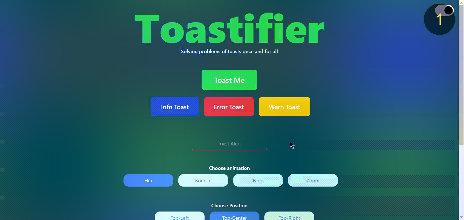
You can play with our official Demo here
Documentation
Check this to get you started!
| Name | Type | Description |
|---|
type | String | Toast Type |
animation | String | Animation Category |
duration | Number | Duration for Animation . |
position | String | Toast position on window. |
onhoverPause | Boolean | pasue toast on hover. |
showIcon | Boolean | Show default SVG icons on toast |
onClick | Function | Function to trriger events. |
styleClass | Class Object | Object for Style Class. |
background | String | Background colour, by default white |
text | String | Text Color, by default based on toast type |
border | String | Border, by default based on toast type |
Available options
| Name | Values | Default |
|---|
type | error, success, warn, info | success |
animation | flip, bounce, fade, zoom | bounce |
position | top-left, top-center, top-right, bottom-left, bottom-center, bottom-right, | top-center |
onhoverPause | true/false | false |
showIcon | true/false | true |
Complete Example
import React from "react";
import toastifier from "toastifier";
import "toastifier/dist/toastifier.min.css";
function App() {
const toastfunction = () => {
alert("function Trigerred");
};
const options = {
type: "success",
shadow: false,
animation: "bounce",
duration: 3000,
position: "top-center",
onhoverPause: true,
onClick: toastfunction,
styleClass: {
background: "#22272e",
text: "#fff",
border: "#eee",
},
};
const notify = () => toastifier("Boom! it Worked", options);
return (
<div>
<button onClick={notify}>Notify!</button>
</div>
);
}
Contribute
Show your ❤️ and support by giving a ⭐. Any suggestions are welcome!
Code Contributors
This project exists thanks to all the people who contribute.


