apsl-react-native-button


A React Native button component customizable via style props.
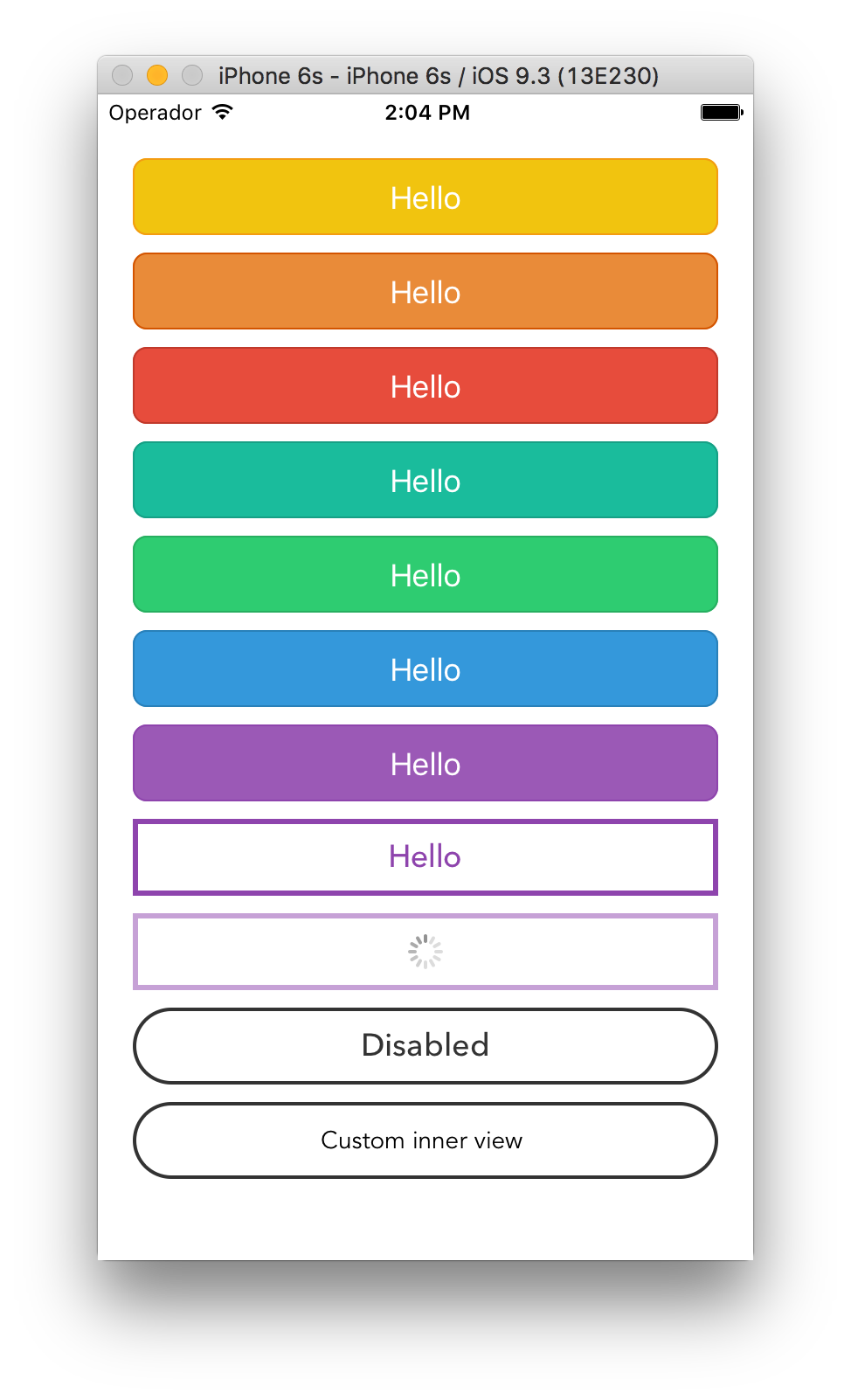
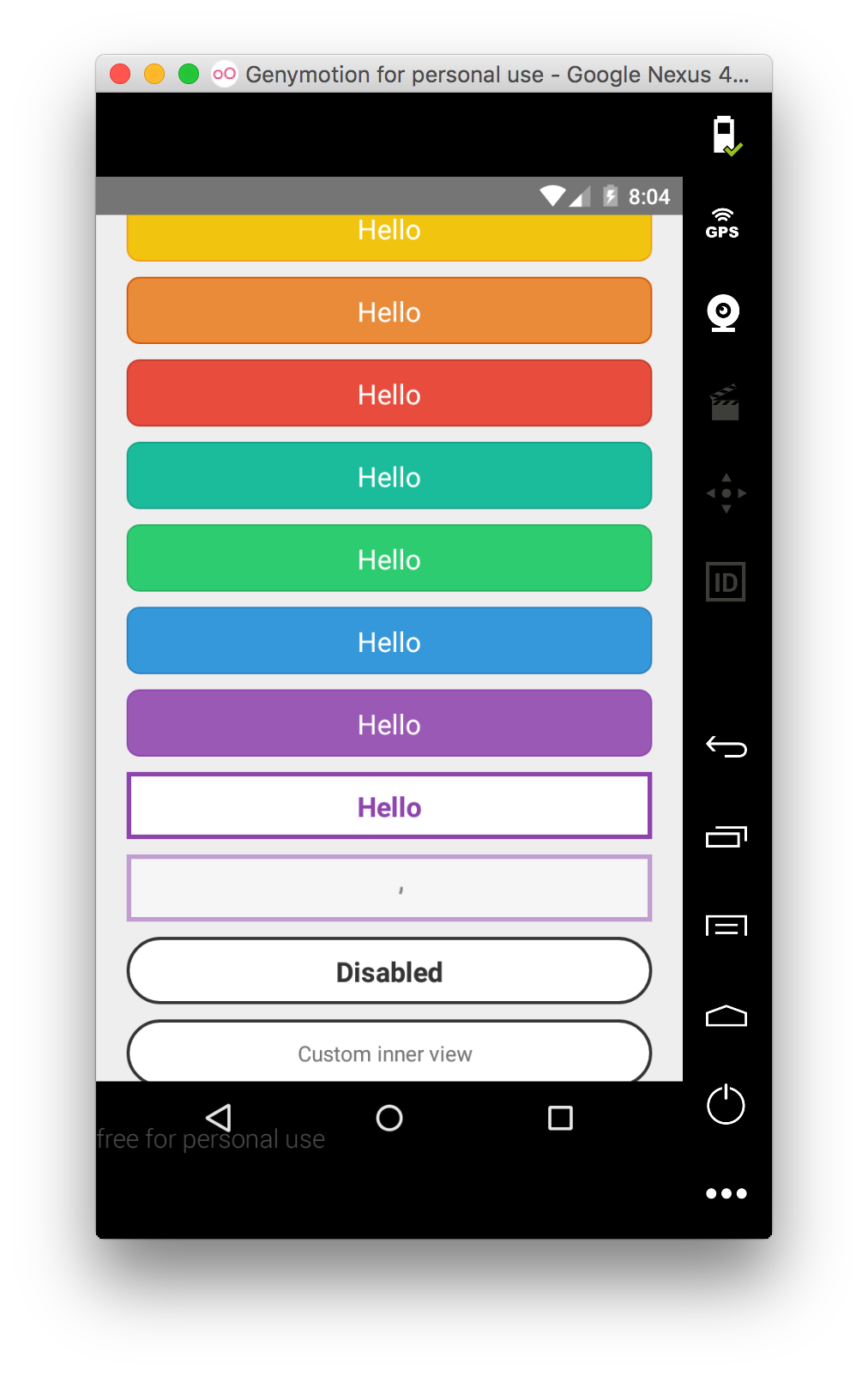
Renders a TouchableOpacity under iOS and a TouchableNativeFeedback under Android.
Install
apsl-react-native-button>=2.6.0 needs React Native 0.28 or higher.
apsl-react-native-button>=2.5.0 needs React Native 0.25 or higher.
apsl-react-native-button<=2.4.2 needs React Native 0.16 or higher.
Install the package:
$ npm i apsl-react-native-button --save
Import the Button component:
import Button from 'apsl-react-native-button'
Usage
Provide TouchableWithoutFeedback' props to the component (including style),
textStyle's StyleSheet to customize the inner text and a children node
to render. You can also provide the isLoading prop that will dim the button
and disable it to prevent accidental taps.
<Button style={{backgroundColor: 'red'}} textStyle={{fontSize: 18}}>
  Hello!
</Button>
You can also provide a <Button> element with nested children that are not strings
or <Text> elements as long as they are valid React elements or numbers. This helps
if your project is using another library that provides easy icon integration
utilizing the <i> tag, for instance, as well as various other cases where you are
creating visually complex buttons. You may omit the textStyle property and apply
your own styles to your child elements as you see fit. Multiple children are allowed.
<Button style={{backgroundColor: 'blue'}}>
  <View style={styles.nestedViewStyle}>
    <Text style={styles.nestedTextStyle}>Nested views!</Text>
  </View>
</Button>
API
onPress | func | Function to execute when the onPress event is triggered. |
onPressIn | func | Function to execute when the onPressIn event is triggered. |
onPressOut | func | Function to execute when the onPressOut event is triggered. |
onLongPress | func | Function to execute when the onLongPress event is triggered. |
textStyle | TextStylePropTypes | The StyleSheet to apply to the inner button text. |
disabledStyle | TextStylePropTypes | The StyleSheet to apply when disabled. |
children | string, number, React.Element,or array | The child nodes to render inside the button. If child is string or number, it will be rendered inside of a <Text> element with textStyle applied if present. Multiple children are allowed (array). |
isLoading | bool | Renders an inactive state dimmed button with a spinner if true. |
isDisabled | bool | Renders an inactive state dimmed button if true. |
activeOpacity | Number | The button onpressing transparency (Usually with a point value between 0 and 1). |
activityIndicatorColor | string | Sets the button of the ActivityIndicatorIOS or ProgressBarAndroid in the loading state. |
background | TouchableNativeFeedback.propTypes.background | Android only. The background prop of TouchableNativeFeedback. |
| Check the included example for more options. | | |
Similar projects
James Ide's react-native-button https://github.com/ide/react-native-button/
License
MIT.


