vue-dynamic-dropdown
A Highly Customizable, easy-to-use, elegant, dropdown component
Feedback would be much appreciated, questions, suggestions, issues are more than welcome.


Demo

Usage:
First
Install via NPM npm i vue-dynamic-dropdown
Second
Require in your project:
var VueDropdown = require('vue-dynamic-dropdown');
or ES6 syntax:
import VueDropdown from 'vue-dynamic-dropdown'
Third
You can register the component globally:
Vue.component('vue-dropdown', VueDropdown);
Or locally in a single Vue component:
components: {
  VueDropdown
}
Insert the following selector anywhere in your project (global) or in your existing component (local):
NOTE: To get up and running quickly the package now supports rendering just the selector with default values.
<vue-dropdown></vue-dropdown>
Docs:
config: {...} is a configuration object that is to be bound to vue-dropdown, API properties are:
Basics
| options | array | Holds the inner selection options of the dropdown (shown when open), each single option is an object that has the value key that pairs with the given value e.g { value: '1st Option' } |
| width | number | Determines the width of the dropdown button & options drawer |
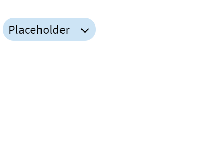
| placeholder | string | The text shown on the dropdown button by default |
| prefix | string | A text prefix that will be added before the placeholder text |
| disabled | boolean | Set true if the dropdown should be disabled |
Customized Styling
| backgroundColor | string | Set the dropdown button & options area background color |
| hoverBackgroundColor | string | Set the dropdown button & options hover background color |
| border | string | Set the dropdown button & options border |
| textColor | string | Set the dropdown button & options text color |
| disabledBackgroundColor | string | Set the disabled dropdown button background color |
| disabledTextColor | string | Set the disabled dropdown button text color |
Events
| setSelectedOption | Option Object | Clicking a dropdown option emits an option data object upwards |
Listening to the event e.g:
<vue-dropdown @setSelectedOption="myLocalSetterFunction($event)"></vue-dropdown>
Implementation Example
Define your config options object in the component importing VueDropdown e.g
data: function() {
    return {
        config: {
            options: [
                {
                    value: "option 1"
                },
                {
                    value: "option 2"
                },
                {
                    value: "option 3"
                },
            ],
            prefix: "The",
            backgroundColor: "green",
            disabled: false,
        }
    }
}
And bind it to the selector like so
<vue-dropdown :config="config"></vue-dropdown>
👨💻 Follow me on Twitter.
Donation
If this project helped you reduce development time, you can buy me a cup of coffee :)


