Security News
npm Adopts OIDC for Trusted Publishing in CI/CD Workflows
npm now supports Trusted Publishing with OIDC, enabling secure package publishing directly from CI/CD workflows without relying on long-lived tokens.
github.com/VitorLuizC/vue-burger-button
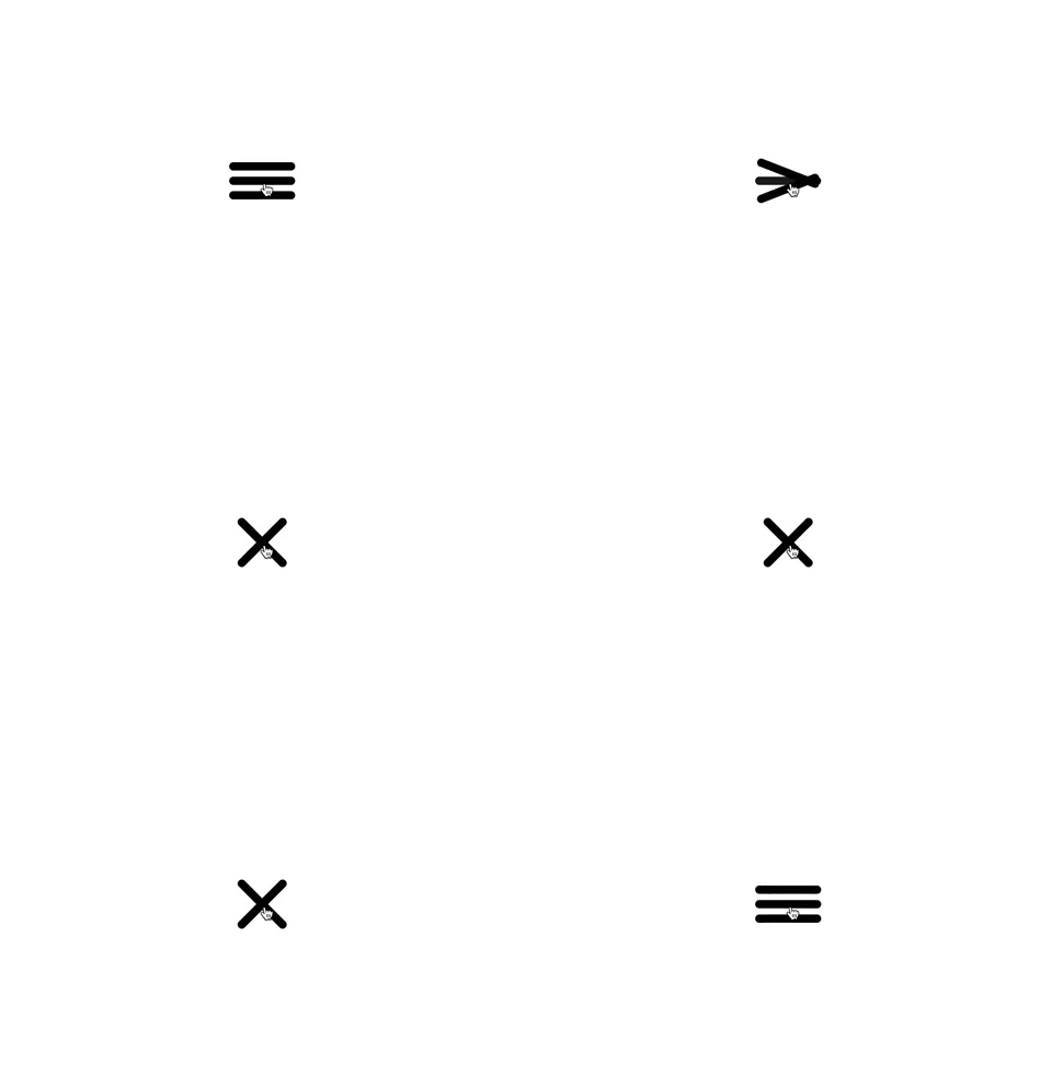
A Vue burger button as functional component, which is faster than a regular component, and is pretty small (JS min+gzip is lower than 700b and CSS min+gzip is lower than 400b).

This module is published under NPM registry, so you can install from any package manager.
npm install vue-burger-button --save
# Use the command bellow for Yarn.
yarn add vue-burger-button
Import the BurgerButton component and its CSS.
<template>
  <burger-button
    :active="isActive"
    @click="isActive = !isActive"
  />
</template>

<script>
  import BurgerButton from 'vue-burger-button';

  export default {
    components: { BurgerButton },
    data: () => ({ isActive: false })
  };
</script>

<style src="vue-burger-button/dist/vue-burger-button.css" />
If you need <burger-button /> available everywhere, you can register it as a global component and don't forget to import its CSS.
import 'vue-burger-button/dist/vue-burger-button.css';
import Vue from 'vue';
import BurgerButton from 'vue-burger-button';

Vue.component('burger-button', BurgerButton);
You can import burger button UMD module and CSS from Unpkg.
<!-- Import vue-burger-button CSS -->
<link rel="stylesheet" href="https://unpkg.com/vue-burger-button@0.1.0/dist/vue-burger-button.css" />

<!-- Import vue-burger-button UMD bundle -->
<script src="https://unpkg.com/vue@2.5.3"></script>
<script src="https://unpkg.com/vue-burger-button@0.1.0"></script>

<script>
  /**
   * vue-burger-button is available through VueBurgerButton.
   */
  console.dir(VueBurgerButton);

  /**
   * Vue.use will add burger button as global component.
   */
  Vue.component('burger-button', VueBurgerButton);
</script>
You can customize your burger button using props.
<template>
  <burger-button
    :active="isActive"
    :bar-color="isActive ? 'red' : 'black'"
    :bar-height="15"
    :bar-width="120"
    @click="isActive = !isActive"
  />
</template>
| Name | Type | Default | Description |
|---|---|---|---|
| active | Boolean | false | If true it switches to a close button. |
| barColor | String | '#000000' | Change the bars colors. |
| barHeight | Number | 10 | Change the bars heights. |
| barWidth | Number | 80 | Change the bars widths. |
The burger button emits every <button /> events. So, you can use @click, @mouseover etc.
Released under MIT License.
FAQs
Did you know?

Socket for GitHub automatically highlights issues in each pull request and monitors the health of all your open source dependencies. Discover the contents of your packages and block harmful activity before you install or update your dependencies.

Security News
npm now supports Trusted Publishing with OIDC, enabling secure package publishing directly from CI/CD workflows without relying on long-lived tokens.

Research
/Security News
A RubyGems malware campaign used 60 malicious packages posing as automation tools to steal credentials from social media and marketing tool users.

Security News
The CNA Scorecard ranks CVE issuers by data completeness, revealing major gaps in patch info and software identifiers across thousands of vulnerabilities.