Security News
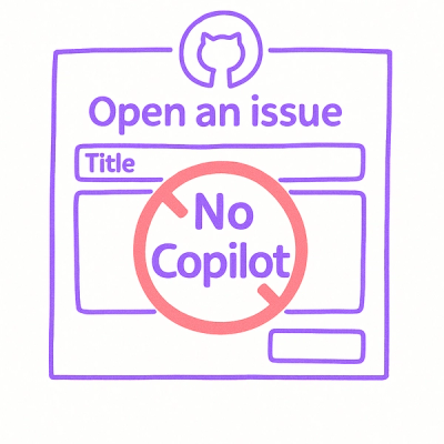
Open Source Maintainers Demand Ability to Block Copilot-Generated Issues and PRs
Open source maintainers are urging GitHub to let them block Copilot from submitting AI-generated issues and pull requests to their repositories.
github.com/azuritul/azdropdownmenu
AZDropdownMenu is a simple dropdown menu component that supports Swift.
Code used in the screencast are included in the bundled sample project.

To run the demo project, clone the repo with git clone https://github.com/Azuritul/AZDropdownMenu.git, and run pod install from the Example directory first.
AZDropdownMenu is available through CocoaPods. To install it, simply add the following line to your Podfile:
use_frameworks!
pod 'AZDropdownMenu'
Use version 1.1.2 if you don't need Swift 4 support.
Declare an array of texts that are served as the item in the menu.
let titles = ["Action 1", "Action 2", "Action 3"]
Then pass the array to the initializer
let menu = AZDropdownMenu(titles: titles)
Set up so that the UIBarButtonItem is asso
ated with a function that shows the menu
let button = UIBarButtonItem(image: UIImage(named: "menu_image"), style: .Plain, target: self, action: "showDropdown")
navigationItem.leftBarButtonItem = menuButton
Calling public func showMenuFromView(view:UIView) can then show the menu.
func showDropdown() {
    if (self.menu?.isDescendantOfView(self.view) == true) {
        self.menu?.hideMenu()
    } else {
        self.menu?.showMenuFromView(self.view)
    }
}
The handler public var cellTapHandler : ((indexPath:NSIndexPath) -> Void)? would be called
when menu item is tapped. So place code in here to do whatever you want. For example
menu.cellTapHandler = { [weak self] (indexPath: NSIndexPath) -> Void in
    self?.navigationController?.pushViewController(controller, animated:true)
}
Pass in a AZDropdownMenuItemData in the initializer: public init(dataSource:[AZDropdownMenuItemData]) and you are good to go.
Take a look at the sample project in this repository to get more usage of the library.
Currently AZDropdownMenu can be customized with the following properties. More will come in the future.
itemHeight Row height of the menu item. Default is 44.itemColor The background color of the menu item. Default is white.itemFontColor The text color of the menu item. Default is black.itemFontSize Font size of the menu item. Default is 14.0itemFont Font used in the menu. Default is 'Helvetica'itemAlignment The alignment of the menu item. Default is left-aligned.itemSelectionColor The background color of the menu item while it is tapped. Default is gray.overlayAlpha The transparency for the background overlay. Default is 0.5overlayColor Color for the background overlay. Default is black.menuSeparatorStyle The separator of the menu. Default is single line.menuSeparatorColor The color of the separator. Default is light gray.itemImagePosition The position of image in the menu. Can be positioned before or after the text. Default is .Prefix.shouldDismissMenuOnDrag If set to true, menu would be dismissed on drag. Default value is false.1.1.3
1.1.2
1.1.1
1.1.0
shouldDismissMenuOnDrag option, menu would be dismissed on drag if this option is enabledUITableView.1.0.0
itemImagePosition option, now can configure the icon position.0.6.1
0.6.0
menuSeparatorColor, itemFont0.5.3
Chris Wu (Azuritul), azuritul@gmail.com
AZDropdownMenu is available under the MIT license. See the LICENSE file for more info.
FAQs
Did you know?

Socket for GitHub automatically highlights issues in each pull request and monitors the health of all your open source dependencies. Discover the contents of your packages and block harmful activity before you install or update your dependencies.

Security News
Open source maintainers are urging GitHub to let them block Copilot from submitting AI-generated issues and pull requests to their repositories.

Research
Security News
Malicious Koishi plugin silently exfiltrates messages with hex strings to a hardcoded QQ account, exposing secrets in chatbots across platforms.

Research
Security News
Malicious PyPI checkers validate stolen emails against TikTok and Instagram APIs, enabling targeted account attacks and dark web credential sales.