Research
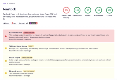
Malicious npm Package Brand-Squats TanStack to Exfiltrate Environment Variables
A brand-squatted TanStack npm package used postinstall scripts to steal .env files and exfiltrate developer secrets to an attacker-controlled endpoint.
github.com/chirag04/react-native-tooltip
Advanced tools
A react-native component from displaying tooltip. Uses UIMenuController.
npm install react-native-tooltip --saveLibraries and click Add Files to "Your Project Name" (Screenshot) then (Screenshot).libRNToolTipMenu.a to Build Phases -> Link Binary With Libraries
(Screenshot).var ToolTip = require('react-native-tooltip');actions: Array of actions [{text: 'Copy', onPress: () => Clipboard.set(this.someValue) }]longPress: Boolean indicating if the tooltip should be showing on longPress, false by default.arrowDirection: String indicating the direction of the tooltip arrow. Possible values are: up, down, left, and right. Default is down.activeOpacityonHideUnderlayonShowUnderlaystyleunderlayColorYou can see the list on the react native website
import React from 'react';
import {
  AppRegistry,
  StyleSheet,
  PixelRatio,
  View,
  Text,
} from 'react-native';

import ToolTip from 'react-native-tooltip';

export default class MyToolTip extends React.Component {
    state = {
        input: 'chirag'
    };

    handleCopyPress = () => {
        AlertIOS.alert(`Copy has been pressed!`);
    };

    handleOtherPress = () => {
        AlertIOS.alert(`Other has been pressed!`);
    };

    handleHide = () => {
        console.log('Tooltip did hide');
    };

    handleShow = () => {
        console.log('tooltip did show');
    };

    render() {
        return (
          <View style={{flex: 1, justifyContent: 'center'}}>
            <ToolTip
              ref='tooltip'
              actions={[
                {text: 'Copy', onPress: this.handleCopyPress },
                {text: 'Other', onPress: this.handleOtherPress }
              ]}
              onHide={this.handleHide}
              onShow={this.handleShow}
              underlayColor={'blue'}
              style={styles.selectedName}
            >
              <Text style={styles.welcome}>
                Press Here.
              </Text>
            </ToolTip>
          </View>
        );
    }
}

const styles = StyleSheet.create({
  container: {
    flex: 1,
    justifyContent: 'center',
    alignItems: 'center',
    backgroundColor: '#F5FCFF',
  },
  textinputContainer: {
    marginTop: 20,
    justifyContent: 'center',
    alignItems: 'center',
  },
  textinput: {
    width: 60,
    marginVertical: 2,
    marginHorizontal: 2,
    borderWidth: 1 / PixelRatio.get(),
    borderRadius: 5,
    borderColor: '#c7c7cc',
    padding: 2,
    fontSize: 14,
    backgroundColor: 'white',
  },
});

AppRegistry.registerComponent('tooltip', () => tooltip);
It is also possible to open the menu programmatically, by calling this.refs.theToolTip.showMenu(); ( theToolTip being the reference of the component).
To hide menu this.refs.theToolTip.hideMenu(); (Though tooltip hides by itself, while using with drawer on specific gesture tooltip does not hide by default.)

Special thanks to jrichardlai for refactoring the api and make it awesome.
FAQs
Unknown package
Did you know?

Socket for GitHub automatically highlights issues in each pull request and monitors the health of all your open source dependencies. Discover the contents of your packages and block harmful activity before you install or update your dependencies.

Research
A brand-squatted TanStack npm package used postinstall scripts to steal .env files and exfiltrate developer secrets to an attacker-controlled endpoint.

Research
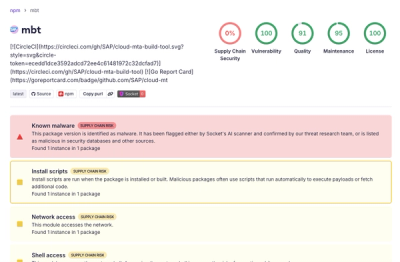
Compromised SAP CAP npm packages download and execute unverified binaries, creating urgent supply chain risk for affected developers and CI/CD environments.

Company News
Socket has acquired Secure Annex to expand extension security across browsers, IDEs, and AI tools.