React Native Awesome Button
@rcaferati/react-native-awesome-button is the current npm package for this repo.
The library exports:
AwesomeButton as the default exportThemedButtongetTheme- explicit TypeScript types such as
AwesomeButtonProps, ThemedButtonProps, ButtonWidth, ThemeName, ButtonVariant, and ButtonSize
Install
Try the live package demo on expo.dev.

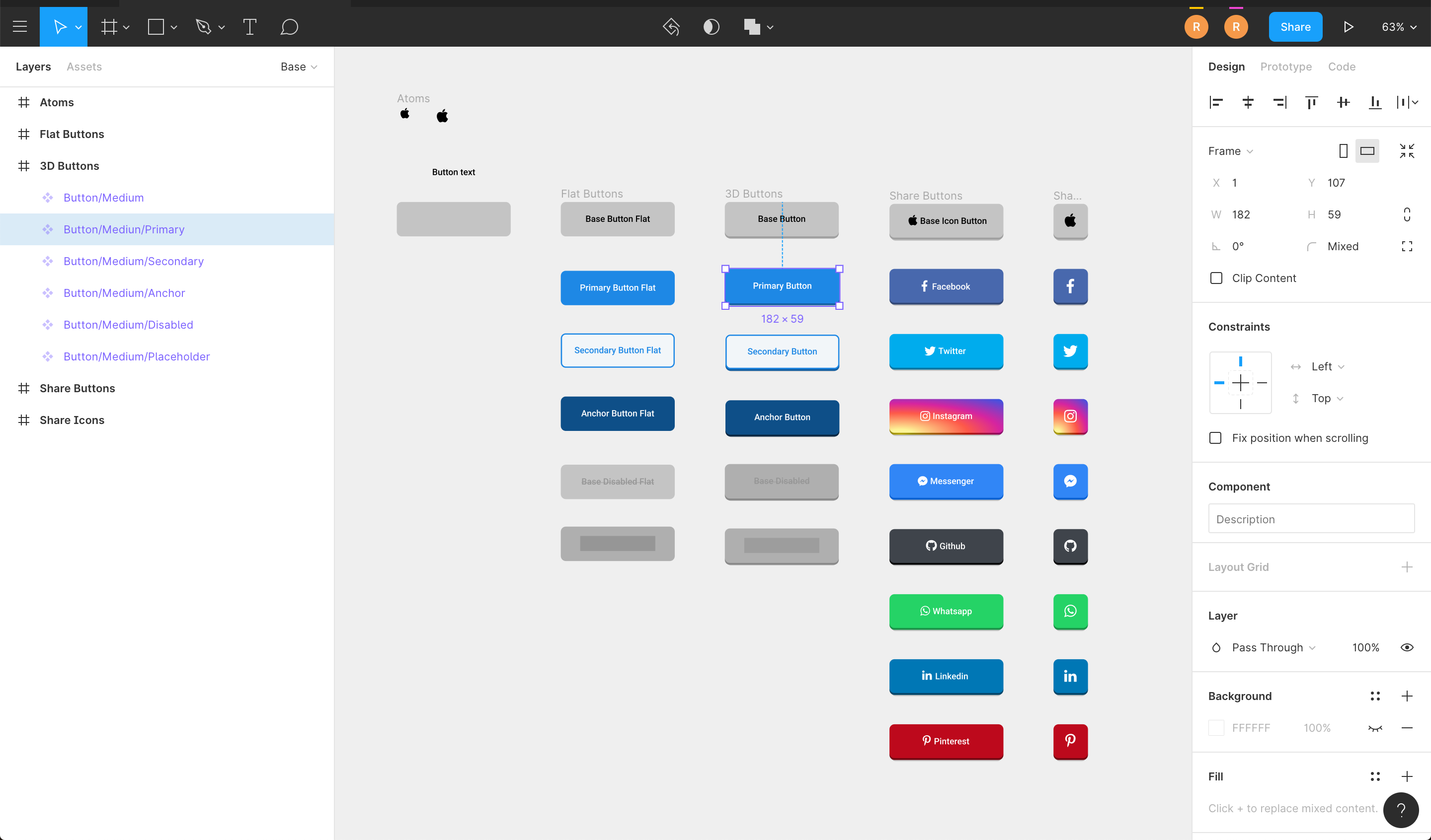
Figma File
Import the button visuals directly into your Figma project.
Install
npm install @rcaferati/react-native-awesome-button
Current peer support:
react >= 18.2.0react-native >= 0.76.0
Basic Usage
import AwesomeButton from '@rcaferati/react-native-awesome-button';

export function SaveButton() {
  return <AwesomeButton>Save</AwesomeButton>;
}
AwesomeButton supports both plain string labels and arbitrary React Native content.
Size Changes
animateSize is enabled by default.
- fixed-size
width / height changes animate with 125ms cubic-bezier(0.3, 0.05, 0.2, 1)
- auto-width string labels grow and shrink when their measured target width changes
- with
textTransition plus auto width:
- wider labels grow first, then animate text
- narrower labels animate text first, then shrink
animateSize={false} keeps size changes instant- fixed-to-auto and auto-to-fixed changes remain instant in
3.1.0
import AwesomeButton, {
  ThemedButton,
} from '@rcaferati/react-native-awesome-button';

export function SizeExample({
  isLong,
  size,
}: {
  isLong: boolean;
  size: 'small' | 'medium' | 'large';
}) {
  const label = isLong ? 'Open analytics dashboard' : 'Open';

  return (
    <>
      <AwesomeButton textTransition>{label}</AwesomeButton>
      <AwesomeButton animateSize={false}>{label}</AwesomeButton>
      <ThemedButton name="rick" size={size}>
        {size}
      </ThemedButton>
    </>
  );
}
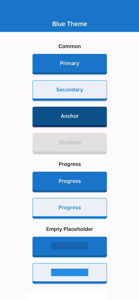
Progress Buttons
When progress is enabled, onPress receives a next callback. Call it when your work is done to complete the progress animation and release the button.
import AwesomeButton from '@rcaferati/react-native-awesome-button';

export function SubmitButton() {
  return (
    <AwesomeButton
      progress
      onPress={(next) => {
        setTimeout(() => {
          next?.();
        }, 800);
      }}
    >
      Submit
    </AwesomeButton>
  );
}
Themed Buttons
import { ThemedButton } from '@rcaferati/react-native-awesome-button';

export function ThemeExample() {
  return (
    <>
      <ThemedButton name="rick" type="primary">
        Rick Primary
      </ThemedButton>
      <ThemedButton name="rick" type="secondary">
        Rick Secondary
      </ThemedButton>
    </>
  );
}
If you need the full registered theme object, use getTheme.
import { ThemedButton, getTheme } from '@rcaferati/react-native-awesome-button';

export function ThemeConfigExample() {
  const theme = getTheme(0);

  return (
    <ThemedButton config={theme} type="anchor">
      {theme.title}
    </ThemedButton>
  );
}
getTheme() safely falls back to the default basic theme if the provided index or name is invalid.
Use before and after for inline content that should animate with the label, and extra for content rendered behind the button body.
import { StyleSheet, Text } from 'react-native';
import { AntDesign } from '@expo/vector-icons';
import { LinearGradient } from 'expo-linear-gradient';
import AwesomeButton from '@rcaferati/react-native-awesome-button';

export function ButtonContentExample() {
  return (
    <AwesomeButton
      before={<AntDesign name="arrowleft" size={18} color="#FFFFFF" />}
      after={<AntDesign name="arrowright" size={18} color="#FFFFFF" />}
      extra={
        <LinearGradient
          colors={['#4C63D2', '#BC3081', '#F47133', '#FED576']}
          style={StyleSheet.absoluteFillObject}
        />
      }
    >
      <Text style={{ color: '#FFFFFF', fontWeight: '700' }}>Continue</Text>
    </AwesomeButton>
  );
}
Transparent Buttons
transparent is supported on ThemedButton. It removes the visible shell layers while preserving the content, hit target, and active/progress feedback.
import { ThemedButton } from '@rcaferati/react-native-awesome-button';

export function TransparentExample() {
  return (
    <ThemedButton name="bruce" type="anchor" transparent>
      Transparent
    </ThemedButton>
  );
}
Built-in Theme Contract
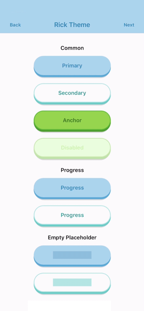
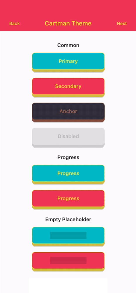
Theme Names
basicbojackcartmanmysterionc137ricksummerbruce
Variants
primarysecondaryanchordangerdisabledflattwittermessengerfacebookgithublinkedinwhatsappredditpinterestyoutube
Unknown variants fall back safely at runtime instead of crashing, but only the variants above are part of the typed built-in API.
Sizes
Selected Props
The public prop surface is typed through AwesomeButtonProps and ThemedButtonProps.
AwesomeButton Props
activityColor | string | #FFFFFF | Activity indicator color shown during progress mode. |
activeOpacity | number | 1 | Opacity applied while the button is pressed. |
animatedPlaceholder | boolean | true | Enables the shimmer loop when the button has no children. |
animateSize | boolean | true | Animates fixed-size geometry changes and auto-width string-label changes. |
backgroundActive | string | rgba(0, 0, 0, 0.15) | Active overlay color rendered over the face while pressed. |
backgroundColor | string | #c0c0c0 | Main front-face background color. |
backgroundDarker | string | #9f9f9f | Bottom-face background color used for the raised 3D effect. |
backgroundPlaceholder | string | rgba(0, 0, 0, 0.15) | Placeholder bar background color when the button is empty. |
backgroundProgress | string | rgba(0, 0, 0, 0.15) | Progress bar background color used during progress mode. |
backgroundShadow | string | rgba(0, 0, 0, 0.15) | Shadow layer background color. |
before | ReactNode | null | Content rendered before the main label inside the button face. |
after | ReactNode | null | Content rendered after the main label inside the button face. |
extra | ReactNode | null | Content rendered behind the active/content layers, useful for gradients and custom backgrounds. |
children | ReactNode | null | Button label or custom content. Plain string labels also support textTransition. |
borderColor | string | undefined | Front-face border color. |
borderRadius | number | 4 | Shared border radius applied to the button face and lower layers. |
borderBottomLeftRadius | number | undefined | Bottom-left radius override. |
borderBottomRightRadius | number | undefined | Bottom-right radius override. |
borderTopLeftRadius | number | undefined | Top-left radius override. |
borderTopRightRadius | number | undefined | Top-right radius override. |
borderWidth | number | 0 | Front-face border width. |
dangerouslySetPressableProps | AwesomeButtonPressableProps | {} | Escape hatch for extra Pressable props. Core onPress, onPressIn, and onPressOut remain owned by the component. |
debouncedPressTime | number | 0 | Debounces onPress in milliseconds. |
disabled | boolean | false | Disables interactions and marks the internal Pressable as disabled. |
height | number | 60 | Base button height before padding and raise-level adjustments. |
hitSlop | PressableProps['hitSlop'] | undefined | Optional press target expansion. |
paddingHorizontal | number | 16 | Horizontal content padding. |
paddingTop | number | 0 | Additional top padding for the content row. |
paddingBottom | number | 0 | Additional bottom padding for the content row. |
progress | boolean | false | Enables the progress-button flow. onPress receives a next callback in this mode. |
progressLoadingTime | number | 3000 | Duration of the loading bar animation in progress mode. |
showProgressBar | boolean | true | Keeps the progress indicator visible while the button is in loading mode. |
raiseLevel | number | 4 | Vertical raise distance used to render the 3D depth effect. |
springRelease | boolean | true | Uses spring-based release animation instead of timing-based release. |
stretch | boolean | false | Makes the button fill the available horizontal space. |
style | StyleProp<ViewStyle> | undefined | Extra style applied to the outer animated container. |
textColor | string | #FFFFFF | Default label text color. |
textFontFamily | string | undefined | Optional font family for string labels. |
textLineHeight | number | 20 | Placeholder bar height and string label line-height baseline. |
textSize | number | 14 | Default font size for string labels. |
textTransition | boolean | false | Enables the built-in scramble/reveal animation for plain string labels. In auto-width mode, wider labels grow first and narrower labels shrink last. |
width | number | 'auto' | null | null | Fixed width, measured auto width (null / 'auto'), or pair with stretch for full width. Auto-width string labels can now both grow and shrink. |
onPress | (next?) => void | () => undefined | Main press callback. In progress mode it receives the completion handler. |
onLongPress | PressableProps['onLongPress'] | undefined | Native long-press callback forwarded to Pressable. |
onPressIn | (event) => void | () => undefined | Native press-in observer callback. |
onPressOut | (event) => void | () => undefined | Native press-out observer callback. |
onPressedIn | () => void | () => undefined | Fires after the internal press-in animation completes. |
onPressedOut | () => void | () => undefined | Fires after the internal release animation completes. |
onProgressStart | () => void | () => undefined | Fires when progress mode transitions into loading. |
onProgressEnd | () => void | () => undefined | Fires when progress mode finishes and the button releases. |
ThemedButton Additional Props
config | ThemeDefinition | undefined | Explicit theme object. When provided, it takes precedence over name and index. |
flat | boolean | false | Requests the flat theme variant when available. |
index | number | null | null | Theme index used by getTheme(index) when config and name are not provided. |
name | ThemeName | null | null | Named built-in theme selector. Falls back safely to basic if invalid. |
size | ButtonSize | medium | Built-in theme size preset: icon, small, medium, or large. |
transparent | boolean | false | Makes the visible shell layers transparent while keeping content, press, and progress feedback active. |
type | ButtonVariant | primary | Built-in variant to resolve from the selected theme. |
Development
Root quality gates:
yarn test
yarn typescript
yarn lint
yarn prepare
Demo app commands:
yarn --cwd demo install
yarn demo
yarn demo:ios
yarn demo:android
yarn demo:web
The Expo demo resolves @rcaferati/react-native-awesome-button to the local src/ folder, so you can iterate on the library without publishing it first.
Demo
The demo/ app is an Expo SDK 52 compatibility harness for:
- common themed buttons across all registered themes
- progress buttons
- variant transition examples
- text transition examples
- size animation parity examples
- empty placeholder states
- flat button variants
- before / after / icon content
- auto-width and stretch examples
- social variants
- extra-content button compositions
See demo/README.md for demo-specific instructions.
Author
Rafael Caferati
Website: https://caferati.dev
LinkedIn: https://linkedin.com/in/rcaferati
Instagram: https://instagram.com/rcaferati
License
MIT.