Research
Security News
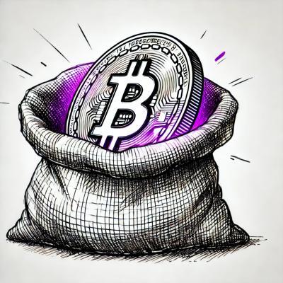
Malicious npm Packages Use Telegram to Exfiltrate BullX Credentials
Socket uncovers an npm Trojan stealing crypto wallets and BullX credentials via obfuscated code and Telegram exfiltration.
By Kush Pandya - May 08, 2025
github.com/xormplus/chart
Basic charts in go.
This package focuses more on autoscaling, error bars, and logarithmic plots than on beautifull or marketing ready charts.

The following chart types are implemented:
Package chart itself provideds the charts/plots itself, the charts/plots can be output to different graphic drivers. Currently
For a quick overview save as xbestof.{png,svg,txt} run
$ example/example -best
A fuller overview can be generated by
$ example/example -All
FAQs
Unknown package
Did you know?

Socket for GitHub automatically highlights issues in each pull request and monitors the health of all your open source dependencies. Discover the contents of your packages and block harmful activity before you install or update your dependencies.
Research
Security News
Socket uncovers an npm Trojan stealing crypto wallets and BullX credentials via obfuscated code and Telegram exfiltration.
Research
Security News
Malicious npm packages posing as developer tools target macOS Cursor IDE users, stealing credentials and modifying files to gain persistent backdoor access.
Security News
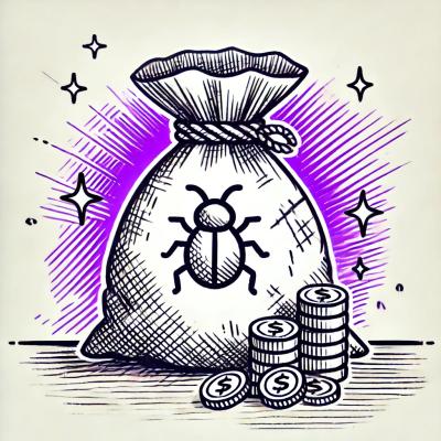
AI-generated slop reports are making bug bounty triage harder, wasting maintainer time, and straining trust in vulnerability disclosure programs.