Research
lightning PyPI Package Compromised in Supply Chain Attack
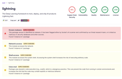
Socket detected a malicious supply chain attack on PyPI package lightning versions 2.6.2 and 2.6.3, which execute credential-stealing malware on import.
github.com/zefoy/ngx-color-picker
Advanced tools
This is a simple color picker based on the cool angular2-color-picker by Alberplz.
This documentation is for the latest version which requires Angular version newer than 2 major versions prior to the current latest version. For older Angular versions you need to use an older version of this library.
Example application | StackBlitz example
npm install
npm run build
npm install
npm run start
npm install ngx-color-picker --save
import { ColorPickerDirective } from 'ngx-color-picker';

@Component({
  // ...
  imports: [
    // ...
    ColorPickerDirective,
    // ...
  ]
})
<input [(colorPicker)]="color" [style.background]="color"/>
[colorPicker]                // The color to show in the color picker dialog.

[cpWidth]                    // Use this option to set color picker dialog width ('230px').
[cpHeight]                   // Use this option to force color picker dialog height ('auto').

[cpToggle]                   // Sets the default open / close state of the color picker (false).
[cpDisabled]                 // Disables opening of the color picker dialog via toggle / events.

[cpColorMode]                // Dialog color mode: 'color', 'grayscale', 'presets' ('color').

[cpCmykEnabled]              // Enables CMYK input format and color change event (false).

[cpOutputFormat]             // Output color format: 'auto', 'hex', 'rgba', 'hsla' ('auto').
[cpAlphaChannel]             // Alpha mode: 'enabled', 'disabled', 'always', 'forced' ('enabled').

[cpFallbackColor]            // Used when the color is not well-formed or is undefined ('#000').

[cpPosition]                 // Dialog position: 'auto', 'top', 'bottom', 'left', 'right',
                             //  'top-left', 'top-right', 'bottom-left', 'bottom-right' ('auto').
[cpPositionOffset]           // Dialog offset percentage relative to the directive element (0%).
[cpPositionRelativeToArrow]  // Dialog position is calculated relative to dialog arrow (false).

[cpPresetLabel]              // Label text for the preset colors if any provided ('Preset colors').
[cpPresetColors]             // Array of preset colors to show in the color picker dialog ([]).

[cpDisableInput]             // Disables / hides the color input field from the dialog (false).

[cpDialogDisplay]            // Dialog positioning mode: 'popup', 'inline' ('popup').
                             //   popup: dialog is shown as popup (fixed positioning).
                             //   inline: dialog is shown permanently (static positioning).

[cpIgnoredElements]          // Array of HTML elements that will be ignored when clicked ([]).

[cpSaveClickOutside]         // Save currently selected color when user clicks outside (true).
[cpCloseClickOutside]        // Close the color picker dialog when user clicks outside (true).

[cpOKButton]                 // Show an OK / Apply button which saves the color (false).
[cpOKButtonText]             // Button label text shown inside the OK / Apply button ('OK').
[cpOKButtonClass]            // Additional class for customizing the OK / Apply button ('').

[cpCancelButton]             // Show a Cancel / Reset button which resets the color (false).
[cpCancelButtonText]         // Button label text shown inside the Cancel / Reset button ('Cancel').
[cpCancelButtonClass]        // Additional class for customizing the Cancel / Reset button ('').

[cpAddColorButton]           // Show an Add Color button which add the color into preset (false).
[cpAddColorButtonText]       // Button label text shown inside the Add Color button ('Add color').
[cpAddColorButtonClass]      // Additional class for customizing the Add Color button ('').

[cpRemoveColorButtonClass]   // Additional class for customizing the Remove Color button ('').

[cpPresetColorsClass]        // Additional class for customizing the Preset Colors container ('').

[cpMaxPresetColorsLength]    // Use this option to set the max colors allowed in presets (null).

[cpPresetEmptyMessage]       // Message for empty colors if any provided used ('No colors added').
[cpPresetEmptyMessageClass]  // Additional class for customizing the empty colors message ('').

[cpUseRootViewContainer]     // Create dialog component in the root view container (false).
                             // Note: The root component needs to have public viewContainerRef.

(colorPickerOpen)            // Current color value, send when dialog is opened (value: string).
(colorPickerClose)           // Current color value, send when dialog is closed (value: string).

(colorPickerChange)          // Changed color value, send when color is changed (value: string).
(colorPickerCancel)          // Color select canceled, send when Cancel button is pressed (void).
(colorPickerSelect)          // Selected color value, send when OK button is pressed (value: string).

(cpToggleChange)             // Status of the dialog, send when dialog is opened / closed (open: boolean).

(cpInputChange)              // Input name and its value, send when user changes color through inputs
                             // ({input: string, value: number | string, color: string})

(cpSliderChange)             // Slider name and its value, send when user changes color through slider
                             //   ({slider: string, value: number | string, color: string})
(cpSliderDragStart)          // Slider name and current color, send when slider dragging starts (mousedown,touchstart)
                             //   ({slider: string, color: string})
(cpSliderDragEnd)            // Slider name and current color, send when slider dragging ends (mouseup,touchend)
                             //   ({slider: string, color: string})

(cpCmykColorChange)          // Outputs the color as CMYK string if CMYK is enabled (value: string).

(cpPresetColorsChange)       // Preset colors, send when 'Add Color' button is pressed (value: array).
openDialog()                 // Opens the color picker dialog if not already open.
closeDialog()                // Closes the color picker dialog if not already closed.
FAQs
Unknown package
Did you know?

Socket for GitHub automatically highlights issues in each pull request and monitors the health of all your open source dependencies. Discover the contents of your packages and block harmful activity before you install or update your dependencies.

Research
Socket detected a malicious supply chain attack on PyPI package lightning versions 2.6.2 and 2.6.3, which execute credential-stealing malware on import.

Research
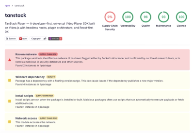
A brand-squatted TanStack npm package used postinstall scripts to steal .env files and exfiltrate developer secrets to an attacker-controlled endpoint.

Research
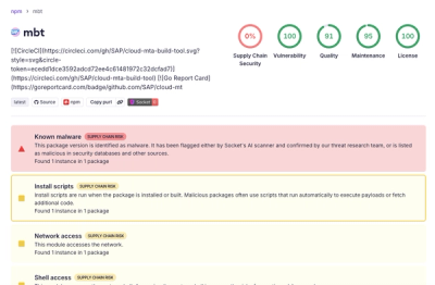
Compromised SAP CAP npm packages download and execute unverified binaries, creating urgent supply chain risk for affected developers and CI/CD environments.