Research
Malicious npm Packages Impersonate Flashbots SDKs, Targeting Ethereum Wallet Credentials
Four npm packages disguised as cryptographic tools steal developer credentials and send them to attacker-controlled Telegram infrastructure.
it.xabaras.android:recyclerview-swipedecorator
Advanced tools
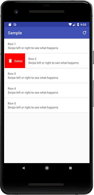
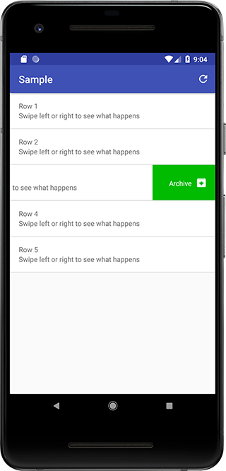
A simple utility class to add a background and/or an icon and/or a label while swiping a RecyclerView item left or right.
A simple utility class to add a background, an icon and a label to a RecyclerView item while swiping it left or right.


Get it via Gradle
implementation 'it.xabaras.android:recyclerview-swipedecorator:1.4'
or Maven
<dependency>
  <groupId>it.xabaras.android</groupId>
  <artifactId>recyclerview-swipedecorator</artifactId>
  <version>1.4</version>
  <type>pom</type>
</dependency>
In version 1.3 RecyclerViewSwipeDecorator migrated to AndroidX
Here is a non-comprehensive guide to RecyclerViewSwipeDecorator for any further information you can reference the library javadoc, the sources and/or the sample app sources.
Create an ItemTouchHelper.SimpleCallback, instantiate an ItemTouchHelper with this callback and attach it to your RecyclerView
ItemTouchHelper.SimpleCallback callback = new ItemTouchHelper.SimpleCallback(0, ItemTouchHelper.RIGHT | ItemTouchHelper.LEFT) {
    @Override
    public boolean onMove(RecyclerView recyclerView, RecyclerView.ViewHolder viewHolder, RecyclerView.ViewHolder target) {
        return false;
    }

    @Override
    public void onSwiped(RecyclerView.ViewHolder viewHolder, int direction) {
        // Take action for the swiped item
    }
};
ItemTouchHelper itemTouchHelper = new ItemTouchHelper(callback);
itemTouchHelper.attachToRecyclerView(recyclerView);
Override the onChildDrawn method of your SimpleCallback object
@Override
public void onChildDraw (Canvas c, RecyclerView recyclerView, RecyclerView.ViewHolder viewHolder,float dX, float dY,int actionState, boolean isCurrentlyActive){
    super.onChildDraw(c, recyclerView, viewHolder, dX, dY, actionState, isCurrentlyActive);
}
Create a RecyclerViewSwipeDecorator using the RecyclerViewSwipeDecoratorBuilder and call the decorate() method
public void onChildDraw (Canvas c, RecyclerView recyclerView, RecyclerView.ViewHolder viewHolder,float dX, float dY,int actionState, boolean isCurrentlyActive){

    new RecyclerViewSwipeDecorator.Builder(c, recyclerView, viewHolder, dX, dY, actionState, isCurrentlyActive)
            .addBackgroundColor(ContextCompat.getColor(MainActivity.this, R.color.my_background))
            .addActionIcon(R.drawable.my_icon)
            .create()
            .decorate();

    super.onChildDraw(c, recyclerView, viewHolder, dX, dY, actionState, isCurrentlyActive);
}
You can choose different background/icon combinations for left and right swipe directions by using direction specific methods in the Builder object. If you want you can add a label for each swiping direction or setting the icon tint.
A method to set the action icon margin from the view left/right bound it available too.
Add a background color to either (left/right) swipe directions
Add an action icon to either (left/right) swipe directions
Set the tint color for either (left/right) action icons
Add a corner radius to swipe background for either (left/right) swipe directions
Add padding to the swipe background for either (left/right) swipe directions
Add a background color to the view while swiping right.
Add an action icon while swiping right (it's suggested to use 24dp square vector drawables.).
Set the tint color for action icon shown while swiping right
Add a background color to the view while swiping left.
Add an action icon while swiping left (it's suggested to use 24dp square vector drawables.).
Set the tint color for action icon shown while swiping left
Set icon horizontal margin from left/right bound of the view (default is 16dp).
Unit is a TypedValue (e.g. TypedValue.COMPLEX_UNIT_DIP)
Add a label to be shown while swiping right
Set the color of the label to be shown while swiping right
Set the size of the label to be shown while swiping right
Unit is a TypedValue (e.g. TypedValue.COMPLEX_UNIT_SP)
Set the Typeface of the label to be shown while swiping right
Add a label to be shown while swiping left
Set the color of the label to be shown while swiping left
Set the size of the label to be shown while swiping left
Unit is a TypedValue (e.g. TypedValue.COMPLEX_UNIT_SP)
Set the Typeface of the label to be shown while swiping left
Add a corner radius to swipe background for left swipe direction
Add a corner radius to swipe background for right swipe direction
Add a corner radius to swipe background for right swipe direction
Add a corner radius to swipe background for left swipe direction
FAQs
A simple utility class to add a background and/or an icon and/or a label while swiping a RecyclerView item left or right.
We found that it.xabaras.android:recyclerview-swipedecorator demonstrated a not healthy version release cadence and project activity because the last version was released a year ago. It has 0 open source maintainers collaborating on the project.
Did you know?

Socket for GitHub automatically highlights issues in each pull request and monitors the health of all your open source dependencies. Discover the contents of your packages and block harmful activity before you install or update your dependencies.

Research
Four npm packages disguised as cryptographic tools steal developer credentials and send them to attacker-controlled Telegram infrastructure.

Security News
Ruby maintainers from Bundler and rbenv teams are building rv to bring Python uv's speed and unified tooling approach to Ruby development.

Security News
Following last week’s supply chain attack, Nx published findings on the GitHub Actions exploit and moved npm publishing to Trusted Publishers.