
Security News
Crates.io Users Targeted by Phishing Emails
The Rust Security Response WG is warning of phishing emails from rustfoundation.dev targeting crates.io users.
By Sarah Gooding - Sep 12, 2025
one.xcorp.widget:swipe-picker
Advanced tools
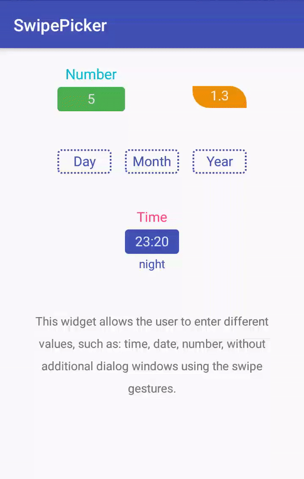
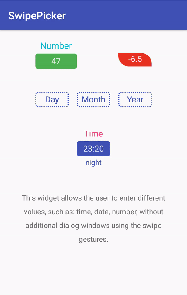
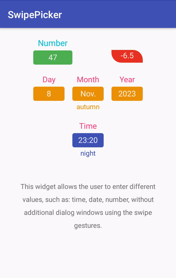
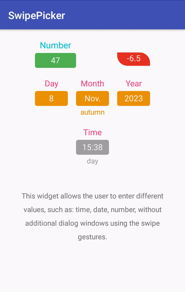
A widget for Android that allows the user to enter different values, such as: time, date, number, without additional dialog windows using the swipe gestures.


SwipePicker - a widget for Android that allows the user to enter different values, such as: time, date, number, without additional dialog windows using the swipe gestures.
To use SwipePicker in your projects, simply add the library as a dependency to your module build.gradle.
dependencies {
implementation 'one.xcorp.widget:swipe-picker:1.2.0'
}
<dependency>
    <groupId>one.xcorp.widget</groupId>
    <artifactId>swipe-picker</artifactId>
    <version>1.2.0</version>
    <type>pom</type>
</dependency>
Alternatively you can directly import the /swipepicker module or swipe-picker-1.2.0.aar file into your Android Studio project and add it as a dependency in your build.gradle.
SwipePicker can be added as a custom view to any layout. For more detailed code example to use the library, please refer to the /sample app.
 <one.xcorp.widget.swipepicker.SwipePicker
        android:layout_width="wrap_content"
        android:layout_height="wrap_content"
        android:hint="Hello"
        app:maxValue="10"
        app:minValue="1"
        app:value="5" />
You can then either set the xml parameters to configure the view or do it programmatically. You can also receive notifications of status changes:
 swipepicker.setOnStateChangeListener(object : SwipePicker.OnStateChangeListener {
            override fun onActivated(view: SwipePicker, isActivated: Boolean) {
                // called when view state is activated and show value.
            }
            override fun onPressed(view: SwipePicker, isPressed: Boolean) {
                // called when the user touches the view.
            }
            override fun onSelected(view: SwipePicker, isSelected: Boolean) {
                // called when the user activates keyboard input.
            }
        })
Or value changes:
swipepicker.setOnValueChangeListener(object : SwipePicker.OnValueChangeListener {
            override fun onValueChanged(view: SwipePicker, oldValue: Float, newValue: Float) {
                // is called when the value is changed.
            }
        })
You can also affect the currently displayed text for the value:
swipepicker.setValueTransformer(object : SwipePicker.ValueTransformer {
            override fun stringToFloat(view: SwipePicker, value: String): Float? {
                // convert the string to a value or in case of an error return
                // null in order not to disable the selection mode and leave
                // the keyboard active.
            }
            override fun floatToString(view: SwipePicker, value: Float): String? {
                // convert the value to a string, return null if you want
                // to display an empty value.
            }
        })
Finally, you can influence the calculation of values during the swipe gesture:
swipepicker.setScaleHandler(object : SwipePicker.ScaleHandler {
            override fun onStick(view: SwipePicker, value: Float): Float {
                // called when you want to stick a value to the scale,
                // return the value lying on the scale.
            }
            override fun onSwipe(view: SwipePicker, value: Float, division: Int): Float {
                // move from the specified value to the specified
                // number of divisions and return the result.
            }
        })
| Name | Type | Description |
|---|---|---|
| android:hint | string | allows you to specify prompt text. |
| android:state_activated | boolean | allows you to specify the state of the component. In the active mode, the entered value is displayed and input is available by gesture. |
| allowDeactivate | boolean | indicates whether the component can go into deactivate mode. |
| allowFling | boolean | allows you to enable/disable inertial scrolling gesture. |
| manualInput | boolean | allows you to enable/disable free entry of values from the keyboard. |
| android:inputType | flag | allows you to specify the type for entering values from the keyboard. See description values on this link. |
| Name | Type | Description |
|---|---|---|
| looped | boolean | allows you to enable/disable cycling of values on the scale. When the maximum value is reached, the motion starts again from the minimum to the maximum value and vice versa. |
| sticky | boolean | allows you to enable/disable the sticky scale. When the value is true, the user can specify only the values located on the scale. |
| scale | reference | specify an float array as a value. Use a scale with values when motion is required with non-uniform step. Above this scale, the movement continues with a fixed step. |
| anchor | float | specifies a scale with a single value. Use when you want to have a fixed step relative to any value. |
| minValue | float | allows you to set a lower limit for a value. |
| maxValue | float | allows you to set the upper limit for the value. |
| step | float | allows you to specify with which step to change the value when using a swipe gesture. Can be zero if only movement within the specified scale is necessary. |
| value | float | specify the initial value. |
| Name | Type | Description |
|---|---|---|
| android:minWidth | dimension | allows you to specify minimum width for component. |
| android:maxLength | integer | allows you to set the maximum number of characters to display the value. |
| hintTextAppearance | reference | allows you to specify a style for the prompt text. |
| inputTextAppearance | reference | allows you to specify a style for the value text. |
| backgroundInput | reference|color | lets you specify the color or image for the value input area. |
| backgroundInputTint | color | allows you to specify a color hue for the background image of the value input area. |
| backgroundInputTintMode | enum | allows you to specify the blending mode for the hue of the background image color. See description values on this link. |
| hoverViewStyle | string | allows you to specify a style for the pop-up value view. |
| Name | Type | Description |
|---|---|---|
| android:minWidth | dimension | allows you to specify minimum width for pop-up value view. |
| android:padding | dimension | allows you to specify an indent for the pop-up value view. |
| android:textSize | dimension | allows you to set the text size for the pop-up value. |
| android:textColor | reference|color | allows you to set the text color for the pop-up value. |
| android:color | color | allows you to set the background color for the pop-up value view. |
| colorTint | string | allows you to set the background hue for the pop-up value view. |
Tell me if you're using my library in your application, I'll share it in this README.
We use SemVer for versioning. For the versions available, see the tags on this repository.
See also the list of contributors who participated in this project.
MIT License

Copyright (c) 2018 Dmitriy Makarov

Permission is hereby granted, free of charge, to any person obtaining a copy
of this software and associated documentation files (the "Software"), to deal
in the Software without restriction, including without limitation the rights
to use, copy, modify, merge, publish, distribute, sublicense, and/or sell
copies of the Software, and to permit persons to whom the Software is
furnished to do so, subject to the following conditions:

The above copyright notice and this permission notice shall be included in all
copies or substantial portions of the Software.

THE SOFTWARE IS PROVIDED "AS IS", WITHOUT WARRANTY OF ANY KIND, EXPRESS OR
IMPLIED, INCLUDING BUT NOT LIMITED TO THE WARRANTIES OF MERCHANTABILITY,
FITNESS FOR A PARTICULAR PURPOSE AND NONINFRINGEMENT. IN NO EVENT SHALL THE
AUTHORS OR COPYRIGHT HOLDERS BE LIABLE FOR ANY CLAIM, DAMAGES OR OTHER
LIABILITY, WHETHER IN AN ACTION OF CONTRACT, TORT OR OTHERWISE, ARISING FROM,
OUT OF OR IN CONNECTION WITH THE SOFTWARE OR THE USE OR OTHER DEALINGS IN THE
SOFTWARE.
FAQs
A widget for Android that allows the user to enter different values, such as: time, date, number, without additional dialog windows using the swipe gestures.
We found that one.xcorp.widget:swipe-picker demonstrated a not healthy version release cadence and project activity because the last version was released a year ago. It has 0 open source maintainers collaborating on the project.
Did you know?

Socket for GitHub automatically highlights issues in each pull request and monitors the health of all your open source dependencies. Discover the contents of your packages and block harmful activity before you install or update your dependencies.
Security News
The Rust Security Response WG is warning of phishing emails from rustfoundation.dev targeting crates.io users.

Product
Socket now lets you customize pull request alert headers, helping security teams share clear guidance right in PRs to speed reviews and reduce back-and-forth.

Product
Socket's Rust support is moving to Beta: all users can scan Cargo projects and generate SBOMs, including Cargo.toml-only crates, with Rust-aware supply chain checks.