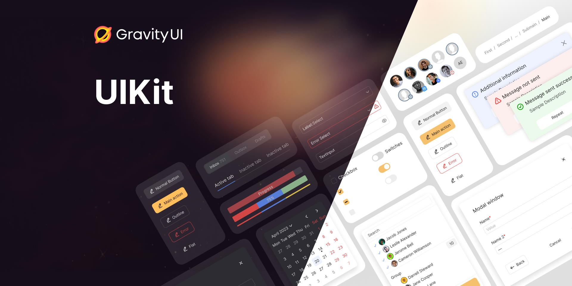
UIKit · 


A set of flexible, highly practical, and efficient React components for creating rich web applications.
Resources
Install
npm install --save-dev @gravity-ui/uikit
Usage
import {Button} from '@gravity-ui/uikit';

const SubmitButton = <Button view="action" size="l" />;
Styles
UIKit comes with base styling and theme. In order to everything look nice include this at the top of your entry file:
import '@gravity-ui/uikit/styles/fonts.css';
import '@gravity-ui/uikit/styles/styles.css';
UIKit supports different themes: light, dark and their contrast variants. Your app must be rendered inside ThemeProvider:
import {createRoot} from 'react-dom/client';
import {ThemeProvider} from '@gravity-ui/uikit';

const root = createRoot(document.getElementById('root'));
root.render(
  <ThemeProvider theme="light">
    <App />
  </ThemeProvider>,
);
It is possible to generate initial root CSS-classes during SSR to avoid theme flashing:
import {getRootClassName} from '@gravity-ui/uikit/server';

const theme = 'dark';
const rootClassName = getRootClassName({theme});

const html = `
<html>
  <body>
    <div id="root" class="${rootClassName}"></div>
  </body>
</html>
`;
Also, there is a SCSS mixins file with useful helpers to use in your app.
I18N
Some components contain text tokens (words and phrases). They come in two languages: en (default) and ru.
To set the language use configure function:
import {configure} from '@gravity-ui/uikit';
configure({
lang: 'ru',
});
Development
To start the development server with storybook run the following:
git clone git@github.com:gravity-ui/uikit.git
cd uikit
npm ci
npm run start


