
Research
2025 Report: Destructive Malware in Open Source Packages
Destructive malware is rising across open source registries, using delays and kill switches to wipe code, break builds, and disrupt CI/CD.
By Kush Pandya - Dec 24, 2025
@aasatech/react-native-alert-notification
Advanced tools
Toast notification and dialog box notification for react native
| Theme Light | Theme Dark |
|---|---|
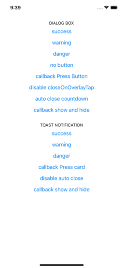 |  |
| Theme Light | Theme Dark |
|---|---|
 |  |
yarn add react-native-alert-notification
yarn add react-native-safe-area-context

pod install
expo install react-native-safe-area-context
import { ALERT_TYPE, Dialog, AlertNotificationRoot, Toast } from 'react-native-alert-notification';

<AlertNotificationRoot>
  <View>
    // dialog box
    <Button
      title={'dialog box'}
      onPress={() =>
        Dialog.show({
          type: ALERT_TYPE.SUCCESS,
          title: 'Success',
          textBody: 'Congrats! this is dialog box success',
          button: 'close',
        })
      }
    />
    // toast notification
    <Button
      title={'toast notification'}
      onPress={() =>
        Toast.show({
          type: ALERT_TYPE.SUCCESS,
          title: 'Success',
          textBody: 'Congrats! this is toast notification success',
        })
      }
    />
  </View>
</AlertNotificationRoot>;
A React node that will be most likely wrapping your whole app.
| Name | Description | Require | Default | Type |
|---|---|---|---|---|
| theme | select theme light dark (by default is auto) | auto | 'light','dark' | |
| colors | custom colors | [IColors, IColors] | ||
| dialogConfig | config dialog box global | {closeOnOverlayTap:bool, autoClose:bool / number} | ||
| toastConfig | config toast global | {autoClose:bool / number, titleStyle?: StyleProp , textBodyStyle?: StyleProp} |
type IProps = {
  dialogConfig?: Pick<IConfigDialog, 'closeOnOverlayTap' | 'autoClose'>;
  toastConfig?: Pick<IConfigToast, 'autoClose' | 'titleStyle' | 'textBodyStyle'>;
  theme?: 'light' | 'dark';
  colors?: [IColors, IColors] /** ['light_colors' , 'dark_colors'] */;
};
type IColors = {
  label: string;
  card: string;
  overlay: string;
  success: string;
  danger: string;
  warning: string;
};
| Name | Description | Require | Default | Type |
|---|---|---|---|---|
| title | The title text | String | ||
| type | Defines the type ("Success", "Warning" or "Error") | true | "SUCCESS", "DANGER", "WARNING" | |
| textBody | The text body | String | ||
| button | name button (for hide button: undefined) | String | ||
| autoClose | Defines time auto close dialog box in ms | face | bool / number | |
| closeOnOverlayTap | allow close if click in overlay | true | bool | |
| onPressButton | (if not declared and isset button action is close) | String | () => void | |
| onShow | action after end animation open | () => void | ||
| onHide | action after end animation close | () => void |
type IConfig = {
  type: ALERT_TYPE;
  title?: string;
  textBody?: string;
  button?: string;
  autoClose?: number | boolean;
  closeOnOverlayTap?: boolean;
  onPressButton?: () => void;
  onShow?: () => void;
  onHide?: () => void;
};
| Name | Description | Require | Default | Type |
|---|---|---|---|---|
| title | The title text | String | ||
| type | Defines the type ("Success", "Warning" or "Error") | "SUCCESS", "DANGER", "WARNING" | ||
| textBody | The text body | String | ||
| autoClose | Defines time auto close dialog box in ms | 5000 | bool / number | |
| onPress | action click in card | bool | ||
| onShow | event after end animation open | () => void | ||
| onHide | event after end animation close | () => void |
type IConfig = {
  type?: ALERT_TYPE;
  title?: string;
  textBody?: string;
  autoClose?: number | boolean;
  titleStyle?: StyleProp<TextStyle>;
  textBodyStyle?: StyleProp<TextStyle>;
  onPress?: () => void;
  onShow?: () => void;
  onHide?: () => void;
};
// For Dialog Box
Dialog.hide();

// For Toast Notification
Toast.hide();
Rodolphe Jerez | https://codingbyjerez.com
See the contributing guide to learn how to contribute to the repository and the development workflow.
MIT
FAQs
Toast notification and dialog box notification for react native
We found that @aasatech/react-native-alert-notification demonstrated a not healthy version release cadence and project activity because the last version was released a year ago. It has 1 open source maintainer collaborating on the project.
Did you know?

Socket for GitHub automatically highlights issues in each pull request and monitors the health of all your open source dependencies. Discover the contents of your packages and block harmful activity before you install or update your dependencies.
Research
Destructive malware is rising across open source registries, using delays and kill switches to wipe code, break builds, and disrupt CI/CD.

Security News
Socket CTO Ahmad Nassri shares practical AI coding techniques, tools, and team workflows, plus what still feels noisy and why shipping remains human-led.

Research
/Security News
A five-month operation turned 27 npm packages into durable hosting for browser-run lures that mimic document-sharing portals and Microsoft sign-in, targeting 25 organizations across manufacturing, industrial automation, plastics, and healthcare for credential theft.