Product
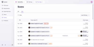
Introducing Pull Request Stories to Help Security Teams Track Supply Chain Risks
Socket’s new Pull Request Stories give security teams clear visibility into dependency risks and outcomes across scanned pull requests.
@ape.swap/bonds-sdk
Advanced tools
The @ape.swap/bonds-sdk package provides an embeddable set of tools and UI components to integrate and manage bond-related functionalities for multi-chain environments. This SDK simplifies the process of displaying, interacting with, and customizing bond-related user interfaces in your projects.
<FullBondsView />, <Bonds/> & <YourBonds />.To install the package via npm or yarn, run the following command:
# With npm
npm install @ape.swap/bonds-sdk

# With yarn
yarn add @ape.swap/bonds-sdk
Here's an example of how to integrate the @ape.swap/bonds-sdk package into your project:
import React from 'react'
import { FullBondsView, ChainId } from '@ape.swap/bonds-sdk'
import '@ape.swap/bonds-sdk/dist/styles.css'
import 'swiper/swiper.min.css'

const MyBondsComponent = () => {
  return (
    <FullBondsView
      referenceId="yourProjectId"
      chains={[
        ChainId.BSC,
        ChainId.BASE,
        ChainId.MATIC,
        ChainId.MAINNET,
        ChainId.ARBITRUM,
        ChainId.LIGHTLINK,
        ChainId.LINEA,
        ChainId.GRAPHLINQ,
        ChainId.IOTA,
        ChainId.CROSSFI,
        ]}
      useRainbowKit={true}
      useHotBonds={true}
      theme={{
        "radii": "10px",
        customFont: 'Poppins',
        "colors": {
            "primaryButton": "#6560C5",
            "white1": "#0E0D16",
            "white2": "#161420",
            "white3": "#1F1D29",
            "white4": "#282632",
            "white5": "#312F3A",
            "text": "#FAFAFA",
            "primaryBright": "#FFF"
            }
        }}
    />
  )
}

export default MyBondsComponent
The core of the SDK lies in its config object params, passed as a prop to its components. Below is a breakdown of key options:
| Property | Type | Description |
|---|---|---|
referenceId | string | A unique identifier for the bonds, shall be provided by ApeBond team. |
chains | Array | An array of supported chain IDs (e.g., 56, 1, 137, etc). It also determines the order of the chains on the bond list. |
useRainbowKit | boolean | Whether to enable RainbowKit for wallet connections. Might be replaced for an enum in the near future. |
useHotBonds | boolean | Whether to show the "hot bonds" component. |
theme | Object (optional) | This is how you can customize the styles of the SDK. Override styles like colors, typography, and layout settings to match your project's branding. |
tokenSymbol | string[] | This parameter is specific to the <SingleBond /> component. It defines the token(s) to display in the UI. Currently, only a single token (one element in the array) is supported. |
The SDK currently supports the following chains:
The list get updated constantly, so make sure to use latest version of the SDK.
The package comes with prebuilt styles that you must import in your project. Make sure to include the following CSS files:
import '@ape.swap/bonds-sdk/dist/styles.css'
import 'swiper/swiper.min.css'
These styles ensure that the components render correctly and include all necessary design details. You can customize or override styles using your own branding.
You can test and visualize the different customization options on the SDK styling playground (beta):
Once you are happy with the styles, make sure to copy the output styles object and paste it under the theme param on the SDK component you will be using.
To use a custom font in the theme, include the customFont property with the name of your desired font family. Please note that you will need to manually download the font and embed it in your project using a <script> or <link> tag in your HTML file.
Bear in mind, that the components of the SDK will use the width and height provided by the parent component.
The following are some key dependencies you must have for the SDK to work properly:
For questions, issues, or contributions, reach out to ApeBond or contact us on Telegram .
This package is licensed under the MIT License.
FAQs
Ape Bond SDK
We found that @ape.swap/bonds-sdk demonstrated a healthy version release cadence and project activity because the last version was released less than a year ago. It has 8 open source maintainers collaborating on the project.
Did you know?

Socket for GitHub automatically highlights issues in each pull request and monitors the health of all your open source dependencies. Discover the contents of your packages and block harmful activity before you install or update your dependencies.

Product
Socket’s new Pull Request Stories give security teams clear visibility into dependency risks and outcomes across scanned pull requests.

Research
/Security News
npm author Qix’s account was compromised, with malicious versions of popular packages like chalk-template, color-convert, and strip-ansi published.

Research
Four npm packages disguised as cryptographic tools steal developer credentials and send them to attacker-controlled Telegram infrastructure.