Product
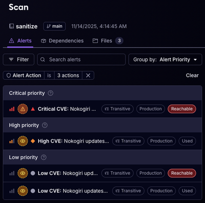
Reachability for Ruby Now in Beta
Reachability analysis for Ruby is now in beta, helping teams identify which vulnerabilities are truly exploitable in their applications.
@ar-dacity/ardacity-text-pressure
Advanced tools
A React component library that adds dynamic pressure effects to text using variable fonts.
npm install @ar-dacity/ardacity-text-pressure
or
yarn add @ar-dacity/ardacity-text-pressure
When you install this package, it automatically:
components/ArDacityUi directory in your project (if it doesn't exist)TextPressure subdirectoryTextPressure.jsxindex.jsAfter installation, you can import the component directly from your components directory:
import TextPressure from './components/ArDacityUi/TextPressure/TextPressure';
// Or simply:
import { TextPressure } from './components/ArDacityUi/TextPressure';

function App() {
  return (
    <div style={{position: 'relative', height: '300px'}}>
      <TextPressure
        text="Ardacity!"
        flex={true}
        alpha={false}
        stroke={false}
        width={true}
        weight={true}
        italic={true}
        textColor="#ffffff"
        strokeColor="#ff0000"
        minFontSize={36}
      />
    </div>
  );
}
| Property | Type | Default | Description |
|---|---|---|---|
| text | string | "ardacity" | Text content that will be displayed and animated. |
| fontFamily | string | "ardacity VF" | Name of the variable font family. |
| fontUrl | string | (ardacity font URL) | URL for the variable font file (needed) |
| flex | boolean | true | Whether the characters are spaced using flex layout. |
| scale | boolean | false | If true, vertically scales the text to fill its container height. |
| alpha | boolean | false | If true, applies an opacity effect based on cursor distance. |
| stroke | boolean | false | If true, adds a stroke effect around characters. |
| width | boolean | true | If true, varies the variable-font "width" axis. |
| weight | boolean | true | If true, varies the variable-font "weight" axis. |
| italic | boolean | true | If true, varies the variable-font "italics" axis. |
| textColor | string | auto | The fill color of the text. Automatically adapts to light/dark themes when not specified. |
| strokeColor | string | "#FF0000" | The stroke color that will be applied to the text when "stroke" is set to true |
| strokeWidth | number | 2 | The width of the stroke in pixels |
| className | string | "" | Additional class for styling the <h1> wrapper. |
| minFontSize | number | 24 | Sets a minimum font-size to avoid overly tiny text on smaller screens. |
<TextPressure
  text="Custom Font"
  fontFamily="My Variable Font"
  fontUrl="https://example.com/path/to/my-variable-font.woff2"
  width={true}
  weight={true}
  italic={false}
  textColor="#000000"
/>
You can also use the component with minimal configuration:
<TextPressure/>
This will render the component with all default settings and automatic text color based on theme.
This package is compatible with:
MIT
FAQs
Dynamic text pressure effects for React applications
We found that @ar-dacity/ardacity-text-pressure demonstrated a healthy version release cadence and project activity because the last version was released less than a year ago. It has 1 open source maintainer collaborating on the project.
Did you know?

Socket for GitHub automatically highlights issues in each pull request and monitors the health of all your open source dependencies. Discover the contents of your packages and block harmful activity before you install or update your dependencies.

Product
Reachability analysis for Ruby is now in beta, helping teams identify which vulnerabilities are truly exploitable in their applications.

Research
/Security News
Malicious npm packages use Adspect cloaking and fake CAPTCHAs to fingerprint visitors and redirect victims to crypto-themed scam sites.

Security News
Recent coverage mislabels the latest TEA protocol spam as a worm. Here’s what’s actually happening.