Security News
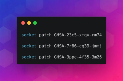
minimatch Patches 3 High-Severity ReDoS Vulnerabilities
minimatch patched three high-severity ReDoS vulnerabilities that can stall the Node.js event loop, and Socket has released free certified patches.
@asphalt-react/button
Advanced tools
Buttons provide a way to trigger an action. The caption of a Button should hint what action it'll perform. The caption is typically text but Buttons can also have an icon with text or just an icon (which we call as Icon Button).
Buttons's caption decides its width by default, but it can also stretch to take its container's width. Buttons can form a group by sticking to each other enabling use cases like split button.
import { Button } from '@asphalt-react/button'
<Button>Click me</Button>
Buttons come in 4 variants to emphasize different levels:
There are 3 intents, which paired with the above variants address multiple supportive actions:
Variants and an intents are mutually exclusive. Button falls back to the default value if a variant or intent occurs more than once. For example, using primary and nude together will fallback to a primary variant.
Buttons support 4 sizes: - extra small (xs) - small (s) - medium (m) - large (l)
Button features the ability to render a semantic link styled as a button (which we call Link Button). Link Buttons and Icon Link Buttons — icon as caption — handle security and privacy risks if the link opens in a new tab.
You can make a split button by grouping a default action button with a menu button.
Set stickEnd to true on start button and stickStart to true on the end button.
Use stick prop optionally on the the end button to enhance it's style in order to make default and menu button look good together. stick adds spacing to the left of the primary, tertiary & nude variant buttons, in case of secondary variant it removes the left border.
import { Button } from '@asphalt-react/button'

<div>
    <Button stickEnd>Default action</Button>
    <Button stickStart stick>Menu</Button>
</div>
Buttons accept React ref to give access to the underlying element.
They accept most of the button element's attributes such as disabled & onClick and supports data-* attributes.
The rendered button element has a type attribute set to "button". You may override the type attribute if needed.
All buttons are focusable and keyboard navigable; tab (or shift+tab when tabbing backwards).
space and enter keys trigger the buttons when in focus.
enter key triggers the link buttons when in focus.
All buttons accept the aria-* attributes button role.
Link buttons accept the aria-* attributes for the link role.
Add aria-label or aria-labelledby in Icon Button to help assistive technologies.
React node for button's caption
| type | required | default |
|---|---|---|
| node | true | N/A |
Renders a primary variant
| type | required | default |
|---|---|---|
| bool | false | false |
Renders a secondary variant
| type | required | default |
|---|---|---|
| bool | false | false |
Renders a tertiary variant
| type | required | default |
|---|---|---|
| bool | false | false |
Renders a nude variant
| type | required | default |
|---|---|---|
| bool | false | false |
Renders brand intent
| type | required | default |
|---|---|---|
| bool | false | false |
Renders danger intent
| type | required | default |
|---|---|---|
| bool | false | false |
Renders system intent
| type | required | default |
|---|---|---|
| bool | false | false |
Renders a link button
| type | required | default |
|---|---|---|
| bool | false | false |
Link element to render. Accepts an HTML element or a React component.
| type | required | default |
|---|---|---|
| elementType | false | "a" |
Accepts props & attributes for the link element.
| type | required | default |
|---|---|---|
| object | false | { href: "." } |
Renders an icon button
| type | required | default |
|---|---|---|
| bool | false | false |
Shrinks the size of the Button keeping the size of the contents intact. Useful for use-cases with space-constraints.
| type | required | default |
|---|---|---|
| bool | false | false |
Qualifier is an icon or a word that enhances the caption. Button prepends the qualifier by default. Accepts SVG for icons. Checkout @asphalt-react/iconpack for SVG wrapped React components.
⚠️ Do not use
qualifierto render an icon button, useiconprop instead
| type | required | default |
|---|---|---|
| union | false | null |
Appends qualifier to the caption
| type | required | default |
|---|---|---|
| bool | false | false |
Controls size of button. Possible values are "xs", "s", "m", "l" for extra small, small, medium & large respectively
| type | required | default |
|---|---|---|
| enum | false | "m" |
Stretches Button to take it's container width
| type | required | default |
|---|---|---|
| bool | false | false |
Adapts to let other buttons stick to its start
| type | required | default |
|---|---|---|
| bool | false | false |
Adapts to let other buttons stick to its end
| type | required | default |
|---|---|---|
| bool | false | false |
Enhances the style of the supporting button.
| type | required | default |
|---|---|---|
| bool | false | false |
Adds underline in link Button
| type | required | default |
|---|---|---|
| bool | false | true |
FAQs
Did you know?

Socket for GitHub automatically highlights issues in each pull request and monitors the health of all your open source dependencies. Discover the contents of your packages and block harmful activity before you install or update your dependencies.

Security News
minimatch patched three high-severity ReDoS vulnerabilities that can stall the Node.js event loop, and Socket has released free certified patches.

Research
/Security News
Socket uncovered 26 malicious npm packages tied to North Korea's Contagious Interview campaign, retrieving a live 9-module infostealer and RAT from the adversary's C2.

Research
An impersonated golang.org/x/crypto clone exfiltrates passwords, executes a remote shell stager, and delivers a Rekoobe backdoor on Linux.