@astro-bryceguy/dropdown(Deprecated)
NOTE
This component is old and deprecated, you can find a better version of this component here: astro-headless-ui
A easy to use dropdown component made using XElement
This was a project that I created for fun to explore how astro-xelement works. If you need a dropdown component you are probably better off using a more popular/stable/kown library
Changes
- WIP dropdowns in dropdowns: working on proper collpasing
- Patched problems with collpasing
Features
- Dropdowns in dropdowns WIP
- Can be used as a user selection input
- Tab navigable
- Toggle focus opening
- Toggle focus locking
- Toggle collapse on focus lost
- Collapse on pressing esc
- Customizable
- Themes
How to use
Install:
npm i @astro-bryceguy/dropdown
Built in tailwindcss themes:
If your using a built in theme that uses tailwind, add the package to your tailwindcss config so it picks up the classes
{
    content: ['./node_modules/@astro-bryceguy/**/*.js']
}
Basic Dropdowns:
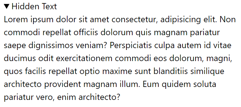
<Dropdown collapse={false}  is="section" text="Hidden Text">
    <p>Lorem ipsum dolor sit amet consectetur, adipisicing elit. Non commodi repellat officiis dolorum quis magnam pariatur saepe dignissimos veniam? Perspiciatis culpa autem id vitae ducimus odit exercitationem commodi eos dolorum, magni, quos facilis repellat optio maxime sunt blanditiis similique architecto provident magnam illum. Eum quidem soluta pariatur vero, enim architecto?</p>
</Dropdown>
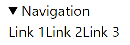
<Dropdown text="Navigation">
    <a href="/">Link 1</a>
    <a href="/">Link 2</a>
    <a href="/">Link 3</a>
</Dropdown>
Themes:
Use built in themes or create your own
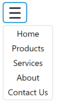
<Dropdown theme="tailwindHamburger">
    <a href="/">Home</a>
    <a href="/">Products</a>
    <a href="/">Services</a>
    <a href="/">About</a>
    <a href="/">Contact Us</a>
</Dropdown>
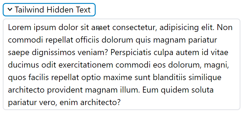
<Dropdown theme="tailwind" collapse={false} is="section" text="Tailwind Hidden Text">
    <p>Lorem ipsum dolor sit amet consectetur, adipisicing elit. Non commodi repellat officiis dolorum quis magnam pariatur saepe dignissimos veniam? Perspiciatis culpa autem id vitae ducimus odit exercitationem commodi eos dolorum, magni, quos facilis repellat optio maxime sunt blanditiis similique architecto provident magnam illum. Eum quidem soluta pariatur vero, enim architecto?</p>
</Dropdown>
Selection Input:
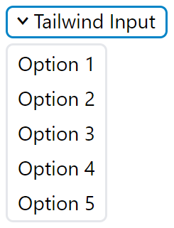
<Dropdown
    open={true}
    lock={true}
    theme="tailwind"
    id="tailwind-input"
    text="Tailwind Input"
    value="option-1"
    options={{
        'Option 1': 'option-1',
        'Option 2': 'option-2',
        'Option 3': 'option-3',
        'Option 4': 'option-4',
        'Option 5': 'option-5'
    }}
/>
Styling
Using Props:
Style using the theme prop using the built in themes: inline, tailwind, tailwindHamburger or by making your own
Make sure to add the module to tailwind.config.cjs if using the tailwind theme
module.exports = {
  content: [
    './node_modules/@astro-bryceguy/dropdown/theme.js',
  ]
}
Community Themes:
If you want to add your themes to the project add them to the themes.js file and submit a PR
Themes defined inside the themes.js file can be refrenced using a string of its exported name
Using a stylesheet:
You can also import a style sheet using the following selectors for a global dropdown style
This stylesheet is styled like the built in tailwind theme
/* Dropdown container */
details {
	outline: none;
}
/* Dropdown toggle */
summary {
    cursor: pointer;
    outline: none;
    line-height: 1;
    display: flex !important;
    align-items: center;
    gap: .25rem;
    padding: .2rem .5rem .25rem .5rem;
    border-radius: 5px;
    border: 2px solid lightgray;
}
/* Remove default marker */
summary::marker {
    content: none;
}
/* Custom dropdown marker */
summary::before {
    content: '>';
    line-height: 1;
    display: inline-block;
    font-family: monospace;
    font-weight: bold;
    font-size: 1.25rem;
}
/* Style toggle element if dropdown is open */
details[open] summary::before {
    transform: rotate(90deg);
}
/* Remove default outline style */
summary:focus-visible {
    outline: none;
}
summary:focus {
    border-color: #0284C7;
}

/* Dropdown content element */
summary + * {
    z-index: 10;
    overflow: hidden;
    position: absolute;
    display: flex;
    flex-direction: column;
    margin-top: .25rem !important;
    background-color: white;
    border-radius: 5px;
    border: 2px solid lightgray;
}
summary + *:focus-within {
    border: 2px solid #0284C7;
}

/* Children inside of dropdown content */
summary + * > * {
    outline: none;
    padding: .2rem .5rem !important;
}
summary + * > *:hover {
    background-color: lightgrey;

}
summary + *:focus-within > *:focus-within {
    background-color: lightgrey;

}
Slots
<details>
    <slot name="first" />
    <summary>
        <slot name="toggle-before" />
        {text}
        <slot name="toggle-after" />
    </summary>
    <slot name="before" >
    <{is}>
        <slot name="content-before" />
        {options}
        <slot />
    <{is}>
    <slot name=last" />
</details>
API
is
Type: string
Default: div
Defines the dropdown content element's tag (the element being hidden) for semantics. If your creating a navigation use nav, if using the options prop use menu, etc
id
Type: string
Use the id of the dropdown to get its value if using as a user selection input
document.getElementByID('id').value
text
Type: string
Set the text inside of the toggle element
value
Type: string
Set the value of the dropdown, acts a default value when using dropdown as an input
Use id to retrieve value
document.getElementByID('id').value
options
Type: {}
Each key/value pair creates a button inside of the content element turning the dropdown into a user input with selectable options
key: Defines the name/text inside of the button
value: Defines the value that will be applied to the dropdown element
tab
Type: boolean
Default: true
Adds tabindex="0" attribute to all children of the dropdown's content element, allows the content of the dropdown to be tab navigable
esc
Type: boolean
Default: true
Escape key will close the dropdown if true
open
Type: boolean
Default: false
Opens drop down when focused, useful for automatically opening for tab navigation
lock
Type: boolean
Default: false
Focus lock, if using tab to navigate you cannot leave dropdown unless you lose focus on it, loops tab navigation back to dropdown toggle
collapse
Type: boolean
Default: true
Close dropdown if focus is lost on dropdown
theme
Type:
'inline', 'tailwind', 'tailwindHamburger' |
{
    container: {},
    toggle: {},
    content: {},
    options: {}
}
Customize the attributes of each elemenet inside of your drop down
Themes defined inside the themes.js file can be refrenced using a string of its exported name
How theme attributes are spread to dropdown elements:
<details {...container}>
    <summary {...toggle}>
    </summary>
    <{is} {...content}>
        <buttons {...options}></buttons>
    <{is}>
</details>
Custom Theme Examples
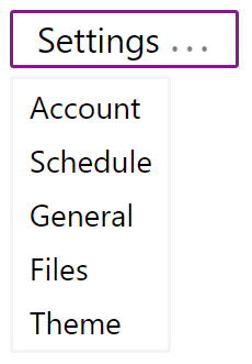
<Dropdown
    id="custom-nav"
    text="Settings"
    theme={{
        container: {
            class: 'group flex items-center',
        },
        toggle: {
            class: "relative flex items-end gap-1 px-3 py-1 rounded-sm border-2 select-none leading-none whitespace-nowrap text-lg marker:content-none after:inline-block after:leading-none after:font-mono after:font-bold after:text-sm after:content-['...'] focus-visible:outline-none focus:border-fuchsia-800 group-open:after:animate-pulse"
        },
        content: {
            class: 'z-10 absolute flex flex-col justify-start mt-1 rounded-sm bg-white border-2 border-gray-100 focus-within:border-fuchsia-800 focus-within:[&>*]:outline-none hover:[&>*]:bg-gray-100 focus:[&>*]:bg-gray-100'
        },
        options: {
            class: 'overflow-hidden px-2 py-0.5 hover:bg-neutral-100 text-left'
        }
    }}
>
    <a href="/">Account</a>
    <a href="/">Schedule</a>
    <a href="/">General</a>
    <a href="/">Files</a>
    <a href="/">Theme</a>
</Dropdown>
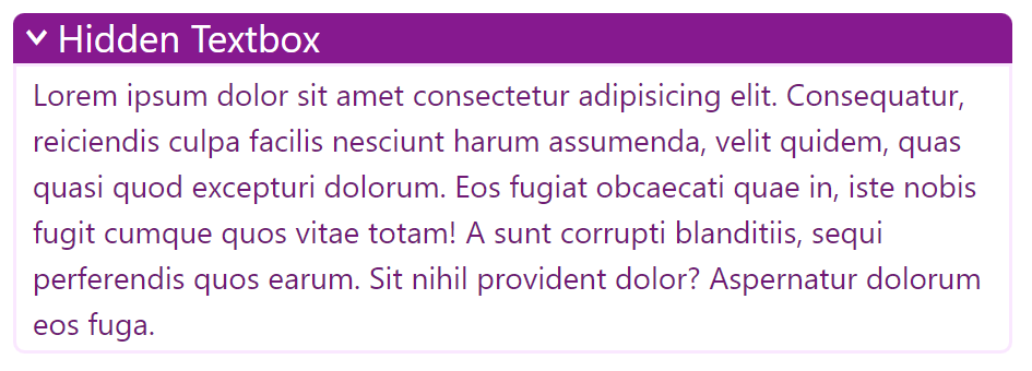
<Dropdown
    collapse={false}
    is="section"
    id="custom-text"
    text="Hidden Textbox"
    theme={{
        container: {
            class: 'group flex items-center w-6/12',
        },
        toggle: {
            class: "flex items-center gap-1 px-2 pt-0.5 pb-1 bg-fuchsia-800 rounded-md group-open:rounded-t-md group-open:rounded-b-none select-none leading-none whitespace-nowrap text-white text-xl marker:content-none before:inline-block before:leading-none before:font-mono before:font-bold before:content-['>'] focus-visible:outline-none group-open:before:rotate-90"
        },
        content: {
            class: 'flex flex-col justify-start bg-white rounded-b-md border-2 border-fuchsia-100 text-fuchsia-900 focus-within:border-fuchsia-800 [&>*]:px-2 [&>*]:py-0.5 [&>*]:text-left focus-within:[&>*]:outline-none'
        },
        options: {}
    }}
>
    <p>Lorem ipsum dolor sit amet consectetur adipisicing elit. Consequatur, reiciendis culpa facilis nesciunt harum assumenda, velit quidem, quas quasi quod excepturi dolorum. Eos fugiat obcaecati quae in, iste nobis fugit cumque quos vitae totam! A sunt corrupti blanditiis, sequi perferendis quos earum. Sit nihil provident dolor? Aspernatur dolorum eos fuga.</p>
</Dropdown>