@astro-bryceguy/rating (Deprecated)
NOTE
This component is old and deprecated, you can find a better version of this component here: astro-headless-ui
A component that uses stars to display a rating for reviews, products, comments, etc
Changes
- Created built in themes
inline, flip, and hearts
- Moved
icon, active, half, inactive props to the theme prop
- Added slots
- Removed total prop
Features
- Shows a rate (2/5, 7.5/10, etc) using stars
- Supports displaying half stars
- Uses astro-icon to serve thousands of popular icon svgs
- Fully customize every elements tag, text, innerHTML, and attributes using astro-json-elements
How to use
Install:
npm i @astro-bryceguy/rating
Add to astro config:
export default defineConfig({
  vite: {
    ssr: {
      external: ["svgo"],
    },
  },
});
Built in tailwindcss themes:
If your using a built in theme that uses tailwind, add the package to your tailwindcss config so it picks up the classes
{
    content: ['./node_modules/@astro-bryceguy/**/*.js']
}
Define default icon svgs:
Icon Defaults
If these icons are not added the default style of the icon will load in as a black box and there will be console errors
Download the icons folder above and put inside your projects src folder if using the default icons
The default icon names are star-active, star-half, and star-inactive take advantage of the local icons feature in astro-icon to serve a local icon svg by default
src/
    icons/
        star-active.svg
        star-half.svg
        star-inactive.svg
    components
    layouts
    pages
Read more about how icons work using astro-icon
Default Styling:

<Rating max="5" rate="2.5"/>
astro-icon
Use astro-icons to customize the icons
//Using tailwindcss classes to style
<Rating
    rate="4.5"
    max="9"
    theme={
        container: {
            style: "display:flex;align-items:center;color:#F9A8D4;"
        },
        icon: {
            style: "height:1rem;width:1rem;"
        },
        active: {
            name: "line-md:heart-filled"
        },
        half: {
            name: "line-md:heart-filled-half"
        },
        inactive: {
            name: "line-md:heart"
        }
    }
/>
Slots
<container>
    <slot name="before-active"/>
    { active stars }
    <slot name="before-half"/>
    { half star }
    <slot name="before-inactive"/>
    { inactive stars }
    <slot />
</container>
API
max
Type: string | number
Default: 5
Max number of stars to display
rate
Type: string | number
Default: 0
A number less than max, represents number of activated stars
theme
Type: string | object
Themes: inline, flip, hearts
Theme objects allow you to customize your elements with astro-json-element props and attributes
interface Theme = {
    container?: {};
    icon?: {};
    active?: {};
    half?: {};
    inactive?: {};
}
container
Type: astro-json-element
Define what attributes/props the rating container will have
icon
Define what attribute all icons will have, Overwritten by theme props active, half, inactive
active
Type: astro-icon
Attributes/props to apply to all active star icons, overwrites icon attrs
half
Type: astro-icon
Attributes/props to apply to all half star icons, overwrites icon attrs
inactive
Type: astro-icon
Attributes/props to apply to all inactive star icons, overwrites icon attrs
...attrs
All other props will be spread to the ratings container
Examples
<Rating
    rate="3"
    max="5"
    theme={{
        container: {
            class: "flex items-center py-2 px-3 rounded-md bg-neutral-50 border border-blue-300"
        },
        icon: {
            class: "text-blue-300 w-4 h-4"
        },
        active: {
            name: "mdi:star"
        },
        half: {
            name: "mdi:star-half-full"
        },
        inactive: {
            name: "mdi:star-outline"
        }
    }}
/>
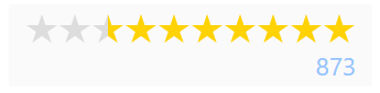
<div class="flex flex-col items-end gap-1 py-1 px-2 bg-neutral-50">
    <Rating
        rate="7.5"
        max="10"
        theme={{
            container: {
                class: "flex flex-row-reverse items-center"
            },
            icon: {
                class: "text-yellow-300 w-4 h-4"
            },
            half: {
                style: "transform:scale(-1, 1);"
            }
        }}
    />
    <span class="leading-none text-xs text-blue-300">873</span>
</div>
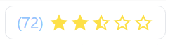
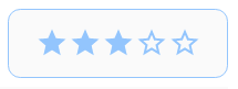
<div class="flex flex-row-reverse items-center gap-1 py-1 px-2 rounded-md border">
    <Rating
        rate="2.5"
        max="5"
        theme={{
            container: {
                class: "flex items-center"
            },
            icon: {
                class: "text-yellow-300 w-4 h-4",
            },
            active: {
                name: "mdi:star"
            },
            half: {
                name: "mdi:star-half-full"
            },
            inactive: {
                name: "mdi:star-outline"
            }
        }}
    />
    <span class="leading-none text-xs text-blue-300">(72)</span>
</div>
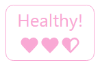
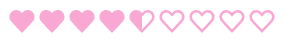
<div class="flex flex-col items-center py-1 px-2 rounded-md border border-pink-300 text-pink-300">
    <span class="mb-1 leading-none text-sm">Healthy!</span>
    <Rating
        rate="2.5"
        max="3"
        theme="hearts"
    />
</div>