Security News
MCP Steering Committee Launches Official MCP Registry in Preview
The MCP Steering Committee has launched the official MCP Registry in preview, a central hub for discovering and publishing MCP servers.
@awardit/formaggio
Advanced tools
The cheesy form library 🧀
npm i @awardit/formaggio
import {
  Form,
  isEmail,
  required,
  rules,
  useFormField,
} from "@awardit/formaggio";

const TextInput = ({ name }) => {
  const { dirty, errors, submitted, inputProps } = useFormField(name);
  const className = (dirty || submitted) && errors.length ?
    "form__text-input form__text-input--error" :
    "form__text-input";

  return <input type="text" className={className} {...inputProps} />;
};

const validateMyForm = rules([
  required("name"),
  required("email"),
  isEmail("email")
]);

const MyForm = () => {
  const [data, setData] = useState({});
  const errors = validateMyForm(data);

  return (
    <Form
      noValidate
      name="my-form"
      value={data}
      onChange={setData}
      onSubmit={console.log}
    >
      <TextInput name="name" />
      <TextInput name="email" />

      <button type="submit">Submit</button>
    </Form>
  );
};
useFormField hookThe library provided React Hook useFormField is used to provide access to the
state for the given field name which include:
dirty: boolean: True if the user has modified this field.submitted: boolean: True if the user has tried to submit the form.errors: Array<ValidationError>: List of errors which apply to this field.inputProps: Object: Properties to apply to the <input /> element.The inputProps object contains id, name, value and an onChange
callback, the idea is to spread the properties into an <input />.
Form componentThe <Form /> component provides the form state to any nested uses of
useFormField. It will wrap all its children in a <form /> tag.
Properties:
errors?: Array<ValidationErrors>: Any validation errors for this form.name?: string: This string will prefix any name and id properties
in nested uses of useFormField.onChange: (FormData) => void: Callback for when the form data
changes, these changes are performed immutably.onError?: (SyntheticEvent<HTMLFormElement>, Array<ValidationError>, FormData) => void:
Callback fired instead of onSubmit if there is an error in the form when
the user tries to submit the form.onSubmit: (SyntheticEvent<HTMLFormElement>, FormData) => void: Callback
fired with the current form data when the user submits the form.value: FormData: The data for the form.Any properties not listed above will be propagated to the <form /> element.
To properly handle validation and onChange events in nested <input />
elements it is recommended to set the property noValidate on <Form />.
Validation is done using functions which take a value to validate and return a list of errors. The validation functions are created using rule-constructors or combinators.
import {
  conditional,
  isEmail,
  lengthGt,
  required,
  rules,
} from "@awardit/formaggio";

const validator = rules([
  isEmail("email"),
  required("firstname"),
  required("lastname"),
  conditional(s => s.password, lengthGt("password", 6)),
]);

const data = {
  firstname: "foo",
  lastname: "bar",
  email: "foo@bar",
};

const errors = validator(data);

console.log(errors); // [{ error: "EMAIL", field: "email" }]
Validation rules are constructed in a declarative manner using rule constructors and rule combinators.
A basic validator has the following type, where T is the type to be validated:
type Validator<T> = (t: T) => Array<ValidationError>;
Errors are objects containing an error code and a field path. The field path is preserved through combinators and is used to determine which field caused the specific error. Additional properties are allowed but are error-specific.
type ValidationError = {
  error: string,
  field: string,
};
FAQs
The cheesy form library
We found that @awardit/formaggio demonstrated a not healthy version release cadence and project activity because the last version was released a year ago. It has 4 open source maintainers collaborating on the project.
Did you know?

Socket for GitHub automatically highlights issues in each pull request and monitors the health of all your open source dependencies. Discover the contents of your packages and block harmful activity before you install or update your dependencies.

Security News
The MCP Steering Committee has launched the official MCP Registry in preview, a central hub for discovering and publishing MCP servers.

Product
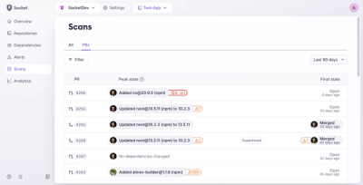
Socket’s new Pull Request Stories give security teams clear visibility into dependency risks and outcomes across scanned pull requests.

Research
/Security News
npm author Qix’s account was compromised, with malicious versions of popular packages like chalk-template, color-convert, and strip-ansi published.