Product
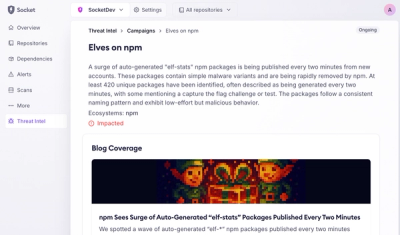
Introducing Supply Chain Attack Campaigns Tracking in the Socket Dashboard
Campaign-level threat intelligence in Socket now shows when active supply chain attacks affect your repositories and packages.
By Philipp Burckhardt - Jan 21, 2026
@bento/input
Advanced tools
import { Meta, Story, ArgTypes, Controls, Source, } from '@storybook/addon-docs/blocks'; import * as Stories from './input.stories.tsx';
import SourceControlled from './examples/controlled.tsx?raw'; import SourceForm from './examples/basic-form.tsx?raw'; import SourceUncontrolled from './examples/uncontrolled.tsx?raw';
The @bento/input package provides a universal input primitive component that renders an <input> element with React Aria interactions. It supports all HTML input types with proper accessibility, hover, and focus management.
This primitive is built with accessibility and flexibility in mind, providing state-based render props, comprehensive data attributes, and integration with React Aria's focus and hover hooks. It can be used for text inputs, checkboxes, radio buttons, file uploads, and any other input type supported by HTML.
npm install --save @bento/input
The @bento/input package exports the Input component:
import { Input } from '@bento/input';

<Input type="text" placeholder="Enter text" />
The following properties are available to be used on the Input component:
For all other properties specified on the Input component, the component
will pass them down to the underlying <input> element. This includes properties
such as id, data-* attributes, or additional ARIA attributes that you might
need for specialized use cases.
The most common pattern for the Input component is to use it as a controlled component, where the value is managed by React state. This allows you to easily read and update the input value.
In this example, the input value is stored in state and updated via the onChange handler. This is the recommended pattern for most use cases where you need to read or validate the input value.
For simpler use cases where you don't need to track the input value in React state, you can use an uncontrolled input with a defaultValue. The DOM will manage the input's value internally.
Uncontrolled inputs are useful when you only need to read the value on form submission, or when integrating with form libraries that manage values through refs.
The Input component supports all HTML input types, making it versatile for building complete forms. This example demonstrates multiple input types working together in a single form.
The component intelligently handles type-specific props, ensuring that only relevant attributes are applied to each input type. For example, min and max are only applied to number and range inputs, while checked is only applied to checkbox and radio inputs.
The Input component is a low-level primitive that provides the foundation for building input fields. Understanding when and how to use it will help you create accessible, user-friendly forms.
The Input component supports all HTML input types:
Text-based inputs: text, email, password, url, tel, search
Numeric inputs: number, range
Date/time inputs: date, datetime-local, time, month, week
Choice inputs: checkbox, radio
File input: file
Color input: color
Hidden input: hidden
Each input type receives appropriate type-specific props automatically. You don't need to worry about which props are valid for which types—the component handles this for you.
Always provide labels for your inputs using the <label> element with a matching htmlFor attribute, or by using aria-label or aria-labelledby. Never rely solely on placeholder text for labeling, as it disappears when the user starts typing.
For invalid inputs, set aria-invalid to provide semantic meaning to assistive technologies. Combine this with aria-describedby to reference error messages that explain what went wrong.
Use appropriate input types to enable better mobile keyboards and native browser features. For example, type="email" shows an email-optimized keyboard on mobile devices, while type="date" shows a native date picker.
The Input component is built with accessibility as a core requirement. It provides comprehensive keyboard support, ARIA attributes, and integration with React Aria's focus management system.
Keyboard Navigation
All input types are fully keyboard accessible. Text inputs can be focused with Tab and navigated with arrow keys. Checkboxes and radio buttons can be toggled with Space. The component integrates with React Aria's useFocusRing hook to provide intelligent focus indicators that only appear during keyboard navigation, not mouse clicks.
Focus Management
The component distinguishes between mouse focus and keyboard focus through the isFocused and isFocusVisible states. This allows you to style focus rings appropriately—showing them only when the user is navigating with a keyboard, which reduces visual noise for mouse users while maintaining accessibility for keyboard users.
ARIA Support
The component passes through all ARIA attributes you provide, including aria-label, aria-labelledby, aria-describedby, and aria-invalid. These attributes are essential for screen reader users to understand the purpose and state of form fields.
State Communication
The component provides comprehensive data attributes that communicate its state to both CSS selectors and assistive technologies. These attributes make it easy to style inputs based on their state and ensure consistent visual feedback.
The Input component is built using the @bento/slots package, allowing you to customize styling based on component state through render props, slots, and data attributes.
The component automatically applies data attributes that correspond to its state, allowing you to style with CSS selectors:
| Attribute | Description | Example Values |
|---|---|---|
data-focused | Whether the input is focused | "true" / "false" |
data-focus-visible | Whether keyboard focus ring should be visible | "true" / "false" |
data-hovered | Whether the input is hovered | "true" / "false" |
data-disabled | Whether the input is disabled | "true" / "false" |
data-invalid | Whether the input is invalid | "true" / "false" |
data-readonly | Whether the input is read-only | "true" / "false" |
data-required | Whether the input is required | "true" / "false" |
data-empty | Whether the input has no value | "true" / "false" |
data-checked | Whether checkbox/radio is checked | "true" / "false" |
The component is registered as BentoInput in the slots system. While the base Input component doesn't introduce additional slots, it can be extended with slot-based composition for building higher-level components.
FAQs
Universal input primitive component supporting all HTML input types
The npm package @bento/input receives a total of 3 weekly downloads. As such, @bento/input popularity was classified as not popular.
We found that @bento/input demonstrated a healthy version release cadence and project activity because the last version was released less than a year ago. It has 4 open source maintainers collaborating on the project.
Did you know?

Socket for GitHub automatically highlights issues in each pull request and monitors the health of all your open source dependencies. Discover the contents of your packages and block harmful activity before you install or update your dependencies.
Product
Campaign-level threat intelligence in Socket now shows when active supply chain attacks affect your repositories and packages.

Research
Malicious PyPI package sympy-dev targets SymPy users, a Python symbolic math library with 85 million monthly downloads.

Security News
Node.js 25.4.0 makes require(esm) stable, formalizing CommonJS and ESM compatibility across supported Node versions.