Product
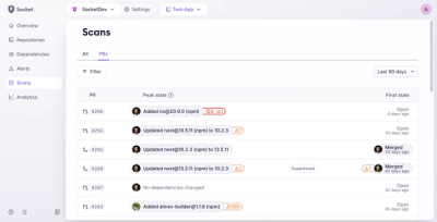
Introducing Pull Request Stories to Help Security Teams Track Supply Chain Risks
Socket’s new Pull Request Stories give security teams clear visibility into dependency risks and outcomes across scanned pull requests.
@buun_group/brutalist-ui
Advanced tools

Bold typography • Stark contrasts • Geometric shapes • Raw functionality
npm install @buun_group/brutalist-ui
# or
yarn add @buun_group/brutalist-ui
# or
pnpm add @buun_group/brutalist-ui
# or
bun add @buun_group/brutalist-ui
import { Button, Card, Input } from '@buun_group/brutalist-ui';
// Styles are included with the components

function App() {
  return (
    <Card variant="brutal">
      <Card.Header>
        <h1>Welcome to Brutalist UI</h1>
      </Card.Header>
      <Card.Content>
        <Input placeholder="Enter text" variant="brutal" />
        <Button variant="brutal">Click me</Button>
      </Card.Content>
    </Card>
  );
}
The library includes all necessary CSS styles. Just import the components and use them!
Override CSS variables to customize the look:
:root {
  --brutal-accent: #ff0066;          /* Change accent color */
  --brutal-border-width: 3px;        /* Thicker borders */
  --brutal-shadow: 6px 6px 0px #000; /* Bigger shadows */
  --brutal-font-display: 'Bebas Neue', cursive;
}
📖 Complete Styling Guide - Detailed documentation on theming, CSS variables, and customization.
| Principle | Description |
|---|---|
| Raw Aesthetics | Unpolished, honest design that shows the structure |
| Bold Typography | Strong, impactful text that commands attention |
| High Contrast | Stark black and white with accent colors |
| Geometric Shapes | Simple, bold shapes with thick borders |
| Functional Focus | Utility over decoration, form follows function |
| Component | Description | Variants |
|---|---|---|
Container | Responsive container with max-width | default, fluid, tight |
Stack | Flexible stack layout with spacing | horizontal, vertical |
AspectRatio | Maintains aspect ratio for content | - |
Separator | Visual divider between content | horizontal, vertical |
| Component | Description | Features |
|---|---|---|
Button | Interactive button element | Variants, sizes, loading state |
Input | Text input field | Variants, sizes, validation |
InputOTP | One-time password input | Auto-focus, paste support |
Textarea | Multi-line text input | Auto-resize, character count |
Select | Dropdown selection | Native & custom variants |
Checkbox | Toggle selection | Indeterminate state |
Radio | Single selection from group | Custom styling |
Switch | Toggle switch | Accessible labels |
Slider | Range slider input | Steps, marks |
Toggle | Toggle button group | Multiple selection |
Combobox | Searchable select | Filtering, async loading |
| Component | Description | Features |
|---|---|---|
Table | Data table | Sorting, selection, pagination |
Card | Content container | Header, content, footer sections |
Badge | Status indicator | Variants, sizes |
Avatar | User representation | Image, fallback, status |
Typography | Text styling | Headings, paragraphs, links |
Alert | Notification message | Types, dismissible |
Toast | Temporary notification | Auto-dismiss, actions |
| Component | Description | Features |
|---|---|---|
Navigation | Site navigation | Responsive, dropdowns |
Sidebar | Side navigation | Collapsible, fixed |
Breadcrumb | Location indicator | Separators, truncation |
Tabs | Tabbed interface | Lazy loading, keyboard nav |
Pagination | Page navigation | Page size, jump to page |
TableOfContents | Document outline | Smooth scroll, active tracking |
| Component | Description | Features |
|---|---|---|
Dialog | Modal dialog | Sizes, close on outside click |
Drawer | Slide-out panel | Positions, overlay |
Popover | Floating content | Positioning, triggers |
Tooltip | Helpful hints | Delay, positions |
HoverCard | Rich hover content | Delay, interactive |
ContextMenu | Right-click menu | Nested menus, shortcuts |
Sheet | Bottom sheet | Swipe to dismiss, snap points |
Dropdown | Dropdown menu | Nested items, dividers |
Command | Command palette | Search, shortcuts |
| Component | Description | Features |
|---|---|---|
Progress | Progress indicator | Determinate, indeterminate |
Spinner | Loading spinner | Sizes, custom animation |
Skeleton | Loading placeholder | Shapes, animation |
| Component | Description | Features |
|---|---|---|
BarChart | Bar chart visualization | Responsive, tooltips |
LineChart | Line chart visualization | Multiple series, interpolation |
PieChart | Pie chart visualization | Labels, animations |
AreaChart | Area chart visualization | Stacked, gradients |
Chart | Base chart component | Customizable, plugins |
| Component | Description | Features |
|---|---|---|
Accordion | Collapsible content | Single/multiple, animations |
Carousel | Content slider | Touch support, indicators |
ScrollArea | Custom scrollbar | Horizontal/vertical scroll |
| Component | Description |
|---|---|
Theme | Theme provider and utilities |
Shapes | Brutalist SVG shapes collection |
# Clone the repository
git clone https://github.com/yourusername/brutalist-components.git
cd brutalist-components/packages/components

# Install dependencies
bun install

# Start development
bun run dev
| Script | Description |
|---|---|
bun run dev | Start development mode with watch |
bun run build | Build the library |
bun run test | Run tests |
bun run lint | Run linter |
bun run type-check | Check TypeScript types |
We love contributions! Please see our Contributing Guide for details.
MIT © Brutalist UI Contributors
Built with:
FAQs
A brutalist-styled component library
We found that @buun_group/brutalist-ui demonstrated a healthy version release cadence and project activity because the last version was released less than a year ago. It has 0 open source maintainers collaborating on the project.
Did you know?

Socket for GitHub automatically highlights issues in each pull request and monitors the health of all your open source dependencies. Discover the contents of your packages and block harmful activity before you install or update your dependencies.

Product
Socket’s new Pull Request Stories give security teams clear visibility into dependency risks and outcomes across scanned pull requests.

Research
/Security News
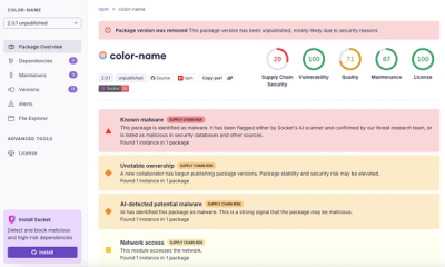
npm author Qix’s account was compromised, with malicious versions of popular packages like chalk-template, color-convert, and strip-ansi published.

Research
Four npm packages disguised as cryptographic tools steal developer credentials and send them to attacker-controlled Telegram infrastructure.