
Product
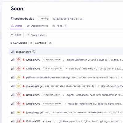
Introducing Webhook Events for Pull Request Scans
Add real-time Socket webhook events to your workflows to automatically receive pull request scan results and security alerts in real time.
By Jeppe Hasseriis - Oct 22, 2025
@cubetiq/enhance-antd-table
Advanced tools
Stil Ant Design Table but more...

Antd v4
yarn add @cubetiq/enhance-antd-table@^1.0.10
Antd v5
yarn add @cubetiq/enhance-antd-table@^2.0.0
import React, { Component } from 'react'

import EnhanceAntdTable from '@cubetiq/enhance-antd-table'

const Example = () => {
  return (
    <EnhanceAntdTable
      createButtonProps={{
        onClick: () => setModal(true)
      }}
      printButton={true}
      actionDelete={{
        onClick: () => console.log('render from action delete')
      }}
      actionDetails={{
        onClick: () => console.log('render from action details')
      }}
      renderOwnActionMenu={
        <Menu>
          <Menu.Item key={uuid()} icon={<DeleteOutlined />}>
            Delete
          </Menu.Item>
        </Menu>
      }
      bordered={true}
      newColumns={columns}
      newSources={data}
    />
  )
}
import { props } from 'antd/es/table'
import { newColumnsInterface } from '@cubetiq/enhance-antd-table'

const columns: Array<newColumnsInterface> = [
  {
    title: 'name',
    dataIndex: 'name',
    key: 'name'
  }
]
const data = [
  {
    key: '1',
    name: 'John Brown',
    age: 32,
    address: 'New York No. 1 Lake Park',
    tags: ['nice', 'developer']
  }
]
<EnhanceAntdTable
  createButtonProps={{
    onClick: () => setModal(true)
  }}
/>
printButton={true}
searchBy={"name"}
	actionDetails={{
	  onClick: () => console.log('render from action delete')
	}}
	actionDetails={{
	  onClick: () => console.log('render from action delete')
	}}
renderOwnActionMenu: Render own action menu but will be overriden the default action menu.
Should use Menu and Menu. Item from ant-design.
	renderOwnActionMenu={
	 <Menu>
	    <Menu.Item key={uuid()} icon={<DeleteOutlined/>}>
	      Delete
	    </Menu.Item>
	 </Menu>
	}
MIT © 2023
FAQs
enhance-antd-table antd-table @antd
We found that @cubetiq/enhance-antd-table demonstrated a not healthy version release cadence and project activity because the last version was released a year ago. It has 2 open source maintainers collaborating on the project.
Did you know?

Socket for GitHub automatically highlights issues in each pull request and monitors the health of all your open source dependencies. Discover the contents of your packages and block harmful activity before you install or update your dependencies.
Product
Add real-time Socket webhook events to your workflows to automatically receive pull request scan results and security alerts in real time.

Research
The Socket Threat Research Team uncovered malicious NuGet packages typosquatting the popular Nethereum project to steal wallet keys.
Product
A single platform for static analysis, secrets detection, container scanning, and CVE checks—built on trusted open source tools, ready to run out of the box.