@data-ui/network
demo at williaster.github.io/data-ui
Overview
This package exports declarative react <Network /> implemented with @vx which can be used to render network.
Usage
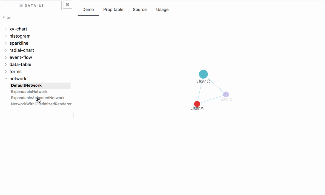
See the demo at williaster.github.io/data-ui for more example outputs.
Components
Check out the example source code and PropTable tabs in the Storybook williaster.github.io/data-ui for more!
<Network />
The Network component renders the network visualization. It takes the following props:
| ariaLabel | PropTypes.string.isRequired | - | Accessibility label for the svg |
| children | PropTypes.node.isRequired | - | Child series, reference lines, defs, or other valid svg children |
| className | PropTypes.string | - | Optional className to add to the svg |
| graph | PropTypes.shape({nodes: PropTypes.array, links: PropTypes.array }) | - | A valid graph structure with nodes and links. |
| height | PropTypes.number.isRequired | - | Height of the svg including top/bottom margin |
| width | PropTypes.number.isRequired | - | Width of the svg including left/right margin |
| margin | PropTypes.shape({ top: PropTypes.number, right: PropTypes.number, bottom: PropTypes.number, left: PropTypes.number }) | { top: 16, right: 16, bottom: 16, left: 16 } | Chart margin |
| onMouseMove | PropTypes.func | null | func({ data, id, event, index }), passed to a NodeComponent |
| onMouseLeave | PropTypes.func | null | func({ data, id, event, index }), passed to a NodeComponent |
| onMouseEnter | PropTypes.func | null | func({ data, id, event, index }), passed to a NodeComponent |
| onClick | PropTypes.func | null | func({ data, id, event, index }), passed to a NodeComponent |
| waitingForLayoutLabel | PropTypes.string | 'Computing layout...' | Placeholder message when the layout algorithm is running |
| scaleToFit | PropTypes.bool | true | A flag to indiate if the computed x and y from layout algorithms will be scaled to fit for the graph width and height. If it is false, the perserveAspectRatio won't be used. It is useful when the layout algorithms handle the scale-to-fit functionality. |
| preserveAspectRatio | PropTypes.bool | true | A flag to indiate if the aspect ratio will be preserved when scaling the layout to fit for the width and height of the component. |
| renderLink | PropTypes.func | Link | Customized Link Renderer for an link object |
| renderNode | PropTypes.func | Node | Customized Node Renderer for an node object |
| layout | PropTypes.object | atlasForce | Customized layout object created by an Layout Class |
Layout Class
Users can creat their own layout algorithm class and pass the object created by the class to the network visualization. For a layout class, it must implement the following functions:
| setGraph | graph: graphShape | Assign a graph to the object |
| getGraph | | return the graph |
| layout | { callback: function } | Layout the graph and call the callback function with the layouted graph as the input parameter. |
| setAnimated | isAnimated: bool | Render the graph layout process with animated transition |
| isAnimated | | Return the animated status |
| clear | | Post-process used to clear any states, such as clear all the callback functions |
| setBoundingBox | { width: number, height: number, margin: marginShape } | set width, height, and margin for the layout algorithm. |
Tooltips
Tooltips are controlled with the renderTooltip function passed to <Network />. This function takes an object with the shape { event, index, id, data } as input and is expected to return the inner contents of the tooltip (not the tooltip container!) as shown above. If this function returns a falsy value, a tooltip will not be rendered.
Under the covers this will wrap the <Network /> component in the exported <WithTooltip /> HOC, which wraps the svg in a <div /> and handles the positioning and rendering of an HTML-based tooltip with the contents returned by renderTooltip(). This tooltip is aware of the bounds of its container and should position itself "smartly".
Customization
If you'd like more customizability over tooltip rendering you can do either of the following:
-
Roll your own tooltip positioning logic and pass onMouseMove and onMouseLeave functions to <Network />. These functions are triggered with the signature described below upon appropriate trigger.
-
Wrap <Network /> with <WithTooltip /> yourself, which accepts props for additional customization:
| children | PropTypes.func or PropTypes.object | - | Child function (to call) or element (to clone) with onMouseMove, onMouseLeave, and tooltipData props |
| className | PropTypes.string | - | Class name to add to the <div> container wrapper |
| renderTooltip | PropTypes.func.isRequired | - | Renders the contents of the tooltip, signature of ({ event, data, datum, color }) => node. If this function returns a falsy value, a tooltip will not be rendered. |
| styles | PropTypes.object | {} | Styles to add to the <div> container wrapper |
| TooltipComponent | PropTypes.func or PropTypes.object | @vx's TooltipWithBounds | Component (not instance) to use as the tooltip container component. It is passed top and left numbers for positioning |
| tooltipProps | PropTypes.object | - | Props that are passed to TooltipComponent |
| tooltipTimeout | PropTypes.number | 200 | Timeout in ms for the tooltip to hide upon calling onMouseLeave |
Note that to correctly position a tooltip, the <WithTooltip /> onMouseMove function minimally requires an event OR coords object of the form { x: Number, y: Number }. If coords is specified it takes precedent over any position computed from the event. See function signatures below for more.
Functions and Function Signatures
<Network /> supports onMouseEnter, onMouseMove, onMouseLeave, and onClick event handlers. These functions are passed to the renderNode components with the following signatures:
onMouseLeave(event);
allOtherFunc({ event, index, id, data: node, coords] });
coords is an object of the form { x: Number, y: Number }. XYChart passes x and y only if snapTooltipToDataX or snapTooltipToDataY are true, respectively.
Programmatically triggering tooltips
<Network /> exposes hooks to manually trigger any of these handlers with the eventTriggerRefs prop. Similar to React refs, this prop is a callback function that is called by <Network /> after mounting. The callback receives an object as input, with keys corresponding to the event type names and respective handlers as values: eventTriggerRefs({ click, mouseenter, mousemove, mouseleave }). The ref handlers have the same signatures as defined above.
Note that snapTooltipToData* props will still apply (i.e., coords will be passed in the event signature) when events are triggered this way.
Roadmap
- more layout algorithms
- dragging interaction enabled


