Product
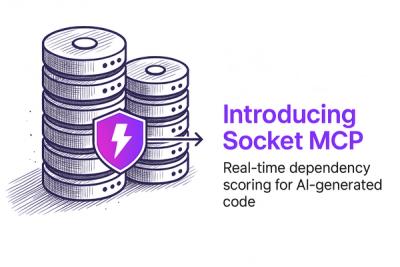
Secure Your AI-Generated Code with Socket MCP
Socket MCP brings real-time security checks to AI-generated code, helping developers catch risky dependencies before they enter the codebase.
By Alexandros Kapravelos - May 28, 2025
@davesnx/styled-ppx
Advanced tools


styled-ppx is a ppx and a library that brings styled components to ReScript and Melange. It allows you to create React Components with type-safe style definitions that don't rely on a different language (DSL) except CSS, but also can be used without React.
Built on top of emotion, it allows you to style apps safely, quickly, and performantly - just as you have always done it.
For the entire documentation, visit styled-ppx.vercel.app
We provide an editor extension that brings syntax highlighting:
If you are interested on another editor, please file an issue
We would love your help improving styled-ppx! Please see our contributing and community guidelines; they'll help you get set up locally and explain the whole process: CONTRIBUTING.md
This project is licensed under the Simplified BSD License (BSD 2-Clause License)
FAQs
Typed styled components in ReScript
The npm package @davesnx/styled-ppx receives a total of 29 weekly downloads. As such, @davesnx/styled-ppx popularity was classified as not popular.
We found that @davesnx/styled-ppx demonstrated a not healthy version release cadence and project activity because the last version was released a year ago. It has 1 open source maintainer collaborating on the project.
Did you know?

Socket for GitHub automatically highlights issues in each pull request and monitors the health of all your open source dependencies. Discover the contents of your packages and block harmful activity before you install or update your dependencies.
Product
Socket MCP brings real-time security checks to AI-generated code, helping developers catch risky dependencies before they enter the codebase.

Security News
As vulnerability data bottlenecks grow, the federal government is formally investigating NIST’s handling of the National Vulnerability Database.

Research
Security News
Socket’s Threat Research Team has uncovered 60 npm packages using post-install scripts to silently exfiltrate hostnames, IP addresses, DNS servers, and user directories to a Discord-controlled endpoint.