Product
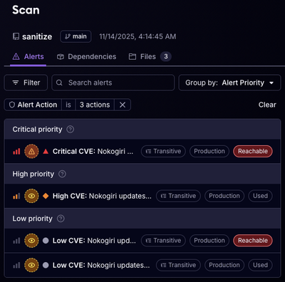
Reachability for Ruby Now in Beta
Reachability analysis for Ruby is now in beta, helping teams identify which vulnerabilities are truly exploitable in their applications.
@dbp-toolkit/tabulator-table
Advanced tools
This web component allows to create a table with tabulator-tables.
This web component allows to create a table with tabulator-tables.
You can install these components via npm:
npm i @dbp-toolkit/tabulator-table
After you have installed the tabulator-table component via npm you can use this example to create interactive, sortable tables. This component is a wrapper around tabulator.
<script
    type="module"
    src="node_modules/@dbp-toolkit/tabulator-table/dist/dbp-tabulator-table.js"></script>
Or you can include the JS files directly via CDN:
<script
    type="module"
    src="https://unpkg.com/@dbp-toolkit/tabulator-table@0.0.1/dist/tabulator-table.js"></script>
<dbp-tabulator-table></dbp-tabulator-table>
lang (optional, default: de): set to de or en for German or English
<dbp-tabulator-table lang="de"></dbp-tabulator-table>identifier (optional string, default: table): set the css selector id of the table element
<dbp-tabulator-table identifier="my-table-id"></dbp-tabulator-table>options (optional object, can be set later, default: { layout: "fitColumns", autoColumns: true, }): set the options for the tabulator table - example <dbp-tabulator-table options="{'myoption': 'a'}"></dbp-tabulator-table> - you can set a tabulator to automatically generate its own columns by setting the option autoColumns: true
and you can still automatically edit generated columns by using the function autoColumnsDefinitions:[ {field:"<field-name>", <property>: value}, ... ], or add translations for the header column titles by using langdata (optional array, can be set later or can be updated): set the data for the tabulator table
<dbp-tabulator-table data="[{a: 123, b: 123}, {a: 234, b: 234}]"></dbp-tabulator-table>pagination-enabled (optional bool, default: false): set to true if you want a pagination shown
<dbp-tabulator-table pagination-enabled></dbp-tabulator-table>pagination-size (optional number, default: 10): sets the pagination size, if pagination is enabled
<dbp-tabulator-table pagination-size="20"></dbp-tabulator-table>select-rows-enabled (optional bool, default: false): allows the user to select rows by clicking on them
<dbp-tabulator-table select-rows-enabled></dbp-tabulator-table>collapse-enabled (optional bool, default: false): add columns that do not fit into the table into a hidden list of column titles and values
<dbp-tabulator-table collapse-enabled></dbp-tabulator-table>responsive:3) and to set the columns' width so that they will not all fit into the tabulator| Event | Description |
|---|---|
dbp-tabulator-table-collapsible-event | Event to tell if the component is in collapsible state |
dbp-tabulator-table-row-selection-changed-event | Tabulator table rowSelectionChanged event |
dbp-tabulator-table-built | Fired after table is built |
getData(): returns the tabulator data.setData(data): sets data of the tabulator table.
data is an array of data which should be shown in the table.getRows(): returns an array with all the row components of the table.selectAllRows(): selects all rows.deselectAllRows(): deselects all rows.getSelectedRows(): returns an array with all the selected rows of the table.checkAllSelected(): checks if all rows are selected.checkNoneSelected(): checks if no row is selected.deleteSelectedRows(): deletes the selected rows.updateRow(row, newData): updates a given row of the tabulator table with new data. -row represents the row object we want to update. -newData represents the new data we want to update. it has to be an object {'column': 'value', ...}deleteRow(row): deletes the given row from the specified tabulator table. -row represents the id of the row we want to delete.deleteSelectedRows(): this function deletes the selected rows (by clicking) of the tabulator.getColumns(): returns an array with all the column components of the table.setColumns(newColumns): sets new columns to the tabulator.
newColumns is an array with the new column definitions.getColumnsFields(): returns an array with all the column fields of the table.setFilter(listOfFilters): filters the tabulator table according to the given list of filters.removeFilter(): removes the filters set on the tabulator.expandAll(): expands all the collapsed columns inside hidden lists of the tabulator tablecollapseAll(): collapses all the expanded columns inside hidden lists of the tabulator tabledownload(type, dataName): downloads the selected rows or the entire tabulator data if none are selected in the specified file format
type represents the file format to be downloadeddataName is the name of the file to be downloadedgetPage(): returns the current table page.setPage(): sets the current table page.getLang(): returns the lang parameter.In best practice options is set if the dom is already rendered.
You can set this attribute with the css selector. (e.g.: this._('#my-table-component).options = myoptions)
Set data only works if the options are set before.
dbp-tabulator-table needs the tabulator-tables/css/tabulator.min.css in the package path and
the icons in @dbp-toolkit/common/icons/ imported.
# get the source
git clone git@github.com:digital-blueprint/toolkit.git
cd toolkit/packages/tabulator-table

# install dependencies
npm install

# constantly build dist/bundle.js and run a local web-server on port 8002
npm run watch-local

# build local packages in dist directory
npm run build
Jump to http://localhost:8002 and you should get a demo page.
FAQs
This web component allows to create a table with tabulator-tables.
We found that @dbp-toolkit/tabulator-table demonstrated a healthy version release cadence and project activity because the last version was released less than a year ago. It has 3 open source maintainers collaborating on the project.
Did you know?

Socket for GitHub automatically highlights issues in each pull request and monitors the health of all your open source dependencies. Discover the contents of your packages and block harmful activity before you install or update your dependencies.

Product
Reachability analysis for Ruby is now in beta, helping teams identify which vulnerabilities are truly exploitable in their applications.

Research
/Security News
Malicious npm packages use Adspect cloaking and fake CAPTCHAs to fingerprint visitors and redirect victims to crypto-themed scam sites.

Security News
Recent coverage mislabels the latest TEA protocol spam as a worm. Here’s what’s actually happening.