Security News
MCP Steering Committee Launches Official MCP Registry in Preview
The MCP Steering Committee has launched the official MCP Registry in preview, a central hub for discovering and publishing MCP servers.
@degjs/expander
Advanced tools
A plugin to handle functionality and accessibility for expanding elements.
A re-usable plugin to manage functionality and accessibility of expanding elements
expander is an ES6 module. Consequently, you'll need an ES^ transpiler (Babel is a nice one) as part of your Javascript workflow.
If you're already using NPM for your project, you can install expander with the following command:
$ npm install @degjs/expander
The expander plugin will handle listening and responding to click events on a trigger button. It also handles accessibility associated with this (see accessibility section below). Finally, there is built-in support for animation when expanding or collapsing.
It will dispatch custom events that the application can listen and respond to.
Note: the expander plugin exports a variable called events to help standardize event names that the app can listen for.
import expander, { events } from '@degjs/expander';

let expanderInst;

const init = () => {
    expanderInst = expander(containerEl);

    containerEl.addEventListener(events.beforeExpand, onBeforeExpand);
};

const destroy = () => {
    expanderInst.destroy();
};
| Property Name | Type | Default | Description |
|---|---|---|---|
| isExpanded | Boolean | false | Describes if the content is expanded on init |
| toggleSelector | String | "button" | The selector string to find the toggle trigger element |
| controlsId | String | null | The id of the content element that is controlled by the toggle button |
| expandingCssClass | String | "is-expanding" | The css class to be added when and element is in the process of expanding |
| collapsingCssClass | String | "is-collapsing" | The css class to be added when and element is in the process of collapsing |
| expandedCssClass | String | "is-expanded" | The css class to be added when and element is fully expanded |
| collapsedCssClass | String | "is-collapsed" | The css class to be added when and element is fully collapsed |
| animationTargetEl | Element | null | The element to add the animation classes to |
| animationEvent | String | "animationend" | The animation event name to listen for. When it is fired, the expand or collapse action will commence |
The getElement method returns the container element used by expander.
| Type | Description |
|---|---|
| Element | the element that contains the trigger and content for expander |
A way to manually trigger the expand functionality of expander.
A way to manually trigger the collapse functionality of expander.
The getOptions method returns the current expander settings.
| Type | Description |
|---|---|
| Object | the current settings for expander (defaults and user-set options combined) |
The setOptions method allows changes to the current expander settings. This method performs a merge of the original settings and the new ones.
| Type | Description |
|---|---|
| Object | new settings for the expander plugin |
Nothing
This method removes any aria-attributes it created and cleans up any event listeners it created.
The aria-controls attribute details a relationships between two elements in the DOM. In this module, the aria-controls attribute is added to the toggle element if an element id is provided in the expander options.
It is recommended that the controlsId is passed as an option if the element shown/hidden by the toggle does not immediately follow the toggle in DOM order.
The aria-expanded attribute details whether a collapsible region is expanded or collapsed.
The expander module will set the aria-expanded attribute to the appropriate value whenever content is expanded or collapsed.
expander depends on the following browser APIs:
To support legacy browsers, you'll need to include polyfills for the above APIs.
FAQs
A plugin to handle functionality and accessibility for expanding elements.
We found that @degjs/expander demonstrated a not healthy version release cadence and project activity because the last version was released a year ago. It has 10 open source maintainers collaborating on the project.
Did you know?

Socket for GitHub automatically highlights issues in each pull request and monitors the health of all your open source dependencies. Discover the contents of your packages and block harmful activity before you install or update your dependencies.

Security News
The MCP Steering Committee has launched the official MCP Registry in preview, a central hub for discovering and publishing MCP servers.

Product
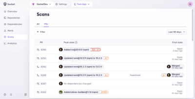
Socket’s new Pull Request Stories give security teams clear visibility into dependency risks and outcomes across scanned pull requests.

Research
/Security News
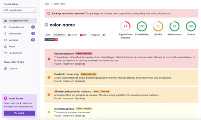
npm author Qix’s account was compromised, with malicious versions of popular packages like chalk-template, color-convert, and strip-ansi published.