Security News
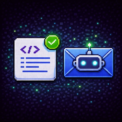
AI Agent Lands PRs in Major OSS Projects, Targets Maintainers via Cold Outreach
An AI agent is merging PRs into major OSS projects and cold-emailing maintainers to drum up more work.
By Sarah Gooding - Feb 14, 2026
@dooboo-ui/native-switch-toggle
Advanced tools
[](https://npmjs.org/package/@dooboo-ui/native-switch-toggle) [

Simple switch toggle component for react-native. This component supports horizontal switch toggle with animation with several options like start/end background colors, start/end circle colors, and duration for animation.
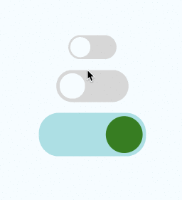
| necessary | types | default | |
|---|---|---|---|
| switchOn | ✓ | boolean | false |
| onPress | ✓ | func | () => {} |
| containerStyle | ViewStyle | { width: 72, height: 36, borderRadius: 18 ... } | |
| circleStyle | ViewStyle | { width: 30, height: 30, borderRadius: 15 ... } | |
| backgroundColorOn | string | 'rgb(227,227,227)' | |
| backgroundColorOff | string | 'rgb(215,215,215)' | |
| circleColorOn | string | 'white' | |
| circleColorOff | string | 'rgb(102,134,205)' | |
| duration | number | 300 | |
| type | number | 0 - Normal switch, 1 - Switch with a text | |
| buttonText | string | Text on-top of the button | |
| backTextRight | string | Text to appear in right side when button toggled to left | |
| backTextLeft | string | Text to appear in left side when button toggled to right | |
| buttonTextStyle | StyleProp<TextStyle> | Styles for text on the button | |
| textRightStyle | StyleProp<TextStyle> | Styles for text in right | |
| textLeftStyle | StyleProp<TextStyle> | Styles for text in left | |
| buttonStyle | StyleProp<ViewStyle> | Styles for the button | |
| buttonContainerStyle | StyleProp<ViewStyle> | Styles for button container | |
| rightContainerStyle | StyleProp<ViewStyle> | Styles for right text container | |
| leftContainerStyle | StyleProp<ViewStyle> | Styles for left text container |
yarn add @dooboo-ui/native
or
yarn add @dooboo-ui/native-switch-toggle
import React, { ReactElement, useState } from 'react';

import { SwitchToggle } from '@dooboo-ui/native';
// or
import SwitchToggle from '@dooboo-ui/native-switch-toggle';
import styled from 'styled-components/native';

const Container = styled.View`
  flex: 1;
  background-color: #f5fcff;
  flex-direction: column;
  align-items: center;
  justify-content: center;
`;

function Page(): ReactElement {
  const [switchOn1, setSwitchOn1] = useState(false);
  const [switchOn2, setSwitchOn2] = useState(false);
  const [switchOn3, setSwitchOn3] = useState(false);
  const [switchOn4, setSwitchOn4] = useState(false);

  return (
    <Container>
      <SwitchToggle
        switchOn={switchOn1}
        onPress={(): void => setSwitchOn1(!switchOn1)}
      />
      <SwitchToggle
        containerStyle={{
          marginTop: 16,
          width: 108,
          height: 48,
          borderRadius: 25,
          backgroundColor: '#ccc',
          padding: 5,
        }}
        circleStyle={{
          width: 38,
          height: 38,
          borderRadius: 19,
          backgroundColor: 'white', // rgb(102,134,205)
        }}
        switchOn={switchOn2}
        onPress={(): void => setSwitchOn2(!switchOn2)}
        circleColorOff="white"
        circleColorOn="red"
        duration={500}
      />
      <SwitchToggle
        containerStyle={{
          marginTop: 16,
          width: 160,
          height: 65,
          borderRadius: 30,
          padding: 5,
        }}
        backgroundColorOn="#a0e1e5"
        backgroundColorOff="#e5e1e0"
        circleStyle={{
          width: 55,
          height: 55,
          borderRadius: 27.5,
          backgroundColor: 'blue', // rgb(102,134,205)
        }}
        switchOn={switchOn3}
        onPress={(): void => setSwitchOn3(!switchOn3)}
        circleColorOff="#ff11ff"
        circleColorOn="green"
        duration={500}
      />
      <SwitchToggle
        buttonText={switchOn4 ? 'Hour' : 'Day'}
        backTextRight={switchOn4 ? '' : 'Hour'}
        backTextLeft={switchOn4 ? 'Day' : ''}
        type={1}
        buttonStyle={{
          alignItems: 'center',
          justifyContent: 'center',
          position: 'absolute',
        }}
        rightContainerStyle={{
          flex: 1,
          alignItems: 'center',
          justifyContent: 'center',
        }}
        leftContainerStyle={{
          flex: 1,
          alignItems: 'center',
          justifyContent: 'flex-start',
        }}
        buttonTextStyle={{ fontSize: 20 }}
        textRightStyle={{ fontSize: 20 }}
        textLeftStyle={{ fontSize: 20 }}
        containerStyle={{
          marginTop: 16,
          width: 160,
          height: 65,
          borderRadius: 30,
          padding: 5,
        }}
        backgroundColorOn="#fff"
        backgroundColorOff="#fff"
        circleStyle={{
          width: 80,
          height: 55,
          borderRadius: 27.5,
          backgroundColor: 'blue', // rgb(102,134,205)
        }}
        switchOn={switchOn4}
        onPress={(): void => setSwitchOn4(!switchOn4)}
        circleColorOff="#e5e1e0"
        circleColorOn="#e5e1e0"
        duration={500}
      />
    </Container>
  );
}

export default Page;
FAQs
[](https://npmjs.org/package/@dooboo-ui/native-switch-toggle) [
Socket for GitHub automatically highlights issues in each pull request and monitors the health of all your open source dependencies. Discover the contents of your packages and block harmful activity before you install or update your dependencies.
Security News
An AI agent is merging PRs into major OSS projects and cold-emailing maintainers to drum up more work.

Research
/Security News
Chrome extension CL Suite by @CLMasters neutralizes 2FA for Facebook and Meta Business accounts while exfiltrating Business Manager contact and analytics data.

Security News
After Matplotlib rejected an AI-written PR, the agent fired back with a blog post, igniting debate over AI contributions and maintainer burden.