The default theme package of Semi Design.
By default, the theme package will be automatically installed as dependence of @douyinfe/semi-foundation.
You can make a custom theme through Semi Design System.
Directory Structure
├── package.json
├── scripts            // Relevant compilation script
│   ├── build-css.js
│   └── processor.js
├── scss
│   ├── _font.scss     // Font-related scss mixin
│   ├── _palette.scss  // Global original color palette(css variable)
│   ├── global.scss    // Global Design Token(css variable, including light and dark mode)
│   ├── index.scss     // Entry
│   ├── mixin.scss     // Extra mixin(e.g, shadow)
│   └── variables.scss // Sizing,spacing,zindex and font related design token
└── semi.scss          // Unified compilation entry for node-sass or dart-sass consumption
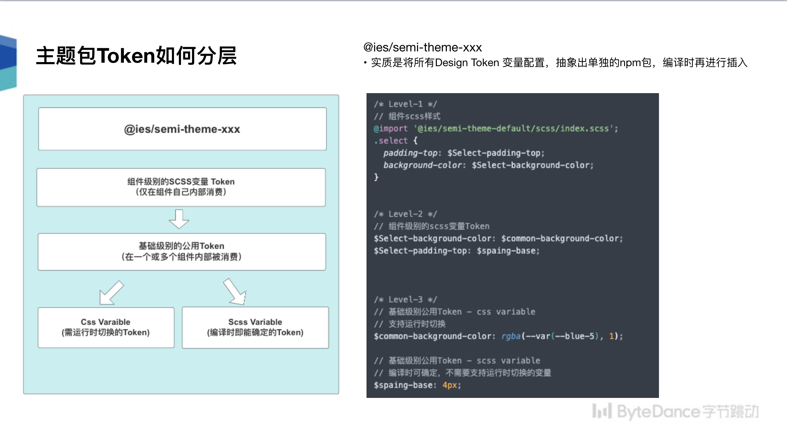
Design Token stratification principle
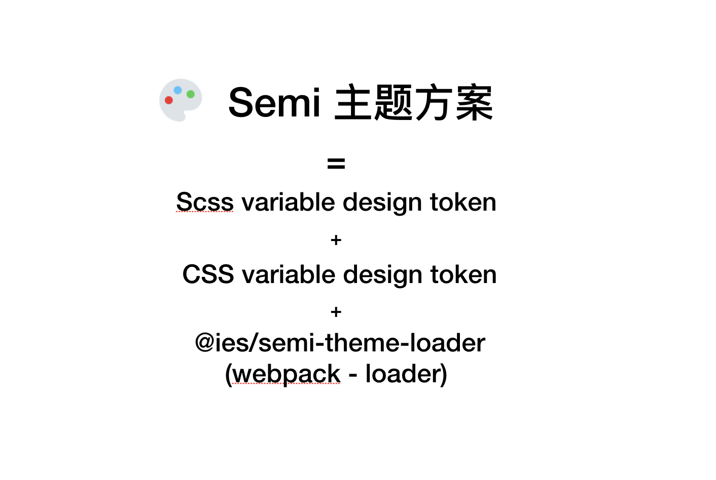
- No need to switch at runtime, carried by sass variable
- Need to support runtime switching, such as the color variable related to the dark mode, carried by css variable
License
MIT


