
Security News
Crates.io Users Targeted by Phishing Emails
The Rust Security Response WG is warning of phishing emails from rustfoundation.dev targeting crates.io users.
@ducdh-origin/react-native-modals
Advanced tools
React Native Popup Dialog for iOS & Android.
Another similar dialog component: react-native-dialog-component the main difference is style.
Pull request are welcomed. Please follow Airbnb JS Style Guide
Just click on ⭐️ button 😘
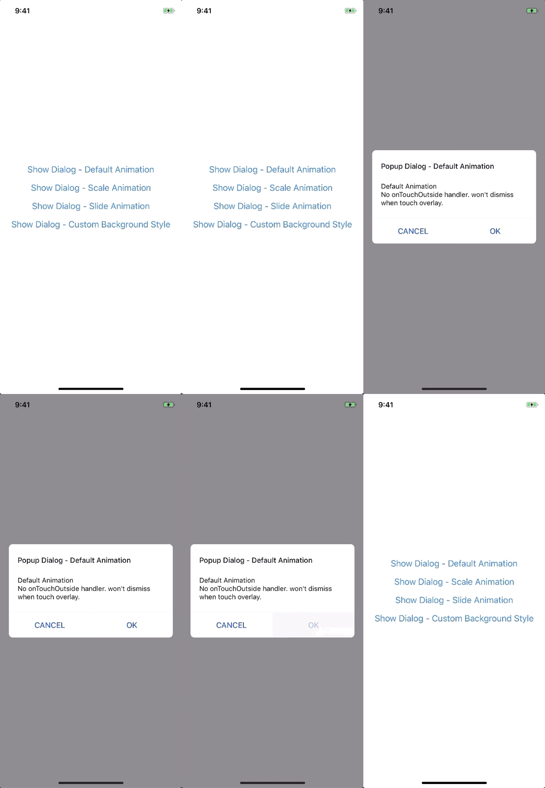
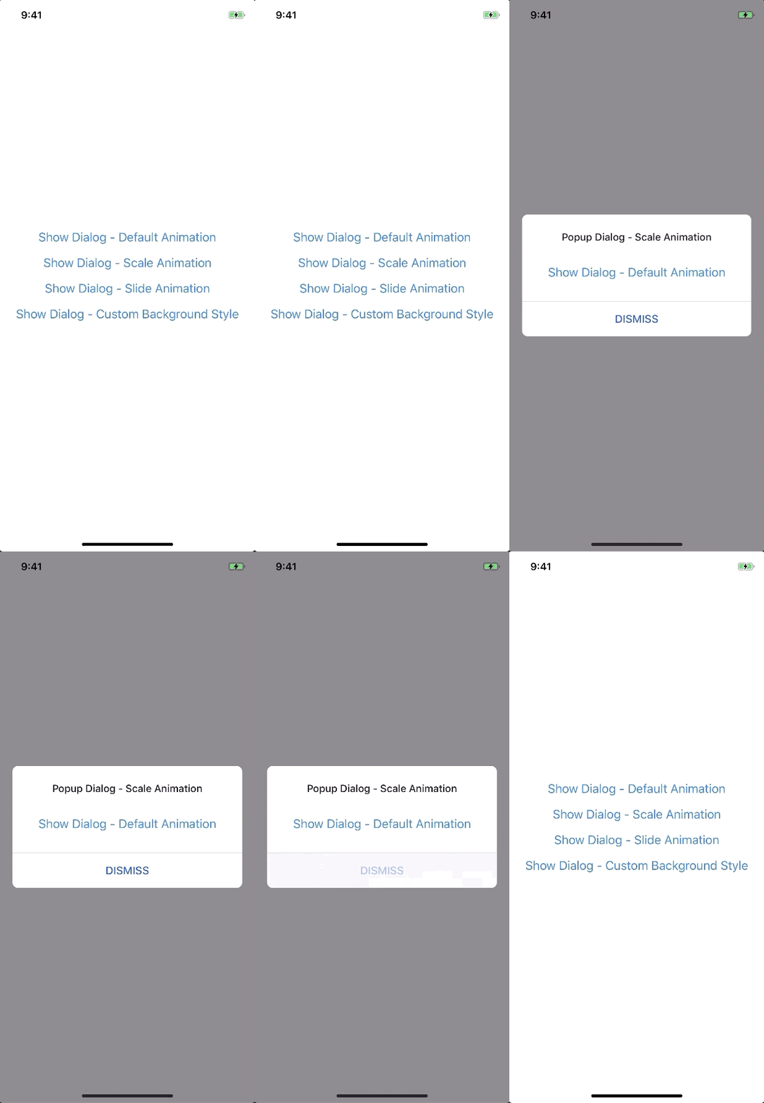
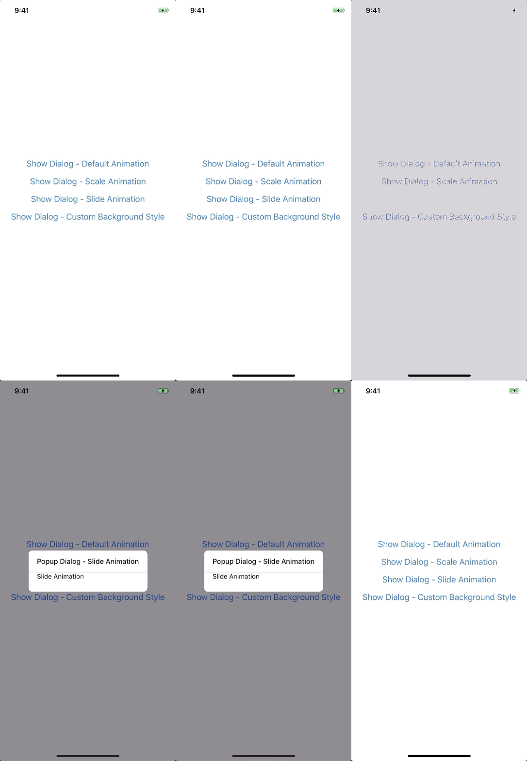
Has a lot of backward incompatible changes in v0.16.0. Please, Read the Docs before upgrading to v0.16.0
npm install --save react-native-popup-dialog
# OR
yarn add react-native-popup-dialog
import Dialog, { DialogContent } from 'react-native-popup-dialog';
import { Button } from 'react-native'

<View style={styles.container}>
  <Button
    title="Show Dialog"
    onPress={() => {
      this.setState({ visible: true });
    }}
  />
  <Dialog
    visible={this.state.visible}
    onTouchOutside={() => {
      this.setState({ visible: false });
    }}
  >
    <DialogContent>
      {...}
    </DialogContent>
  </Dialog>
</View>
import Dialog, { SlideAnimation, DialogContent } from 'react-native-popup-dialog';

<View style={styles.container}>
  <Dialog
    visible={this.state.visible}
    dialogAnimation={new SlideAnimation({
      slideFrom: 'bottom',
    })}
  >
    <DialogContent>
      {...}
    </DialogContent>
  </Dialog>
</View>
import Dialog, { DialogTitle, DialogContent } from 'react-native-popup-dialog';

<View style={styles.container}>
  <Dialog
    visible={this.state.visible}
    dialogTitle={<DialogTitle title="Dialog Title" />}
  >
    <DialogContent>
      {...}
    </DialogContent>
  </Dialog>
</View>
import Dialog, { DialogFooter, DialogButton, DialogContent } from 'react-native-popup-dialog';

<View style={styles.container}>
  <Dialog
    visible={this.state.visible}
    footer={
      <DialogFooter>
        <DialogButton
          text="CANCEL"
          onPress={() => {}}
        />
        <DialogButton
          text="OK"
          onPress={() => {}}
        />
      </DialogFooter>
    }
  >
    <DialogContent>
      {...}
    </DialogContent>
  </Dialog>
</View>
| Prop | Type | Default | Note |
|---|---|---|---|
visible | boolean | false | |
rounded | boolean | true | |
useNativeDriver | boolean | true | |
children | any | ||
dialogTitle? | React Element | You can pass a DialogTitle component or pass a View for customizing titlebar | |
width? | Number | Your device width | The Width of Dialog, you can use fixed width or use percentage. For example 0.5 it means 50% |
height? | Number | 300 | The Height of Dialog, you can use fixed height or use percentage. For example 0.5 it means 50% |
dialogAnimation? | FadeAnimation | animation for dialog | |
dialogStyle? | any | ||
containerStyle? | any | null | For example: { zIndex: 10, elevation: 10 } |
animationDuration? | Number | 200 | |
overlayPointerEvents? | String | Available option: auto, none | |
overlayBackgroundColor? | String | #000 | |
overlayOpacity? | Number | 0.5 | |
hasOverlay? | Boolean | true | |
onShow? | Function | You can pass shown function as a callback function, will call the function when dialog shown | |
onDismiss? | Function | You can pass onDismiss function as a callback function, will call the function when dialog dismissed | |
onTouchOutside? | Function | () => {} | |
onHardwareBackPress? | Function | () => true | Handle hardware button presses |
footer? | React Element | null | for example: <View><Button text="DISMISS" align="center" onPress={() => {}}/></View> |
| Prop | Type | Default | Note |
|---|---|---|---|
title | String | ||
style? | any | null | |
textStyle? | any | null | |
align? | String | center | Available option: left, center, right |
hasTitleBar? | Bool | true |
| Prop | Type | Default | Note |
|---|---|---|---|
children | any | ||
style? | any | null |
| Prop | Type | Default | Note |
|---|---|---|---|
children | DialogButton | ||
bordered? | Boolean | true | |
style? | any | null |
| Prop | Type | Default | Note |
|---|---|---|---|
text | String | ||
onPress | Function | ||
align? | String | center | Available option: left, center, right |
style? | any | null | |
textStyle? | any | null | |
activeOpacity? | Number | 0.6 | |
disabled? | Boolean | false | |
bordered? | Boolean | false |
| Prop | Type | Default | Note |
|---|---|---|---|
visible | Boolean | ||
opacity | Number | 0.5 | |
onPress? | Function | ||
backgroundColor? | string | #000 | |
animationDuration? | Number | 200 | |
pointerEvents? | String | null | Available option: auto, none |
useNativeDriver? | Boolean | true |

new FadeAnimation({
  initialValue: 0, // optional
  animationDuration: 150, // optional
  useNativeDriver: true, // optional
})
| Param | Type | Default | Note |
|---|---|---|---|
initialValue | Number | 0 | |
animationDuration? | Number | 150 | |
useNativeDriver? | Boolean | true |

new ScaleAnimation({
  initialValue: 0, // optional
  useNativeDriver: true, // optional
})
| Param | Type | Default | Note |
|---|---|---|---|
initialValue | Number | 0 | |
useNativeDriver | Boolean | true |

new SlideAnimation({
  initialValue: 0, // optional
  slideFrom: 'bottom', // optional
  useNativeDriver: true, // optional
})
| Param | Type | Default | Note |
|---|---|---|---|
initialValue | Number | 0 | |
slideFrom | String | bottom | Available option: top, bottom, left, right |
useNativeDriver | Boolean | true |
import { Animated } from 'react-native';
import { Animation } from 'react-native-popup-dialog';

class CustomAnimation extends Animation {
  in(onFinished) {
    Animated.spring(this.animate, {
      toValue: 1,
      useNativeDriver: this.useNativeDriver,
    }).start(onFinished);
  }

  out(onFinished) {
    Animated.spring(this.animate, {
      toValue: 0,
      useNativeDriver: this.useNativeDriver,
    }).start(onFinished);
  }

  getAnimations() {
    return {
      transform: [{
        translateY: this.animate.interpolate({
          inputRange: [0, 1],
          outputRange: [800, 1],
        }),
      }],
    };
  }
}
yarn
yarn run build
yarn test
FAQs
React Native Popup Dialog for IOS & Android.
The npm package @ducdh-origin/react-native-modals receives a total of 4 weekly downloads. As such, @ducdh-origin/react-native-modals popularity was classified as not popular.
We found that @ducdh-origin/react-native-modals demonstrated a not healthy version release cadence and project activity because the last version was released a year ago. It has 1 open source maintainer collaborating on the project.
Did you know?

Socket for GitHub automatically highlights issues in each pull request and monitors the health of all your open source dependencies. Discover the contents of your packages and block harmful activity before you install or update your dependencies.

Security News
The Rust Security Response WG is warning of phishing emails from rustfoundation.dev targeting crates.io users.

Product
Socket now lets you customize pull request alert headers, helping security teams share clear guidance right in PRs to speed reviews and reduce back-and-forth.

Product
Socket's Rust support is moving to Beta: all users can scan Cargo projects and generate SBOMs, including Cargo.toml-only crates, with Rust-aware supply chain checks.