Storybook Addon Bugherd
Storybook Status Addon can be used to add a Bugherd feedback button in Storybook.
Installation
npm install @etchteam/storybook-addon-bugherd --save-dev
Configuration
Create a file called main.js in your storybook config.
Add the following content to it:
module.exports = {
  addons: ['@etchteam/storybook-addon-bugherd/register']
}
Next, add a file called preview-head.html in your storybook config folder and add this bugherd script to it.
<script>
  var BugHerdConfig = {
    feedback: {
      hide: true,
    }
  };
</script>
<script type="text/javascript" src="https://www.bugherd.com/sidebarv2.js?apikey=<BUGHERD_API_KEY>" async="true"></script>
Finally, in preview.js or config.js (depending on how you have set up storybook) in your storybook folder, you'll need to add a global decorator.
import { addDecorator } from '@storybook/react';
import withBugherd from '@etchteam/storybook-addon-bugherd';

addDecorator(withBugherd);
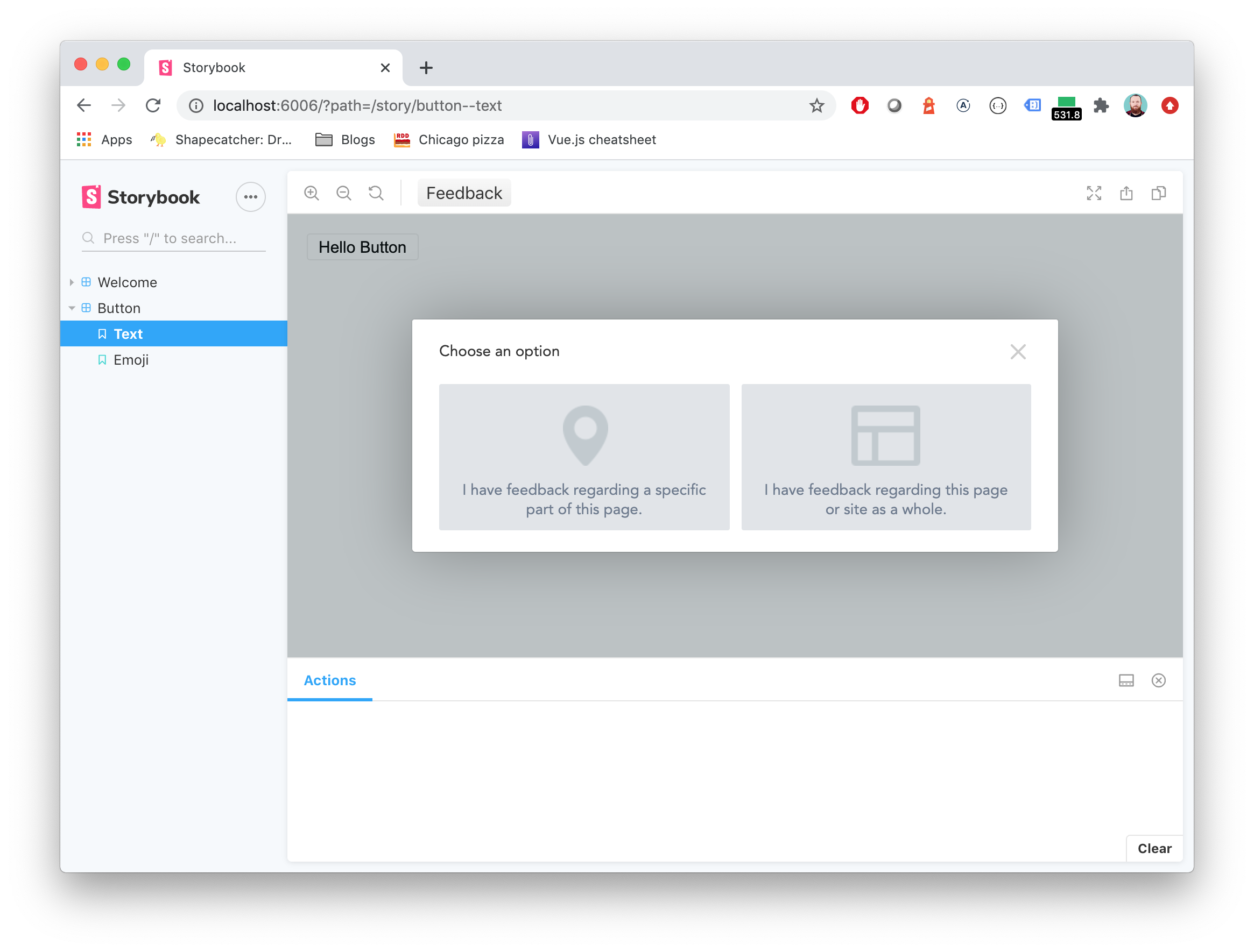
You'll get a bugherd feedback button for anonymous users injected in the top toolbar.
Made with ☕ at Etch


