
Security News
MCP Steering Committee Launches Official MCP Registry in Preview
The MCP Steering Committee has launched the official MCP Registry in preview, a central hub for discovering and publishing MCP servers.
@expo/react-native-action-sheet
Advanced tools
@expo/react-native-action-sheet is a library that provides a customizable ActionSheet component for React Native applications. It allows developers to present a list of options to the user in a modal dialog, which can be used for various purposes such as selecting an item, confirming an action, or displaying additional options.
Displaying an ActionSheet
This feature allows you to display an ActionSheet with a list of options. The user can select an option, and the selected option's index is returned in the callback function.
import React from 'react';
import { View, Button } from 'react-native';
import { useActionSheet } from '@expo/react-native-action-sheet';
const App = () => {
const { showActionSheetWithOptions } = useActionSheet();
const onOpenActionSheet = () => {
const options = ['Option 1', 'Option 2', 'Cancel'];
const cancelButtonIndex = 2;
showActionSheetWithOptions(
{
options,
cancelButtonIndex,
},
(buttonIndex) => {
// Handle button press
console.log('Selected option:', buttonIndex);
}
);
};
return (
<View>
<Button title="Open ActionSheet" onPress={onOpenActionSheet} />
</View>
);
};
export default App;Customizing ActionSheet Options
This feature allows you to customize the ActionSheet options, including setting a destructive button (e.g., for delete actions) and a cancel button.
import React from 'react';
import { View, Button } from 'react-native';
import { useActionSheet } from '@expo/react-native-action-sheet';

const App = () => {
  const { showActionSheetWithOptions } = useActionSheet();

  const onOpenActionSheet = () => {
    const options = ['Delete', 'Save', 'Cancel'];
    const destructiveButtonIndex = 0;
    const cancelButtonIndex = 2;

    showActionSheetWithOptions(
      {
        options,
        cancelButtonIndex,
        destructiveButtonIndex,
      },
      (buttonIndex) => {
        // Handle button press
        console.log('Selected option:', buttonIndex);
      }
    );
  };

  return (
    <View>
      <Button title="Open ActionSheet" onPress={onOpenActionSheet} />
    </View>
  );
};

export default App;react-native-action-sheet is a popular library for displaying action sheets in React Native applications. It provides similar functionality to @expo/react-native-action-sheet, allowing developers to present a list of options to the user. However, it may require additional setup and configuration compared to the Expo version.
react-native-modal is a versatile library for creating modals in React Native applications. While it is not specifically designed for action sheets, it can be used to create custom modal dialogs with a list of options. It offers more flexibility and customization options compared to @expo/react-native-action-sheet but may require more effort to implement.
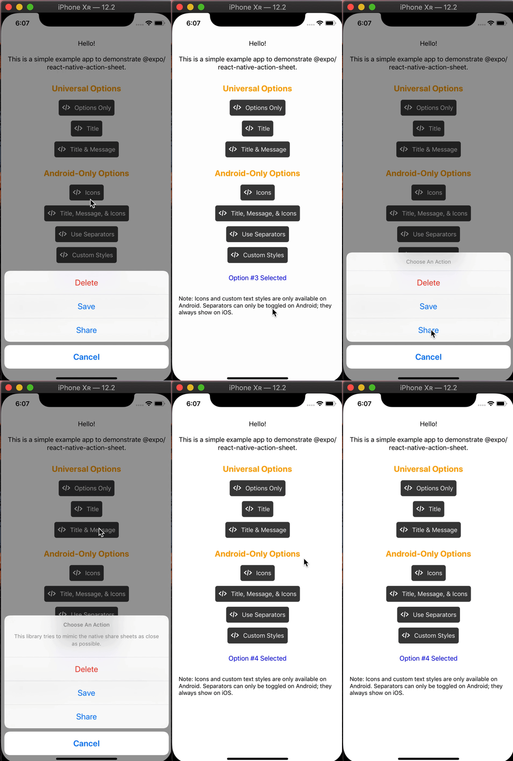
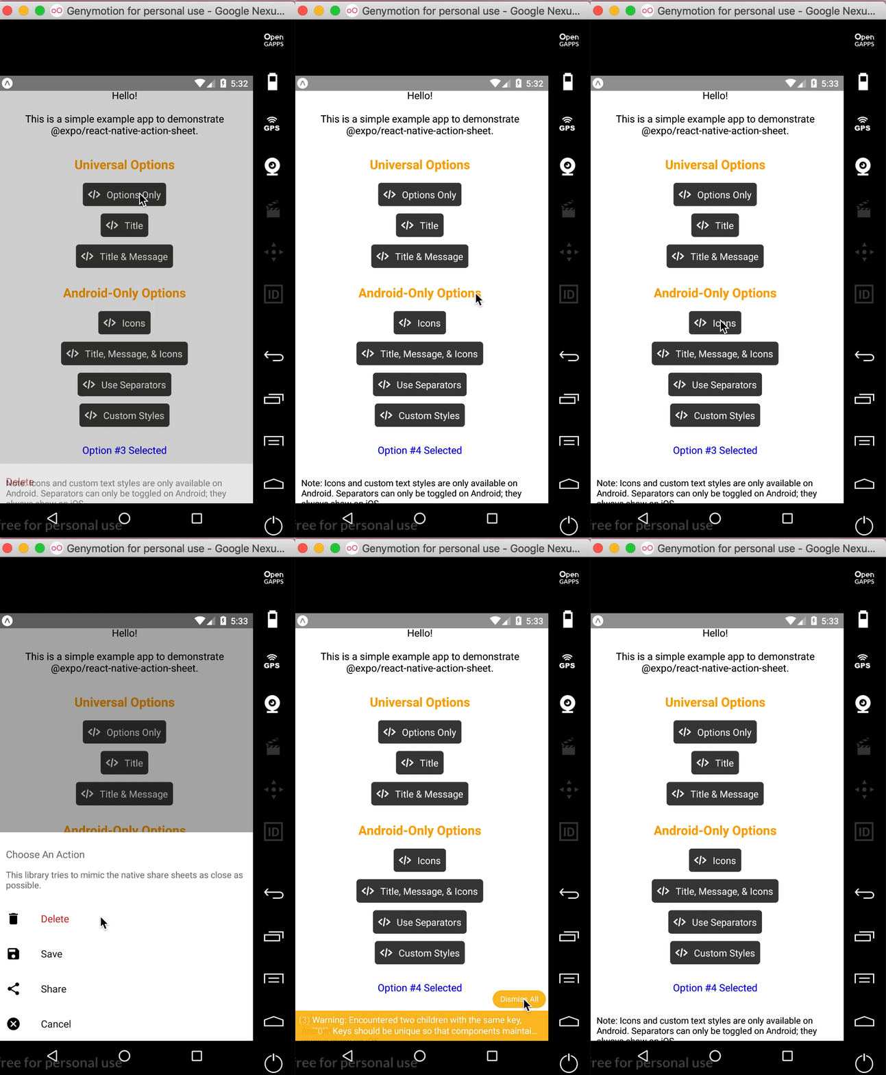
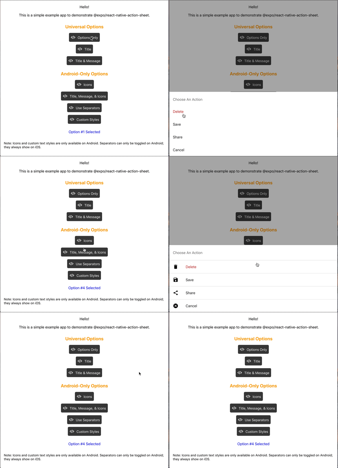
React Native Action Sheet is a cross-platform React Native component that uses the native UIActionSheet on iOS and a pure JS implementation on Android.
| iOS | Android | Web |
|---|---|---|
 |  |  |
npm install @expo/react-native-action-sheet
or
yarn add @expo/react-native-action-sheet
<ActionSheetProvider />ReactNativeActionSheet uses React context to allow your components to invoke the menu. This means your app needs to be wrapped with the ActionSheetProvider component first.
import { ActionSheetProvider } from '@expo/react-native-action-sheet';

export default function AppContainer() {
  return (
    <ActionSheetProvider>
      <App />
    </ActionSheetProvider>
  );
}
showActionSheetWithOptions method with a hook or a higher order component.// Using the provided hook
import { useActionSheet } from '@expo/react-native-action-sheet';
export default Menu() {
const { showActionSheetWithOptions } = useActionSheet();
const onPress = () => {
const options = ['Delete', 'Save', 'Cancel'];
const destructiveButtonIndex = 0;
const cancelButtonIndex = 2;
showActionSheetWithOptions({
options,
cancelButtonIndex,
destructiveButtonIndex
}, (selectedIndex: number) => {
switch (selectedIndex) {
case 1:
// Save
break;
case destructiveButtonIndex:
// Delete
break;
case cancelButtonIndex:
// Canceled
}});
}
return (
<Button title="Menu" onPress={onPress}/>
)
};
Alternatively, any component can use the higher order component to access the context and pass the showActionSheetWithOptions as a prop.
// Using a Higher Order Component to wrap your component
import { connectActionSheet } from '@expo/react-native-action-sheet';

function Menu({ showActionSheetWithOptions }) {
  /* ... */
}

export default connectActionSheet(Menu);
Menu component can now access the actionSheet prop as showActionSheetWithOptions.
The goal of this library is to mimic the native iOS and Android ActionSheets as closely as possible.
This library can also be used in the browser with Expo for web.
| Name | Type | Description |
|---|---|---|
options | array of strings | A list of button titles (required) |
cancelButtonIndex | number | Index of cancel button in options |
cancelButtonTintColor | string | Color used for the change the text color of the cancel button |
destructiveButtonIndex | number or array of numbers | Indices of destructive buttons in options |
title | string | Title to show above the action sheet |
message | string | Message to show below the title |
tintColor | string | Color used for non-destructive button titles |
disabledButtonIndices | array of numbers | Indices of disabled buttons in options |
| Name | Type | Description |
|---|---|---|
anchor | number | iPad only option that allows for docking the action sheet to a node. See ShowActionSheetButton.tsx for an example on how to implement this. |
userInterfaceStyle | string | The interface style used for the action sheet, can be set to light or dark, otherwise the default system style will be used. |
The below props allow modification of the Android ActionSheet. They have no effect on the look on iOS as the native iOS Action Sheet does not have options for modifying these options.
| Name | Type | Description |
|---|---|---|
icons | array of required images or icons | Show icons to go along with each option. If image source paths are provided via require, images will be rendered for you. Alternatively, you can provide an array of elements such as vector icons, pre-rendered Images, etc. |
tintIcons | boolean | Icons by default will be tinted to match the text color. When set to false, the icons will be the color of the source image. This is useful if you want to use multicolor icons. If you provide your own nodes/pre-rendered icons rather than required images in the icons array, you will need to tint them appropriately before providing them in the array of icons; tintColor will not be applied to icons unless they are images from a required source. |
textStyle | TextStyle | Apply any text style props to the options. If the tintColor option is provided, it takes precedence over a color text style prop. |
titleTextStyle | TextStyle | Apply any text style props to the title if present. |
messageTextStyle | TextStyle | Apply any text style props to the message if present. |
autoFocus | boolean | If true, this will give the first option screen reader focus automatically when the action sheet becomes visible. On iOS, this is the default behavior of the native action sheet. |
showSeparators | boolean | Show separators between items. On iOS, separators always show so this prop has no effect. |
containerStyle | ViewStyle | Apply any view style props to the container rather than use the default look (e.g. dark mode). |
separatorStyle | ViewStyle | Modify the look of the separators rather than use the default look. |
useModal | boolean | Defaults to false (true if autoFocus is also true) Wraps the ActionSheet with a Modal, in order to show in front of other Modals that were already opened (issue reference). |
destructiveColor | string | Modify color for text of destructive option. Defaults to #d32f2f. |
The following props can be set directly on the ActionSheetProvider
| Name | Type | Description |
|---|---|---|
useCustomActionSheet | boolean | iOS only prop that uses the custom pure JS action sheet (Android/Web version) instead of the native ActionSheetIOS component. Defaults to false. |
useNativeDriver | boolean | Windows only option that provides the option to disable the native animation driver for React Native Windows projects targeting Windows 10 Version-1809 ; Build-10.0.17763.0 and earlier. useNativeDriver is supported in Version-1903 and later so if your project is targeting that, you don't need to set this prop. |
// example of using useCustomActionSheet on iOS
export default function AppContainer() {
  return (
    <ActionSheetProvider useCustomActionSheet={true}>
      <App />
    </ActionSheetProvider>
  );
}
The second parameter of the showActionSheetWithOptions function is a callback for when a button is selected. The callback takes a single argument which will be the zero-based index of the pressed option. You can check the value against your cancelButtonIndex to determine if the action was cancelled or not.
function onButtonPress(selectedIndex: number) {
  // handle it!
}
Try it in Expo Snack: https://snack.expo.dev/@expo-action-sheet/example.
See the example app.
$ cd example
$ yarn

// build simulator
$ yarn ios
$ yarn android

// web
$ yarn web
$ git clone git@github.com:expo/react-native-action-sheet.git
$ cd react-native-action-sheet
$ yarn
We use bob.
$ yarn build
// tsc
$ yarn type-check

// ESLint + Prettier
$ yarn lint
FAQs
A cross-platform ActionSheet for React Native
The npm package @expo/react-native-action-sheet receives a total of 173,004 weekly downloads. As such, @expo/react-native-action-sheet popularity was classified as popular.
We found that @expo/react-native-action-sheet demonstrated a healthy version release cadence and project activity because the last version was released less than a year ago. It has 28 open source maintainers collaborating on the project.
Did you know?

Socket for GitHub automatically highlights issues in each pull request and monitors the health of all your open source dependencies. Discover the contents of your packages and block harmful activity before you install or update your dependencies.

Security News
The MCP Steering Committee has launched the official MCP Registry in preview, a central hub for discovering and publishing MCP servers.
Product
Socket’s new Pull Request Stories give security teams clear visibility into dependency risks and outcomes across scanned pull requests.
Research
/Security News
npm author Qix’s account was compromised, with malicious versions of popular packages like chalk-template, color-convert, and strip-ansi published.