Product
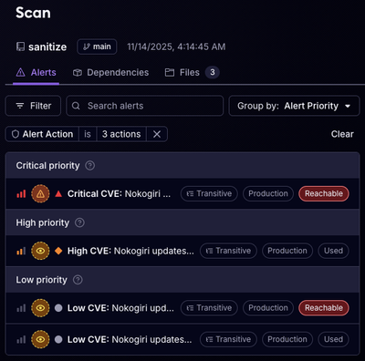
Reachability for Ruby Now in Beta
Reachability analysis for Ruby is now in beta, helping teams identify which vulnerabilities are truly exploitable in their applications.
@flexilla/collapse
Advanced tools
A versatile and interactive collapse component for creating collapsible sections in web applications, conserving space and improving user experience.
The Collapse component is used to hide and show an element.
| Params | Description | Type |
|---|---|---|
| collapseElement | The element to be collapsed/expanded | HTMLElement |
| triggerElement | The element that triggers the collapse | HTMLElement | null |
| options | Additional options for the Collapse | CollapseOptions |
| Option | Description | Type |
|---|---|---|
| orientation | The orientation of the collapse | "vertical" | "horizontal" | "vertical" |
| defaultState | The default state of the collapse | "open" | "close" | "close" |
const options = {
orientation: "vertical",
defaultState: "close",
};
const collapse = new Collapse(
'#myCollapseElement',
options,
'#myTriggerElement',
);
// Show the collapse element
collapse.show();
// Hide the collapse element
collapse.hide();
// Toggle the collapse element
collapse.toggle();
FAQs
A versatile and interactive collapse component for creating collapsible sections in web applications, conserving space and improving user experience.
We found that @flexilla/collapse demonstrated a healthy version release cadence and project activity because the last version was released less than a year ago. It has 1 open source maintainer collaborating on the project.
Did you know?

Socket for GitHub automatically highlights issues in each pull request and monitors the health of all your open source dependencies. Discover the contents of your packages and block harmful activity before you install or update your dependencies.

Product
Reachability analysis for Ruby is now in beta, helping teams identify which vulnerabilities are truly exploitable in their applications.

Research
/Security News
Malicious npm packages use Adspect cloaking and fake CAPTCHAs to fingerprint visitors and redirect victims to crypto-themed scam sites.

Security News
Recent coverage mislabels the latest TEA protocol spam as a worm. Here’s what’s actually happening.