Product
Introducing Data Exports
Export Socket alert data to your own cloud storage in JSON, CSV, or Parquet, with flexible snapshot or incremental delivery.
@flockos/vue-components
Advanced tools
## How to use: 1. Just use `npm install --save @flockos/vue-components` 2. Use the components in your file directly.
npm install --save @flockos/vue-componentsimport Components from '@flockos/vue-components';
// Global registration in your main.js/App.vue file
Object.entries(Components).forEach((name, component) => {
Vue.component(name, component);
});
Check out the demo here: https://codesandbox.io/s/n9n7yy2lwp
All components are registered with the Vue global and are available for use. You do not need to re-register them.
You can use the Flock Component's own event bus to pass data around.
focusChanged: Whenever the document is clicked, this event is fired. The only parameter is element which was clicked.
Usage:
import { eventBus } from '@flockos/vue-components';

eventBus.$on('focusChanged', (element) => {
    // Do a few things if focus changes.
});
More events will be supported as needed.
Usage:
<flock-button type="primary">Submit</flock-button>
click: Emits the click event when clicked.
styles: Custom styles for your button.
shape: Default is default. Options are default and flat. Flat means that there's no hover state.
size: Size of the button. Possible values: full, half & auto. Default is auto.
small: Reduce padding and makes a smaller styled button. Default is false.
loading: To show asynchronous operations, a loader circle shows up whenever this is set to true.
disabled: Disables the button and applies an opacity to it.
type: The style of the button. Possible values are primary, secondary & destructive. Default is primary.
invert: Replaces the color & background with each other.
Usage:
<flock-radio>
    name="radio-demo"
    label="Is this the value!"
    v-model="radio"
    optionValue="Yes"
    :disabled="false"
>
</flock-radio>
<flock-radio>
    name="radio-demo"
    label="Or is this the value!"
    v-model="radio"
    optionValue="No"
    :disabled="false"
>
</flock-radio>
Usage:
<flock-select
    :width="150"
    :options="listOptions"
    v-model="selectedOption"
/>
change: Whenever the FlockSelect changes value, this event is fired with the new value as a parameter.
open: Initial state of the FlockSelect dropdown.
options: Array of options. Every option needs to be in the { label: 'Some Visible Text', value: String|Object|Number } format.
width: The width of the FlockSelect component, if it needs to be constant.
v-model: The value that will dynamically change just like normal models in Vue.js.
Usage:
<FlockModal @close="showModal = false" v-if="showModal" title="Settings">
    List of devices!
</FlockModal>
close: Fired whenever the modal is closed. User has to handle the close themselves using a v-if.
closeOnBgClick: When set to true, the modal will automatically emit the close event whenever the background is clicked.
background: This sets the backdrop of th modal. Default is none.
title: The title of the Modal.
Usage:
<FlockBanner>
    This is a banner.
</FlockBanner>
position: Position of the toast. Can be either top or bottom. Default is bottom.
styles: A styles object to customize background, color etc. of your banner. By default, the banner will occupy 100% of the total width of the page.
Usage:
<FlockToast v-if="showToast" @toasthidden="doSomething">
    Let's make a toast!
</FlockToast>
toasthidden: Gets triggered when the toast is hidden, automatically or manually.
time: The time duration of the toast in milliseconds. Default duration is 5000ms.
position: Position of the toast. Can be either top or bottom. Default is bottom.
styles: A styles object to customize background and color of your toast.
You need to control the visibility of the toast by supplying a v-if conditional.
TODO: Make Toast better so that a user can directly use it like: eventBus.showToast(Some Text, 4000)
FAQs
## How to use: 1. Just use `npm install --save @flockos/vue-components` 2. Use the components in your file directly.
We found that @flockos/vue-components demonstrated a not healthy version release cadence and project activity because the last version was released a year ago. It has 1 open source maintainer collaborating on the project.
Did you know?

Socket for GitHub automatically highlights issues in each pull request and monitors the health of all your open source dependencies. Discover the contents of your packages and block harmful activity before you install or update your dependencies.

Product
Export Socket alert data to your own cloud storage in JSON, CSV, or Parquet, with flexible snapshot or incremental delivery.

Research
/Security News
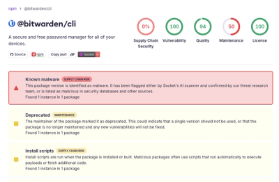
Bitwarden CLI 2026.4.0 was compromised in the Checkmarx supply chain campaign after attackers abused a GitHub Action in Bitwarden’s CI/CD pipeline.

Research
/Security News
Docker and Socket have uncovered malicious Checkmarx KICS images and suspicious code extension releases in a broader supply chain compromise.