

Product
Reachability for Ruby Now in Beta
Reachability analysis for Ruby is now in beta, helping teams identify which vulnerabilities are truly exploitable in their applications.
By Oskar Haarklou Veileborg - Nov 17, 2025
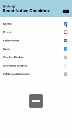
@futurejj/react-native-checkbox
Advanced tools
A papery checkbox for react native


A beautiful, customizable, and animated checkbox component for React Native applications. This component works across iOS, Android, and Web platforms with smooth animations and accessibility support.
yarn add @futurejj/react-native-checkbox
# or
npm install @futurejj/react-native-checkbox
This component uses Material Community Icons. You'll need to install either:
@expo/vector-icons (if using Expo - built-in)react-native-vector-icons (if using React Native CLI - follow the installation instructions for react-native-vector-icons)import React, { useState } from 'react';
import { View } from 'react-native';
import { Checkbox } from '@futurejj/react-native-checkbox';
export default function CheckboxExample() {
const [checked, setChecked] = useState(false);
const toggleCheckbox = () => {
setChecked(!checked);
};
return (
<View style={{ padding: 20 }}>
<Checkbox
status={checked ? 'checked' : 'unchecked'}
onPress={toggleCheckbox}
/>
</View>
);
}
<Checkbox
  status="checked" // 'checked', 'unchecked', or 'indeterminate'
  disabled={false} // disable the checkbox
  onPress={() => {}} // handle press events
  color="#6200ee" // color when checked
  uncheckedColor="#757575" // color when unchecked
  size={32} // customize size (default: 24)
  style={{ marginRight: 8 }} // additional styles for the container
/>
| Prop | Type | Default | Description |
|---|---|---|---|
status | 'checked' OR 'unchecked' OR 'indeterminate' | Required | Current status of the checkbox |
disabled | boolean | false | Whether the checkbox is disabled |
onPress | (e: GestureResponderEvent) => void | Required | Callback when checkbox is pressed |
color | string | '#2196F3' | Color of the checkbox when checked |
uncheckedColor | string | '#757575' | Color of the checkbox when unchecked |
size | number | 24 | Size of the checkbox icon |
testID | string | - | Test ID for testing frameworks |
style | StyleProp<ViewStyle> | - | Additional styles for container |
The checkbox includes smooth animations:
This component is built with accessibility in mind:
checkbox)See the contributing guide to learn how to contribute to the repository and the development workflow.
MIT


FAQs
A papery checkbox for react native
We found that @futurejj/react-native-checkbox demonstrated a healthy version release cadence and project activity because the last version was released less than a year ago. It has 1 open source maintainer collaborating on the project.
Did you know?

Socket for GitHub automatically highlights issues in each pull request and monitors the health of all your open source dependencies. Discover the contents of your packages and block harmful activity before you install or update your dependencies.
Product
Reachability analysis for Ruby is now in beta, helping teams identify which vulnerabilities are truly exploitable in their applications.
Research
/Security News
Malicious npm packages use Adspect cloaking and fake CAPTCHAs to fingerprint visitors and redirect victims to crypto-themed scam sites.

Security News
Recent coverage mislabels the latest TEA protocol spam as a worm. Here’s what’s actually happening.