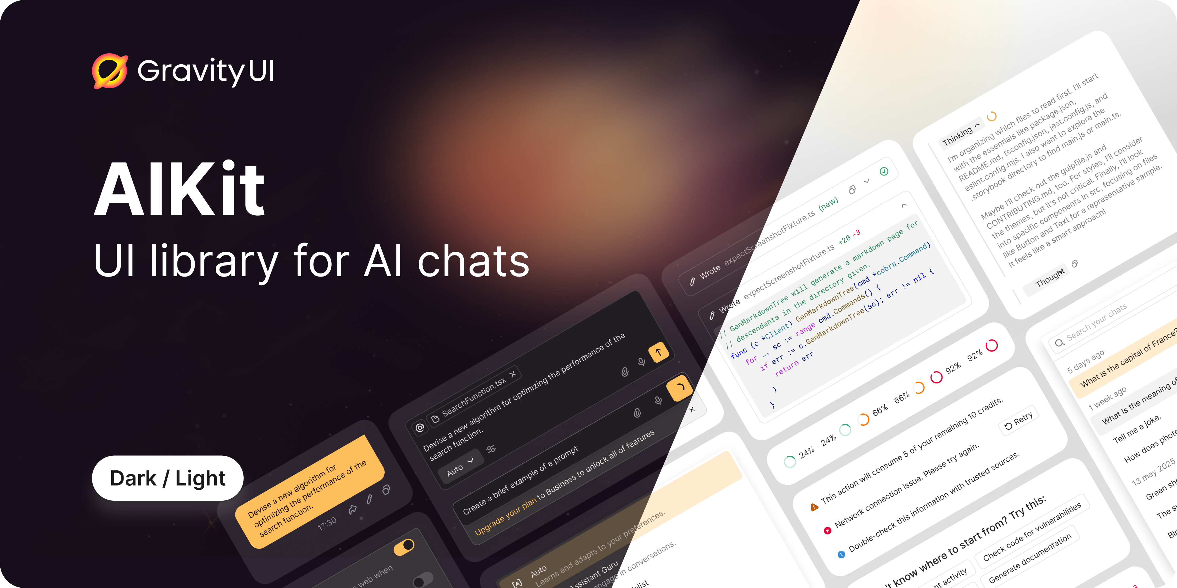
AIKit · 


UI component library for AI chats built with Atomic Design principles.
Resources
Description
@gravity-ui/aikit is a flexible and extensible React component library for building AI chats of any complexity. The library provides a set of ready-made components that can be used as-is or customized to fit your needs.
Key Features
- 🎨 Atomic Design — clear component hierarchy from atoms to pages
- 🔧 SDK Agnostic — independent of specific AI SDKs
- 🎭 Two-Level Approach — ready-made components + hooks for customization
- 🎨 CSS Variables — easy theming without component overrides
- 📦 TypeScript — full type safety out of the box
- 🔌 Extensible — custom message type registration system
Project Structure
src/
├── components/
│ ├── atoms/ # Basic indivisible UI elements
│ ├── molecules/ # Simple groups of atoms
│ ├── organisms/ # Complex components with logic
│ ├── templates/ # Complete layouts
│ └── pages/ # Full integrations with data
├── hooks/ # General purpose hooks
├── types/ # TypeScript types
├── utils/ # Utilities
└── themes/ # CSS themes and variables
Installation
npm install @gravity-ui/aikit
Quick Start
import { ChatContainer } from '@gravity-ui/aikit';
import type { ChatType, TChatMessage } from '@gravity-ui/aikit';

function App() {
    const [messages, setMessages] = useState<TChatMessage[]>([]);
    const [chats, setChats] = useState<ChatType[]>([]);
    const [activeChat, setActiveChat] = useState<ChatType | null>(null);

    return (
        <ChatContainer
            chats={chats}
            activeChat={activeChat}
            messages={messages}
            onSendMessage={async (data) => {
                // Your sending logic
                console.log('Message:', data.content);
            }}
            onSelectChat={setActiveChat}
            onCreateChat={() => {
                // Create new chat
            }}
            onDeleteChat={(chat) => {
                // Delete chat
            }}
        />
    );
}
Architecture
The library is built on Atomic Design principles:
🔹 Atoms
Basic indivisible UI elements without business logic:
ActionButton — button with integrated tooltipAlert — alert messages with variantsChatDate — date formatting with relative datesContextIndicator — token context usage indicatorContextItem — context label with remove actionDiffStat — code change statistics displayDisclaimer — disclaimer text componentInlineCitation — text citationsLoader — loading indicatorMarkdownRenderer — Yandex Flavored Markdown rendererMessageBalloon — message wrapperShimmer — loading animation effectSubmitButton — submit button with statesToolIndicator — tool execution status indicator
🔸 Molecules
Simple combinations of atoms:
BaseMessage — base wrapper for all message typesButtonGroup — button group with orientation supportInputContext — context managementPromptInputBody — textarea with auto-growingPromptInputFooter — footer with action icons and submit buttonPromptInputHeader — header with context items and indicatorPromptInputPanel — panel container for custom contentSuggestions — clickable suggestion buttonsTabs — navigation tabs with delete functionalityToolFooter — tool message footer with actionsToolHeader — tool message header with icon and actions
🔶 Organisms
Complex components with internal logic:
AssistantMessage — AI assistant messageHeader — chat headerMessageList — message listPromptInput — message input fieldThinkingMessage — AI thinking processToolMessage — tool executionUserMessage — user message
📄 Templates
Complete layouts:
ChatContent — main chat contentEmptyContainer — empty stateHistory — chat history
📱 Pages
Full integrations:
ChatContainer — fully assembled chat
Documentation
Testing
The project uses Playwright Component Testing for visual regression testing.
Run tests
Important: All tests must be run via Docker to ensure consistent screenshots across different environments.
npm run playwright:docker
npm run playwright:docker:update
npm run playwright:docker -- --grep "@ComponentName"
npm run playwright:docker:clear-cache
Local testing (Linux only)
If you're on Linux, you can run tests locally:
npm run playwright:install
npm run playwright
npm run playwright:update
For detailed testing documentation, see Playwright Guide.
Development
Development and contribution instructions are available in CONTRIBUTING.md.
License
MIT


