H2O.ai UI Kit
This is a library of shared components and themes for sharing code between Web front ends. As of this writing, this library is based on Microsoft's Fluent UI library of components, with an applied theme expressing H2O's corporate visual design.
Design
Implements components in H2O Design Library (https://xd.adobe.com/view/eebb600c-026b-4ca1-bb6b-0a439235452b-bbe8/) Some components are not in H2O Design Library.
Browsing the library
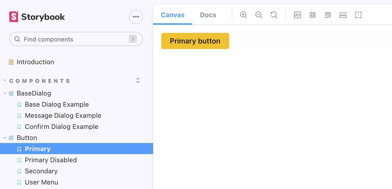
click UI kit Storybook
To view the library locally, and browser the different components, use Storybook: npm run storybook and you will see the library in your local browser. Use Storybook to develop and validate new components as you work:
Development
In order for PRs to be merged into master, the PR must pass several tests:
- Unit tests: To run unit tests, run
npm run test.
- Formatting: To check formatting, run
npm run format:check. To auto-format all files, run npm run format
- Linting: To check linting, run
npm run lint.
- Typescript transpilation: To check this, run
npx tsc
Visual Regression tests
There is a NPM script storybook:screenshots which generates a screenshot of all stories in the Storybook. The images are stored in __screenshots__ directory.
The script uses Storycap library which relies on Puppeteer. For deterministic results, script is
running in Docker container, so Docker has to be installed on you machine and running. The PNG generators on different platform yields different PNG images although visually they are identical, since we want to track diffs, we have to eliminate this platform difference.
You can run storybook:screenshots to generate images of stories, if there will be a change in the image, you can use the Git diff tool to inspect differences.
The screenshots are also taken on the GitHub for the pull-requests (PR), the GitHub Action generates a screenshots and if there is a difference, it sends a commit to the PR branch, so the reviewers can see the diff and tell if it is a problem or not.
Dependency management
This repository contains two package.json files, one in the root and one inside the src/ directory. The src/ project is private and contains development tooling that relies on the peerDependencies. The reason is hassle-free npm link. if all those tooling and peerDependencies would be installed in the root, then the peerDependencies would leak into the client project during the npm link and cause many headaches.
Since npm@7 the npm install installs peerDependencies by default, we prevent that with omit = peer in .npmrc. The dependencies in src are installed automatically for you via a prepare scripts.
CSS-in-JS
We use CSS-in-JS library of Fluent UI.
CSS Requirements
ui-kit is based on box-sizing: border-box
Using icons
The UI-Kit uses Fluent's icon-font, the users of UI-Kit are responsible for initializing (fetching) the icon-font and registering the glyphs in Fluent system. The documentation is covered in Fluent's wiki. If there are no special requirements, just add following snippet into entry file of your application.
import { initializeIcons } from '@fluentui/react';

initializeIcons();
data-test instead of data-testid
The UI-Kit uses data-test prop instead of data-testid for screen.getByTestId().
You need to add below code to the setup test file.
import { configure } from '@testing-library/react';
configure({ testIdAttribute: 'data-test' });
Global Theme
Default H2O Palette and Semantic colors etc
the default colors are in themes/colors.ts file.
<H2OThemeProvider>
  App
</H2OThemeProvider>
Custom theme
const darkTheme: IH2OTheme = {
  semanticColors: {
    linkText: 'white',
    ...
  }
}
<H2OThemeProvider theme={darkTheme}>
  App
</H2OThemeProvider>
Component Theme
Every component has ComponentName.styles.ts file which has simple style objects or functions that return a simple style object.
Style Function Naming Convention
The function name is componentNameStyles + style name. It is for IDE friendly name.
The function of the default styles is componentNameStylesDefault like footerStylesDefault, linkStylesDefault.
e.g) linkStylesDefault, linkStylesBlack, linkStylesIcon
Use style functions
The default styles componentNameStylesDefault is already applied internally. If you need to add additional styles you can use styles prop as below example. styles prop can have a single style object & function or an array of the functions & style objects.
export interface IAppBarStyles {
root?: IStyle;
logo?: IStyle;
menuIcon?: IStyle;
title?: IStyle;
content?: IStyle;
userMenu?: IStyle;
}
export const appBarStylesDefault = (theme: IH2OTheme): IAppBarStyles => ({
root: {
display: 'flex',
...
},
logo: {
cursor: 'pointer',
...
},
menuIcon: {
paddingLeft: 24,
...
},
title: {
cursor: 'pointer',
...
},
content: { flex: 1, ... },
userMenu: {
paddingLeft: 32,
...
},
});
export const appBarStylesThin = (theme: IH2OTheme): IAppBarStyles => ({
root: {
height: 96,
...
},
});
export const appBarStylesThick = (theme: IH2OTheme): IAppBarStyles => ({
root: {
height: 96,
...
},
});
export const appBarStylesBlack = (theme: IH2OTheme): IAppBarStyles => ({
root: {
backgroundColor: theme.palette?.black
...
},
});
const myAppBarStyles: IAppBarStyles = {
root: {
width: 200
}
};
<AppBar styles={appBarStylesThick}>
<AppBar styles={[appBarStylesThick, appBarStylesBlack, myAppBarStyles]}>
<AppBar styles={appBarStylesThin}>
<AppBar styles={[appBarStylesThin, appBarStylesBlack, {root: {width: 100}}]}>
How to publish ui-kit npm package
ui-kit uses github actions to publish it for now. When Jenkins is ready, we don't need the github action.
- Update the version of ui-kit package in
package.json
- Goto Release
- Click
Draft a new release
- Click
Choose a tag -> Input the new version x.x.x -> Click Create new tag:x.x.x
- Input
Release title as the version x.x.x
- Input the details
- Click
Publish release
Develop components with a beta version
You can publish an npm package by running npm publish. You can publish your branch as a beta version of the npm package to test your components or changes in the ui-kit. You can also install the beta version in your project and test it. If you think it is ready to be released, you can make a PR with the official version.
- create your branch
- develop components / storybook examples / unit tests
- deploy the ui-kit npm package as a beta version for your ui-kit branch
- version:
xx.xx.x-b1 if you need to deploy it again, you can use the next beta version xx.xx.x-b2...xx.xx.x-bn
- run
npm run build -> npm publish
- install the ui-kit beta in your project and test the components:
npm install xx.xx.x-b1
- if it works very well, make a PR to release the new version of the ui-kit with the official version.
Develop components with npx link
You can use npx link instead of the beta version. npx is better and safer than npm. See the details here https://hirok.io/posts/avoid-npm-link
cd ./your-project-web-folder
npx link ../../ui-kit-folder


